House Review

Creating Wow Exteriors

Professional Builder’s House Review design team delivers its take on creating attractive exteriors without breaking the bank.
April 16, 2014
7 min read

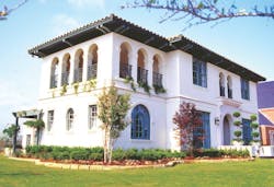
We all realize how important curb appeal becomes when designing and building new homes. In fact, it could be argued that the wow factor of the exterior is the most important design element. After all, if our clients don’t find the exterior exciting, they might not even venture inside the home. Of course, creating an attractive exterior while staying within a reasonable budget is always the challenge. While the amount of detail and material selections vary with the overall value of the home, the essence of an appealing exterior essentially involves three elements: scale, proportion, and proper use of materials.

In other words, the mass of the roof, window shutters that are correctly sized, and logical placement of masonry, siding, and stucco all play critical roles in the creation of homes that our clients consider attractive. While the following designs range from small bungalows to luxurious custom residences, each has a wow factor appropriate for its budget.
For past House Review topics, click here.

[PAGEBREAK]

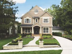
Timeless and simple, sometimes less is more. As a result of removing and diluting classical detailing, elevations became too plain to appeal to consumers and community review boards. The response has been to compensate with more gables, creating overly complex elevations. A preferred approach is simpler massing with a return to traditional detailing. The money saved by deleting extra gables and roof breaks can be repurposed to pay for enhanced detailing without breaking the budget. This approach also creates a much richer and inviting streetscape. A series of well-detailed homes with simpler massing produces a more cohesive composition and a successful community.
Architect
GMD Design Group
Scott Gardner, AIA
919.320.3022
Donnie McGrath
770.375.7351
• Crown crosshead at decorative vent
• Rake frieze with crown molding
• Crown molding at eaves
• Downspouts located on corner boards
• Fiber cement lap siding
• Window crosshead
• Window jamb trim
• Transom over front door aligns with top of adjacent windows
• Appropriately sized porch beam
• 6-inch wide corner boards, preferred over 3-inch corner boards
• Porch railing, enhances elevation even when not required by code
• Raised foundation gives porch added appeal

[PAGEBREAK]

Designer
Larry Garnett, FAIBD
www.smartlivinghomedesigns.com
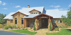
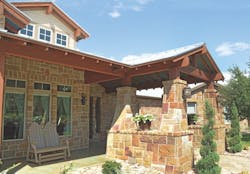
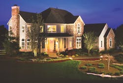
Although larger custom homes offer the opportunity to use more expensive details, there’s always a budget consideration. While native stone and metal roofing are certainly costly items, the overall structure of this 4,100-square-foot home is rather straightforward. Although there’s meticulous craftsmanship throughout, the majority of the intricate detail, including exposed rafters, cedar beams, tapered stone columns, and a dormer with clerestory windows, is confined to the front entry.
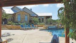
Notice that the attention to the exterior design continues at the rear elevation. Although often overlooked, rear elevations typically become the owner’s most frequently viewed exterior portion of their home. The proportions of the intersecting roof lines, along with the use of native stone and cedar become the basis for an exterior that is both exciting and appropriate for the setting.
• Dormer with clerestory windows emphasizes the central part of the home.
• Truss provides for an open porch ceiling.
• Exposed rafters at front porch
• Tapered native stone column base
• View of rear elevation from outdoor kitchen area shows the mixture of stone and horizontal siding.

[PAGEBREAK]

Architect
Donald F. Evans, AIA
The Evans Group
www.theevansgroup.com
407.650.8770
You don’t have to spend a lot of money to create a streetscape with impact. Good design utilizing the simple ideas of proportion, scale, color, and detail are the key.
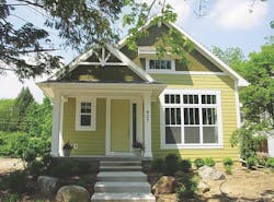
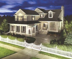
A quaint cottage creates instant curb appeal with a traditional color palette and simple details. It can be hard to create wow factor with today’s narrow homes, but design and simple details are the key.

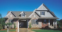
A unique mixture of siding, stone, and brick keeps expensive materials at a minimum, while still creating a lot of impact. The dynamics of the elevation allowed for natural stopping points for each of the materials and keeps the simple lap siding on the rest of the home from looking out of place.

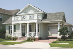
A simple traditional stucco home gets its wow factor from an unexpected railing detail above the front porch colonnade.
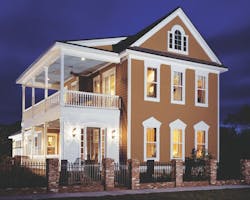
A Charleston side-yard-entry home is a showstopper using design, not expensive materials. Proportion, scale, design, and appropriate color make this elevation memorable.

[PAGEBREAK]

Architect
Todd Hallett, AIA, CAPS
TK Design and Associates
www.tkhomedesign.com
248.446.1960
Whether or not an exterior is wow worthy is a matter of perspective. Years ago when I was a fledgling designer in the home building business, my boss Phil McCafferty would say, “Anyone can design a house that looks great. However, if you can design a house that knocks their socks off but doesn’t cost much more to build, then you have something special.”
From that point forward I always strived to design exteriors that looked like they cost a lot more than they actually did. One of the overriding principles of lean design is to maximize the customer’s bang for their buck. Designing a wow exterior without breaking the bank is a good way to start. Let’s take a closer look at some exteriors designed for a range of budgets.
• A prefabricated sunburst takes the place of a half round window. This provides the desired look without the expense of higher ceilings, window costs, trim, etc., associated with putting in a half-round window.
• Shake siding is more expensive than horizontal siding and is used here as accent material.
• Prefab stone accents are used to create a base around the home.
• The corner is eliminated at the entrance providing a relatively inexpensive bay look. This detail provides richness inside and out, creating value.
• Stone is used as an accent material.

• Building over the garage helps to maximize the square footage relative to the footprint without giving the home the box-on-box look.

• A false dormer adds character to this narrow home.
• A raised wooden porch is an inexpensive way to create outdoor space.
• Flower boxes add color and charm to the exterior.

• Stone is used as an accent to create drama and richness at the entry.

[PAGEBREAK]

Architect
Rick Garza, Principal Architect
RPGA Design Group
www.rpgaarchitects.com
817.332.9477
The budget of a home, regardless of whether it costs $100,000 or $1 million, is always a major consideration, especially for the home buyer. When a home buyer is working through the design process, they are thinking about both wow interiors and exteriors. However, desire often collides with budget reality.
It’s true that careful consideration has to be given to both, but especially to the exterior. There are many ways to finish out the look of a home in an economical way and ways to make the desired design more cost effective. If more attention is paid to proportion, scale, balance, and proper window placement, then less money can be spent on expensive elements or ornate details.
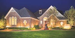
These two designs are the exact same house.
The first home was finished with painted brick and clean lines without flashy window casings and overly ornate architecture. The simplicity of the exterior gives this home an elegance befitting the accompanying neighborhood, and it is budget conscious, as well.
The second home is an adaptation of the same floor plan in the same neighborhood. This home, however, presents a completely different exterior design. Its metalwork, cross timbering, brick details, and use of stone veneer eschew the Mediterranean feel of the first home to create more of a Tudor look while still falling within the budget-friendly range.

Sign-up for Pro Builder Newsletters
Get all of the latest news and updates.