|
|
 |
 |

"We looked around and saw that the only colors that aren't being used here are black and white," says Gerry Ryan, principal of G. Ryan Design. "We would stand out just because we weren't fighting with everybody else. That's where the name Onyx came from.
"The sales office had a lot of glass in front of it, and our signage was backlit, which made it even more different than the other guys just doing plywood signs," adds Ryan. "As you drove along the street you could see inside the sales office, so it was very inviting. You could see the model; you could see people walking around."
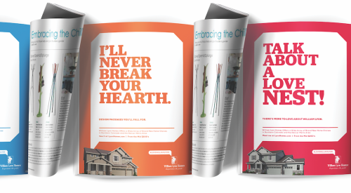
The brochure stands out by looking less like a housing brochure than a fashion magazine. "It was out of scale big ... with lots of lifestyle pictures of people filling double page spreads of the brochure. Again, it was something fresh for the area," Ryan says. "That was why we turned out to be a success. It was out of character [compared to] everyone else. It was fun, too."
Builder: Davies Smith Developments, Toronto
Ad Agency/PR Firm: G. Ryan Design, Toronto
PB Topical Ref