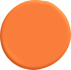
17 Ways to Bring Pantone’s Living Coral Into Your Next Project
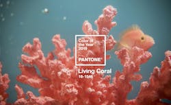
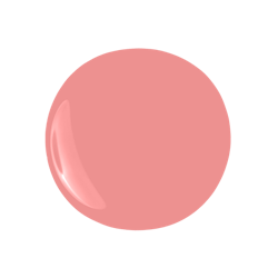
Color authority Pantone has announced the warm orange hue Living Coral as its 2019 Color of the Year.
The company says Pantone 16-1546, or Living Coral, is an “animating and life-affirming shade of orange with a golden undertone.” Similar to how coral reefs provide refuge for sea life, Living Coral provides comfort and warmth in a shifting environment, Pantone says.
[READ MORE: WHAT THESE 10 'COLOR OF THE YEAR' PICKS SAY ABOUT DESIGN IN 2019]
“Color enhances and influences the way we experience life,” says Laurie Pressman, vice president of the Pantone Color Institute. “As a shade that affirms life through a dual role of energizing and nourishing, Pantone 16-1546 Living Coral reinforces how colors can embody our collective experience and reflect what is taking place in our global culture at a moment in time.”
[ READ MORE: 15 ON-TREND PANTONE COLOR OF THE YEAR PRODUCTS FOR 2021 ]
Pantone says the color carries feelings of joy, authenticity, and engagement. It also bridges the gap between natural and digital, occurring both naturally in the ocean and frequently on social media feeds and in marketing materials.
“Color is an equalizing lens through which we experience our natural and digital realities and this is particularly true for Living Coral,” says Leatrice Eiseman, executive director of the Pantone Color Institute. “With consumers craving human interaction and social connection, the humanizing and heartening qualities displayed by the convivial Pantone Living Coral hit a responsive chord.”
Not everyone is a fan of the new shade, though. Michelle Ogundehin, a writer and design consultant, called the bright hue “loud and strident, recalling cheap toilet roll colours and the sort of bridesmaids dresses that people refer to as meringues,” in a column in Dezeen. She went on to criticize Pantone’s cheerful “naivety” when referencing a species that is dying off in many area due to warming oceans.
[READ MORE: NEW SHERWIN-WILLIAMS SURVEY SAYS WHITE, GRAY WALLS ARE OUT IN 2020]
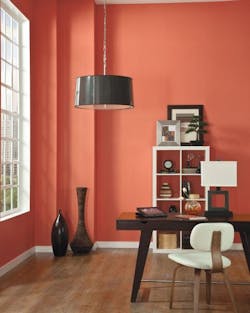
Whether you love it or not, Living Coral is sure to stick around the design world this year, and will certainly make its way into homes. When used in interior design, Pantone says Living Coral “adds a dramatic pop of color to any room setting whether in decorative accessories, tabletop, or on the wall.”
Here are 17 products that will bring Pantone-inspired shades into your next project.
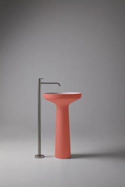
1. Antoniolupi
The Ago85 pedestal sink is made with the company’s Flumood composite material. Made from aluminum hydroxide and synthetic resins, the product has a low styrene content and is easy to clean and repair. The curving sink is available in a variety of colors, including the peachy bambola, which closely matches Pantone’s Living Coral.
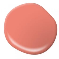
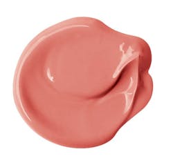
Left: Salmon Coral, Right: Watermelon Slice
2. Behr
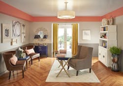
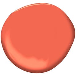
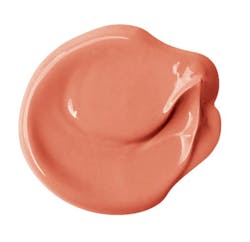
The paint manufacturer recommends its Watermelon Slice interior paint or its Salmon Coral decorative chalk paint for matching Pantone’s Living Coral. The chalk paint can be used over unprepped or irregular surfaces, while Watermelon Slice is available in a variety of the company’s interior and exterior paint products. A variety of sheens are available.
3. Benjamin Moore
Tangerine Dream is an orange-heavy version of Pantone’s 2019 trend. Part of the Color Preview collection, the shade is a good compliment to classic colors, the company says.
4. Big Chill
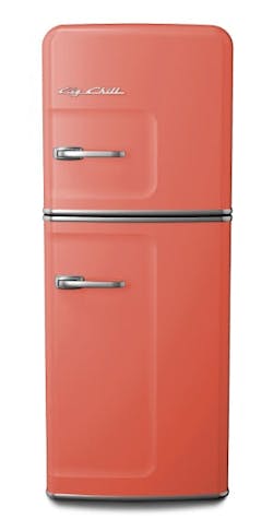
The manufacturer offers its Retro line of appliances in a custom Salmon Pink, a close match to Pantone’s COY. The 24-inch-wide slim fridge, pictured here, has a 10.7-cubic-foot capacity, a stamped metal body, and a pivoting chrome handle
5. BlueStar
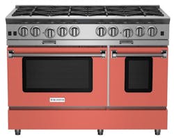
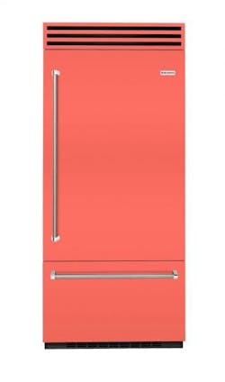
BlueStar offers over 750 appliance colors and can customize to any shade. The company’s newest offering is inspired by Pantone’s Living Coral. It is seen here on the company’s 36-inch Platinum Range and 36-inch built-in refrigerator with a swing door.
6. Clare
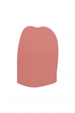
Clare Paint’s Pink Sky is a more subdued version of Pantone’s COY. The company’s paint is available online and has zero VOCs, is washable, and is Greengaurd certified, the company says.
7. Formica
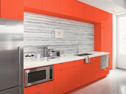
The Laminate line’s Clementine is a deeper version of Living Coral, “ideal to represent the heart of the home and bold enough for modern interiors,” says Renee Hytry Derrington, global design lead at Formica Group. The laminate is postforming and resistant to impact and wear, the company says.
8. Glidden
The company’s best match for the coral trend is Celebration Orange, a bright shade that pairs well with white and cream, the company says. It is available in several interior and exterior paint types.
9. HGTV Home by Sherwin-Williams
The paint company’s Dishy Coral was included in Mystic Light, one of the three 2019 color palettes it released last fall. HGTV Home says the collection “explores the blurred lines between physical and digital,” echoing Pantone’s sentiments regarding Living Coral.
10. Marioni
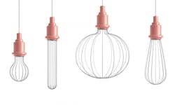
The Italian home goods company offers its suspended Edison series in four shapes. The ceramic cap can be specified in a variety of finishes, including this coral shade. Wall and floor lamp versions are also available.
11. MasterBrand Cabinets
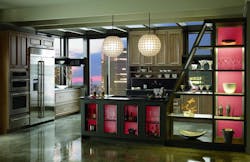
MasterBrand subsidiary Omega offers a wide variety of semi-custom cabinetry, including custom paint colors to match any sample.
12. Nemo Tile + Stone
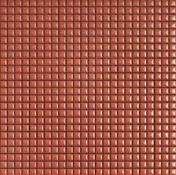
The Diva by Appiani collection adds textures to walls or floors with its tight grid. It comes in 12-inch-by-12-inch mesh sheets and is available in a variety of colors, including Coral.
13. Officine Gullo
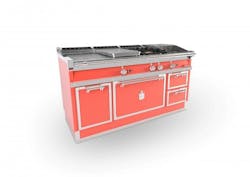
The Italian manufacturer is offering its professional cooking suite in a wide variety of colors, including this coral finish. It includes a gas or electric oven, a cooktop with two electric burners, a coup de feu cooking surface, a fry top, a work area, and two drawers. Suites can be customized.
14. Officinaciani
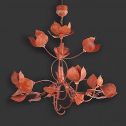
This hand-forged iron chandelier features a leaf design available in many color options.
16. Sherwin-Williams
Coral Reef is a “great accent color,” according to Sue Wadden, director of color marketing at Sherwin-Williams. The shade is available in several interior paint types.
17. Valspar
Orange Slice is one of Valspar’s 12 color of the year picks for 2019. Sue Kim, the company’s color strategist, says that the “adventurous orange maintains an artificial intensity that invites an experimental mindset.”
