5 Design, Product Resolutions You Should Make for 2020
As a new decade dawns, now is the time to ditch these five design moves in favor of some that make more sense for homebuyers and clients.
All design is local and regional, which means that sometimes the existing conditions and the size of the budget dictates what can be done and for how much—even if the solution is less than ideal. Often, the best option is not possible and compromises have to be made.
For example, a kitchen sink by the window is an ideal placment if a home has a nice view to landscape or the water, but in a tight space, designers must sometimes insert the sink in a corner location. In small baths, a tiny corner sink or faucets placed to the side of a vanity is the only option available to the architect or designer.
Still, there are design details and product installations that drive some designers (and us) crazy. We consulted a handful of design pros and other resources to find out what ticks them off and to get advice on better options to explore.
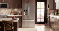
Sometimes it cannot be avoided, but locating a fridge right next to a stove or wall oven is not an ideal solution. Image courtesy Whirlpool Corp.
1. The refrigerator next to the wall oven or stove
There is no law against locating the refrigerator next to the stove. Trust us, we checked. In fact, GE says a refrigerator may be installed next to a range or wall oven as long as air clearances for both appliances are met. But the appliance company does say that failure to adhere to the recommended clearances can void the warranty. This seals it for us and makes us even more steadfast in our opinion that it’s best to find an alternative to the stove next to the fridge. Contractor Art Childers of GAC Design & Consulting agrees: “Basically, you don’t want to locate your refrigeration next to your dishwasher, oven or stove top,” he says. “Should be obvious, but I can't tell you how many times I've seen, what is touted as a wonderful Kitchen, where the refrigerator and the oven are directly adjacent each other.”
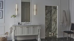
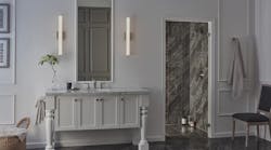
Instead of a single light above the vanity, designers should opt for face-level lighting on both sides of the mirror. Image courtesy Lumens.com
2. Single light over the medicine cabinet
A single light above the vanity is the standard installation in many bathrooms, but this is not the best soliution for optimum lighting. “It's easy to think a single overhead light or a single sconce above the mirror will be enough to light a small bathroom,” Wolfers Lighting says. “However, even if the room is small, a single light fixture is often insufficient.” Plus, a single light is not the most flattering for applying makeup, as it casts weird shadows on the face.
Architect Doug Walter, AIA, has a better solution: The best possible lighting for activities in front of the bathroom mirror comes from fixtures mounted on either side roughly at the user’s eye level,” the principal of Doug Walter Architect writes in proremodeler.com, our sister publication. “This leaves no part of the face in shadow, as happens with an overhead fixture. If the mirror wall isn’t an option, move the light fixtures to the side walls, or hang pendants from the ceiling; just try to get the light to either side where it will do the most good.”
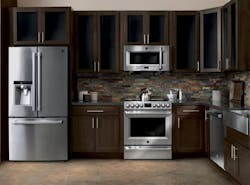
Designers say installing a microwave oven above the stove is a holdover from a different era and is not the ideal location. Image courtesy Kenmore
3. Microwave over the stove
Seriously! It’s basically 2020, and we are still doing this? We see this one all the time, and it drives us crazy. For one thing, we have never seen a microwave over the range that’s really effective at removing smoke and grease from a high-powered range.
Yale Appliance agrees with us. “The CFM (how many cubes of air is exhausted in a minute) is 300-400 on the average side,” the appliance supplier and distributor says on its blog. “Most range hoods are 300-695 CFM's for a standard gas range. It was an adequate ventilator for a typical stove designed in the 1980’s and 1990’s. However, it is not a product capable to exhaust grills, woks, or professional ranges (sorry Viking, it will NOT work), because there is little depth or capture area. Smoke is never immediately filtered. It is captured and then channeled through the duct to the outside.”
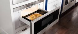
Using a microwave drawer or installing the oven in a cabinet under the counter is much better idea. Image courtesy Sub-Zero/Wolf
Designer Kathleen Jennison goes even further. “It’s ugly,” the principal of KTJ Design Co. writes on her site. “It became the popular location for the microwave in the 1980’s as a way to remove it from the counter top. It seemed liked an efficient use of space, but with today’s large kitchens that is not an issue anymore. “
But more importantly, a microwave over the range could be safety concern in certain situations. The idea of lifting a hot boiling item up and over your head while there is potentially another hot surface below doesn’t seem like a good idea to us. Instead, designers should option for a microwave drawer or perhaps think about locating the microwave in a cabinet below the countertop. Not only is this safe for users, but it’s more functional as well.
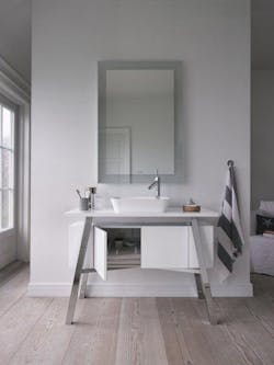
Even if your powder room looks as good as this one above, having the door open into the kitchen is a terrible idea. Image courtesy Duravit
4. Powder rooms that open right next to the kitchen
Urban living in cities and dense housing in the suburbs is hot right now, and it’s forcing builders and architects to do things that may not be in the best interest of homebuyers and renters. One of them is the powder room door that opens right into the kitchen. For obvious reasons, this is a bad idea. Sure, we understand that this is unavoidable in tight urban spaces, but seriously, please make every effort to cease and desist this practice in 2020. There has to be a better way, no matter the situation.
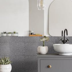
Mosaic tiles are making comeback and can be a nice addition to the bathroom, but use sparingly on a floor in a large bathroom, designers and manufacturers say. Image courtesy The Home Depot
5. Small tiles in a big bathroom
For some years now at the European tile shows, the trend has been for larger and even larger-format tiles that sometimes measure up to 48 inches long by 24 or 36 inches wide. Large tiles are awesome for large or even small spaces and make rooms feel bigger. But now mosaics are making a comeback and can be a nice additon to the bathroom as well—if the designer knows what to do. But there are some things to remember.
If you have a large room, tiny floor tiles may be too overwhelming. American Olean says tiny tiles can help a small room flow better. “You can also help a small floor plan flow by using tiny tiles,” the tile company says. “This is especially helpful if the spacing between the sink, toilet, and other features is compact. Small mosaic tiles will require less cuts, thus offering a more streamlined look.”
