Motorcycles and rock music aren’t what you’d expect to find inspiring a high-end furnishings brand, but they definitely played a role in the formation of Buster + Punch.
The U.K.-based brand is known for gorgeous hardware, exquisite lighting, and beautiful furniture and accessories but with an edgy aesthetic that’s attracting global buzz.
Founder and creative director Massimo Buster Minale was born into a family of designers. After design school he worked for an architecture firm before starting his studio in a garage in one of East London’s grittier sections back in late 2012.
Building and customizing motorcycles for musicians, fashion designers, and film stars led to doing some cool custom hardware and lighting for those clients looking for decorative pieces with elevated street style.
Today, the studio is located in the London Bridge area; there’s a showroom in Stockholm, and collections can be ordered directly online and shipped worldwide.
“What’s impressive with the studio’s output so far is that it doesn’t merely copy the rock, bohemian aesthetic, but achieves an original interpretation of it,” says Greek interior designer Costas Voyatzis.
“Minale is after an aesthetic result that is dramatic, beautiful, and dark.”
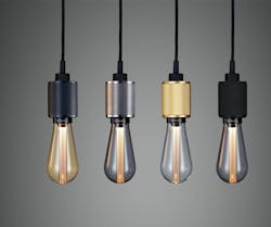
Lighting is stripped down to the simplest elements – bulb, socket, cord, and perhaps a supporting structure. But that minimalism puts the spotlight on the well-thought-out design.
Several pendant fixtures are simply a bulb in a socket on a cord—the kind of light you’d see hanging off a grungy rafter in an urban motor garage. But in Buster + Punch’s version, the weighty metal socket is intricately honed with a signature diamond-cut knurling pattern so it looks like a cool guy’s bracelet. The matte black rubber cord evokes the tires on a badass motorcycle. And then there’s that bulb.
The studio’s LED Buster bulb was the first real designer LED. A central resin light pipe creates a subtle ambient light that hadn’t been possible with previous LED iterations. The bulb, evocative of Edison bulbs, comes in a teardrop or cylinder shape, in gold or smoked finishes as well as clear. In the warmer finishes, it’s about as sensuous and sculptural as a lightbulb could be, and is one more example of where Minale and his team have elevated the utilitarian.
Minale says they were inspired in 2015 by Rolls Royce’s “legacy of harnessing energy with grace” to adapt the bulb into a fixture with a unique gold-plated bayonet design, offering it as an exclusive product for the Rolls Royce Enthusiast Club exhibition at London’s Saatchi Gallery.
The hardware collection includes handles, pulls, and knobs, as well as light switches made of hefty marine-grade steel, with oversized screws and the Buster & Punch knob.
“All our products are made from solid metals and manufactured using the same techniques that we used to make motorcycle parts,” says Minale.
“This ensures that our products are both heavy and have an element of excitement in their DNA. We then finish the details with our signature, diamond-cut knurling pattern to make them feel amazing when touched.”
That knurling technique on the hardware pieces—whether brass, bronze, steel, or black or white metal—gives them a vintage industrial look.
“We first started with a special technique for motorcycle handles,” Minale says, “using whiskey during the turning process to ensure the cleanest cut and a great grip. Today we use pure alcohol to finish our solid metals, but otherwise the technique remains unchanged. As you can tell, we’re very proud of our knurling!”
Minale says they wanted to transform something mundane into something memorable. “A bunch of beautiful solid knobs and handles that can make opening things a simple pleasure.”
In the furniture collection, there’s a showstopper of a bar cabinet made of American walnut, with a sultry berry silk quilted back panel. Finished with custom brass buttons, brass handles, and a cage light, it merits its moniker: the Rockstar.
U.K.-based studio ILOVEDUST designed a packaging collection that debuted this fall.
“We wanted the boxes to look like they’d been slightly destroyed by spending too long in a garage,” explained Minale. “The hardware boxes look like they’ve been splashed with oil, and the lighting boxes look like a jolt of electricity has charred them.”
Grit, glamour, and excitement—the perfect blend for a brand on the cutting edge of luxury.
