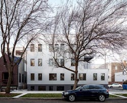
Designed by Vladimir Radutny Architects, W Rice Street is an eight-unit multi-family condo building that complements Chicago’s historic Ukrainian Village neighborhood with its focus on community, energy efficiency, and longevity.
Ukrainian Village is one of the Windy City’s oldest areas and this 14,000 square-foot project hopes to make a timely impression by combining modern construction with traditional surroundings. Although the building provides living quarters for more occupants than the previous space, the scale was chosen in order to blend well with surrounding homes.
[ Read More: PROJECT OF THE WEEK: A CHICAGO HOUSE THAT REINTERPRETS TRADITIONAL ARCHITECTURE ]
Big plans for a small space
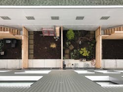
The client, Ranquist and Spartan Development Group, asked the design team—Radutny, Fanny Hothan, and Ryan Sarros—to maximize the limited space provided. Previously, three single-family homes occupied the lot, and now its occupancy has more than doubled. One contiguous, corrugated steel exterior wraps around the eight units, with room for private backyards, large terraces, and parking spaces.
This project was a special task for the designers as it was their first substantial ground-up construction. Typically, the firm works with renovations and additions. Their success, which resulted in a 2019 AIA Chicago Design Excellence Award, did not come easy, but with careful consideration and a process that designer Sarros relates to a jigsaw puzzle. Breaking down the large square structure with windows, terraces, and stairwells helped to make the scale of the building seem smaller.
“I think the idea of introducing more residential perforations in the facade, like kind of a controlled study of window apertures, really helps bring down the scale of a pretty large cube,” Sarros says.
Creating a multi-family building without sacrificing amenities is a triumph, they say. The firm believes W Rice Street can serve as an example of maximizing budget and space.
“We are optimistic that projects such as 2016 Rice Street will elevate the bar for future small scale developments, promoting higher design standards at all residential work within our city’s fabric,” the firm says.
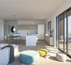
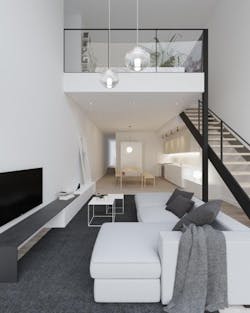
Due to the jigsaw nature of the design, each unit ended up with unique characteristics. These vary from unit to unit, such as a secluded, loft-style area, large open floor plan, and a nearly 700-square-foot outdoor terrace, which ends up providing shade to lower units.
“We did a really nice job, I think, of basically just carving the earth out at those areas to flood those lower portions of the units with natural light,” says Sarros. “The idea of being able to explore that volume just adds a nice variety of spaces to hang out in for a duplex-type unit.”
Thoughtfully chosen materials create a long lifespan, low maintenance
The modernity of the project is not only seen in the continuous steel exterior, but in the decisions made for materials and the process of obtaining them.
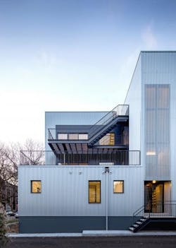
Their material choice played a large role in this piece of the puzzle. A reflective material was important so the surrounding landscape could bounce off the building’s exterior through Chicago’s four seasons, but also to reflect the sun’s changing beams over the span of a day, the firm says. By using corrugated steel wall rain screen panels finished with Kynar, there is longevity and little maintenance. Sarros says the shape is an efficient one, especially for Chicago’s weather patterns.
“The cube itself is actually a pretty energy-efficient shape overall, probably the most for our climate, or at least colder climates,” Sarros says. “One good thing about it is you get maximum volume with minimum surface area exposure.”
The same can be said for the building’s terraces.
[ Read More: HOW TO BUILD KNOCK-OUT DECKS, PATIOS THAT HOMEOWNERS WILL ACTUALLY USE ]
For the deck, the team chose Thermory heat-treated ash instead of composite decking. The heating process retains the wood’s natural beauty while increasing its rot-resistant properties and extending its lifespan. Around the decks, HardiePlank siding lines the exterior.
Inside, exposed concrete floors, walls, and steel stairways helped to limit the amount of VOC, or volatile organic compounds, while connecting the modernistic exterior to the interior. In addition to a uniform design, the exposed aspects reduced the need for additional finish materials.
Steel was not only used for accents such as stairways and railings, but in the building itself.
“Thinking of the longevity, what this building is made up of, it’s basically a concrete modular block, so a CMU structural shell,” Sarros says. “It also has a lot of steel hybridized into it to allow some of the gymnastics to occur between the units. Basically, the corrugated metal panel itself was probably where we had the most input in terms of how we wanted to see this thing cladded. That material is very maintenance-free and very long-lasting. It's also kind of totally different from the more absorptive brick facades you would typically see in Chicago.”
High energy efficiency and a deep connection to the outdoors
The design team had to balance energy efficiency with the developer’s tight budget. This resulted in a benefit for the residents as well, reducing their bills with EnergyStar appliances, cross breezes, natural sunlight, and high-value insulation.
Each of the eight units feature three distinct orientations so sunlight and breezes permeate any unit a potential buyer chooses. This feature boosts natural light and circulating air as well.
“The way light casts through it, it just transforms and really livens that space,” Sarros says. “Definitely one of my favorite parts about the project is studying that moment where you have a pretty massive scale building, but you also have this really grand gesture of life at the edge of it.”
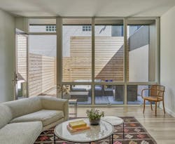
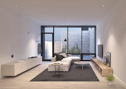
The features that make this project efficient, such as large windows and distinct orientations, also help with indoor-outdoor living, Sarros says.
“I think what I really appreciated the most is the connection to the outdoors,” Sarros says. “We placed windows at certain orientations, so as you’re circulating through, you’re either following light or you end up at a view. It’s calm in there. It's kind of quiet, and it just has a nice feel to it overall. Something that seems pretty massive from the outside really kind of breaks down to a nice, livable unit that’s just different.”
Units look out to the tree-lined W Rice Street or the neighboring Damen Avenue, and all windows are fully operable, able to adjust to any residents’ desire. Natural surrounding trees were complemented with enough windows to experience the natural beauty, but native vegetation was also utilized in the front of the building. Instead of bringing in different foliage resulting in more upkeep and irrigation in the summer, the firm used native plants to bring a natural quality and to provide privacy for the lower units.
Paying respects to Chicago
The configuration of the project is atypical for Chicago, Sarros says. The new, future-focused approach is one that the firm hopes makes a mark, but they did not forget the city or community during planning.
Outdoor spaces and large terraces were placed with community in mind. As residents spend time outdoors, they are able to wave to neighbors and become a part of the neighborhood.
“Social connectivity between neighbors and their neighborhood is one of the key design intents of this project, encouraging visual connectivity between public and private spaces enhances community building and enriches an intangible sense of place,” the firm says.
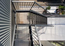
Different features of the building also reflect the classic Chicago staples like “L” train platforms, steel grates on sidewalks, and ubiquitous fire escapes. These aspects pay homage to the location, and the steel exterior also plays perfectly with the big Midwest sky, Sarros says.
[ Read More: PROJECT OF THE WEEK: COMMERCIAL SHEATHING HELPS CREATE DURABLE N.C. HOUSE ]
The multifamily project required significant coordination between the two teams: strategic planning on the architects’ side and proper execution on the part of the builder for this puzzle of a project. Sarros says the finished product was satisfying to see, and he appreciated the builder’s attention to detail.
“The transitions between the materials, like where the corrugated metal goes over the main entries, essentially goes from solid to perforated to allow light to go through into that stairwell,” Sarros says. “It's kind of a beautiful, seamless transition. The way the building’s skin kind of stops at the fifth course of masonry to articulate the masonry course, it was a neat way to focus on all these moments.... I was really happy how the builder constructed this in the end.”
