Kitchen + Bath Features to Make You Stand Out and Seal the Deal
Sean Ruppert, a Washington, D.C., builder and principal of OPaL, tells an anecdote about a master bath feature he included in his high-end production homes in Canal Mews, an enclave of the Palisades, a neighborhood in the District’s northwestern reaches. The feature is a glass-enclosed walk-in shower with a tub and a towel-off area. When Ruppert saw the wet room in its initial planning stages, he knew right away it was a clever use of space. “But when I was showing the house during construction, everyone who walked through asked, ‘What the heck is that?’” he recalls.
Ruppert remained convinced. Shortly after, he happened to see a similar shower showcased in photographs of Bette Midler’s luxurious Manhattan apartment. “If it was good enough for Bette, I figured it was good enough for me,” he says, laughing. “Once we modeled it, everybody loved it.” The tub-and-shower enclosure setup is a great idea for smaller single-family homes, Ruppert says. “It blends the need to offer a large tub and a walk-in shower while utilizing the same space.” As for the homes at Canal Mews, the last one sold and just went to settlement.
It’s no news that holding a buyer’s interest means separating yourself from the pack. One of the most effective ways to do this is via the bath and the kitchen. The production builders we talked with say that typically a kitchen takes up around 10 percent of a new home’s overall budget. The bath? Just 3 percent. That’s a relatively small but mighty way to make an impression. According to the Research Institute for Cooking & Kitchen Intelligence (RICKI), a market research firm exclusively devoted to kitchens, well over half of buyers have no strong opinions when it comes to brand choices for high-impact items such as ranges, cooktops, and fridges. As for countertops and rangehoods, even fewer buyers have strong preferences. In other words: You have a big opportunity to make a splash. The following pages offer inspiration.
The Kitchen
“The kitchen is where the best conversations happen,” says Joan Marcus-Colvin, senior vice president of sales, marketing, and design at The New Home Co., in Aliso Viejo, Calif. But if kitchens have long been the places that pull people together, they represent a challenge for the builder: offering something current that satisfies classic needs. “Kitchens tend to be one of the more dynamic spaces in the home,” Marcus-Colvin observes. “We’re constantly focusing on what’s next, asking ourselves what we’ve missed in our previous designs. We’re never satisfied,” she adds.
Photo: Bernard André
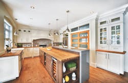
Take a look at these features in the kitchen (above) by kitchen designer Leslie Lamarre and architect Randy Grange:
- The breakaway wooden cart on wheels offers options. Part of the island, it can be a place for milk and cookies or can serve as a moveable prep area.
- A wall separates the dining area and the kitchen, delineating the cook’s place. The doorway and pass-through (to the right of the doorway) connect the rooms, and the pass-through makes serving and clearing a cinch.
- The deep drawers underneath the cooktop hold pots and pans and roll out quietly and smoothly. They’re a more streamlined solution than doors that conceal a rollout shelf. Passage space in the kitchen is narrow, so every half-inch counts: Pull-holes eliminate the need for cabinet hardware that would protrude into the circulation area.
- A mix of materials divides this 20-foot-long island into sections for cleanup, prep, cooking, and sitting. A quartz countertop provides an attractive and hardy work surface on either side of the cooktop.
- Kitchen lighting should be able to go from task to ambient. A pendant and recessed halogens provide illumination to work by; glass-front cabinets lit from within contrast with the wood and add ambient light. Windows, of course, admit natural light.
Fantasy Island
“An island needs to be more than just a box that’s a cutting board and a table,” says Nick Lehnert, executive director at KTGY Group and head of the firm’s R + D Lab in Irvine, Calif. Whether there’s a break in the surface so that the sink and cooking zone are separated from the dining area is up for grabs. But the design needs to show the capability for being an activity area: prep, cooking, homework, and hanging out. “The good ones take on a bit of architecture,” says Lehnert, in the form of a waterfall countertop, standing legs, and possessing a bit of scale.
Marcus-Colvin says that if there’s space, double islands are worth it. “If you’re going to have a party in the kitchen, you need space for people to prep, or at least to pretend that they’re prepping.” Islands need proper knee clearance for sitting, deep drawers for pots and pans, and, if they contain a cooktop, a heatproof surface on both sides of the burners for landing.
While ample islands spark dreams of good parties and great meals, they’re not always feasible.
Even in A Narrow Kitchen, An Island is Possible
Builders, architects, and designers alike agree that a great island (if not two) is essential. What’s more, that island has to be as handsome as it is hardworking, including a seating area, storage, prep space, possibly a sink, an appealing countertop, and smashing design.
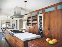
Yes, the San Francisco-area kitchen pictured above is custom, and its creators—kitchen designer Leslie Lamarre and her husband, architect Randy Grange of TRG Architects, in Burlingame, Calif.—are based in a part of the country that’s booming. But in such a pricey area, Lamarre and Grange often work on small houses, with many of the same challenges as anyone else: creating inviting, efficient kitchens within modest footprints.
This kitchen, at roughly 20 by 13 feet, was too narrow to accommodate a normal island but too wide to function as a galley setup. The solution: anchor the room with a 2 ½-by-6 ½-foot island. Longer and slimmer than standard, the island is as chockablock with great ideas as the rest of the kitchen.
Stay Connected
A smooth connection between kitchen and outdoor space goes a long way, even if the outdoors is just a small deck with a table, chairs, and pots for herbs and cherry tomatoes. “It’s another way we’re creating romance,” Marcus-Colvin says. “Those indoor-outdoor relationships speak to the farm-to-table revolution.”
Marcio Decker, an interior designer in Truckee, Calif., sees connectivity as essential, too, because large families and friends spend holidays together. “If the kitchen is integral to the living spaces, the room isn’t isolated,” he says, adding that it requires that the room “blend in with the architecture,” so appliances are hidden behind panels.
Shed Light
Because the kitchen is the hub, it serves many functions. Multiple sources of lighting—recessed lights in the ceiling and pendants over the island that are both on dimmers, cabinets lit from within, not to mention doors and windows—make it possible for the kitchen lighting to go from task to ambient, and the kitchen itself to go from work area to dining area.
Raid the Pantry
“Walk-in pantries are essential,” says Jim Wentling, a Philadelphia-based architect who works in more than 20 states and Canada, providing designs for production homes. “That 5-foot space between the dining room and the kitchen can house a walk-in pantry or a butler’s pantry with a counter and nice, thick shelves,” he says. Many designers spoke of a Costco pantry, and there’s no doubt that space for paper towels and dish detergent is a must for today’s buyer. But the romance part of storage means catering to the foodie buyer, suggests Joan Marcus-Colvin, “whether they’re doing their own canning or are buying dried mushrooms from overseas and need dry storage.”
The Bath
“We’ve created gourmet kitchens—now we’re creating ‘gourmet baths,’” says architect Donald Evans, president of The Evans Group, an Orlando, Fla., design firm. Evans views the bath as an opportunity to go semi-custom, sell up, and deliver something special for buyers. “They’re seeking a bath that makes you think you’re at a resort,” says John Guilliams, partner and director of design at KGA Studio, in Louisville, Colo.
"You’re setting the stage for the dream,” says KTGY Group’s Nick Lehnert of the master bath as a place to escape to and influenced by hotel trends. Features such as the curbless shower, steam showers, lighting in the shower, increased linen storage, and radiant floor heating are also increasingly in demand, according to the NKBA. Beautiful finishes are essential, and products such as porcelain tile that resembles wood planking offer the opportunity to replicate the warmth and texture of wood without the maintenance concerns. In addition, expect more call for water-saving fixtures, comfort-height toilets, and vanities that comply with universal design requirements.
Photo: courtesy Kohler
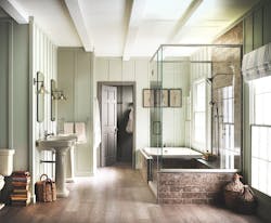
Take a Look at These Best-Selling Bath Features (Above):
- A double vanity is turning into a feature that's now expected. It can be designed as twin sinks or a Jack-and-Jill configuration on either side of a closet or flanking a window.
- A deluxe shower can be "a little bit spendy for production, but showers with dual heads and niches for bath products make it feel like a spa," says Marcio Decker. Though a streamlined spa look speaks to buyer desires, proceed with caution: Walk-in showers need to have a door on them to keep steam in, even in Southern California, advises Nick Lehnert.
- Getting as much natural light into the bath as possible makes a difference, especially when daylight light streams into the shower, says architect Don Ruthroff. Clerestory windows, off-the-shelf glass blocks, or frosted glass are ways to simultaneously offer light and privacy
- A bathtub is a hotly debated feature (see below). Architect Jim Wentling estimates that about half of buyers want a tub for resale value. If you include one, placement is key. So is providing a surface for bath products and towels.
The Great Debate
Shower, tub, or both? This seems to be the single biggest debate in interiors right now. Though the tub in the master bath may up a home’s resale value, it may be OK to forgo it in houses where square footage is at a premium. “We get the resale question from real estate agents, but more and more people are ignoring it,” John Guilliams says.
Donald Ruthroff, senior architect for the Dahlin Group, in Pleasanton, Calif., reports that if the house is less than 2,000 square feet, he jettisons a tub in favor of a big, luxurious shower. Clients have been giving it the thumbs-up. “As long as there’s a tub somewhere in the house, everybody’s fine,” Ruthroff says. He notices two trends: cavernous, steam-room–type showers with ambient lighting, as well as showers that are filled with natural light. “A shower is anybody’s game right now,” he says. “It’s fun; you get a lot of variety.”
“With the tub, you lose floor space that’s coming out of a bedroom or a closet,” Guilliams says. “The question becomes, ‘Do I need a bathtub or three extra feet of closet space?’” As a result, use the tub as an upgrade, he advises.
If there is a tub, placement really matters, Nick Lehnert says. He acknowledges that a freestanding tub can be a striking piece of sculpture, but advises setting it in an area that feels sheltered, as opposed to in the center of the room. The tub should be big enough for two and needs a deck, even if it’s not a full one, with room for a couple of towels, a magazine, bath salts, or a glass of wine. “A bath is experiential,” Lehnert says.
“We’re doing an option for what we call a spa shower or a super shower,” says Don Ruthroff of a feature that’s piquing buyer interest. It replaces the standard 42-inch-square shower pan/18-inch seat and a 6-foot tub. Instead, the tub/shower space is reconfigured to contain a walk-in drying-off area and two showerheads. “Hotels drive the trend so much, even if it’s only on television,” he says. “We spend a lot of time talking about ‘the spa feeling’ and ‘the hotel feeling.’”
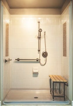
“If the trades can work it, try for a curbless shower,” Guilliams advises. He notes that manufacturers are catching on and are coming up with creative solutions that answer the curbless shower demand in a production-friendly manner, including a readymade shower pan that can be tiled over, plus a structural board with an integrated drain. “You can order 4 by 8 sheet and cut it to fit, so you tile right through to the drain,” he says. “It’s really slick.” (For more on pre-built showers, see below.)
White Isn't Trite
Despite trend-talk about “color blocking,” the National Kitchen & Bath Association (NKBA) says that around 80 percent of designers spec’d white or off-white in the last year for kitchens and baths. Sean Ruppert thinks that it’s because strong color tends to evoke strong emotions—and not always good ones. “Our bathrooms are pretty vanilla,” he says. Classic materials simply applied, such as subway or basket-weave tile, Carrara marble, and porcelain present buyers with a luxurious space that they can personalize.
Cater to Vanity
Double vanities in the master bath are the standard, notes Jim Wentling, whether set up with a window in between, side by side, or with a linen closet separating them. “We’re seeing a lot of variation in household formation,” Donald Evans says. “Double vanities are no longer just for the active adult or senior market. To use the term ‘first-time’ buyer, you have to be really specific about who you’re talking to because during the downturn, buyer profiles changed.”
Along with her colleagues, Marcus-Colvin uses her travels to do market research, also citing the hotel trend as highly influential in bath design. Floating cabinetry allows the space for installing ambient lighting underneath and adds a custom feel, she says. Mirrors, too, are a hotel-like design element to watch for, she adds: “Wall-mounted, lit, or tilted, with a space where you can sit down if you want to.”
Kitchen & Bath in a Box
An emerging product category is kitchen and bath systems that reside in the middle of the continuum between off-the-shelf and custom. They offer a made-to-order feel that can set a home apart from the rest with attractive design, attention to detail, and appeal that speaks to a broad range of buyers.
Photo: courtesy Cuisines Laurier
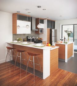
Kitchen systems used to be the domain of manufacturers targeting designers with big budgets. But a few companies now offer the means to deliver a custom look with a prefab sensibility. Canadian brand Cuisines Laurier and Italian company Unica Kitchens sell kitchen cabinetry systems that come in standard North American sizes, plus panels for fridges, dishwashers, columns, and even backsplashes. A selection of standard finishes is available (custom options are, too). Unica Kitchens CEO, Marco Maset, says that, with a distribution center in Virginia and a warehouse in Florida, Unica can offer delivery in as little as three business days.
Both Cuisines Laurier and Unica Kitchens use Blum soft-motion hardware and offer space-saving features such as corner pullouts for efficient storage. “This product could easily up the game for builders who don’t want to do a cookie-cutter thing,” says Bob Drake, owner of Trig Modern, a design showroom in Raleigh, N.C., that carries both Cuisines Laurier and Unica Kitchens. “A builder comes in with a blueprint and we can figure out a package so it’s turnkey.”
Photo: courtesy Best Baths
