5 Common Bathroom Mistakes Pros Should Avoid
Design magazines and TV shows about home remodeling regularly feature bathrooms that “absolutely are like eye candy,” says Toronto kitchen and bath designer Art Warren. But they often break NKBA’s common-sense guidelines for safety and good design.
We checked in with some of NKBA’s leading experts to determine some of the most common design flaws that homeowners, contractors, and even some designers make when they ignore the rules. Here are five that stood out:
The beveled edges of the vanity in this bathroom by Alberto Villalobos offer a decorative element while avoiding sharp corners that can lead to injury. Photo: Courtesy Villalobos Desio
1. Bathroom chandelier
It’s almost too tempting to pass up: A ceiling-mounted chandelier dangling over a freestanding bathtub can render a bathroom worthy of a magazine cover. It also can knock the bather on the head when she stands up to dry off. And it puts her at risk of electrical shock if she touches it while she’s standing in a tub full of water. NKBA recommends that hanging fixtures be no closer than 3 feet horizontally and 8 feet vertically from the top of the bathtub rim or shower stall threshold.
“Even just changing the bulb while you’re standing in a tiny bit of water” is dangerous, says Annette Starkey, CKBD, owner of Living Environment Design in Orangevale, Calif.
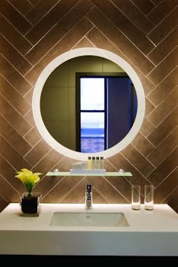
A back-lit mirror, such as Trinity from Electric Mirror, can add a unique decorative lighting element as an alternative to a chandelier.
2. Sharp corners
Just a splash of water on a bathroom floor can leave it slick enough to cause a slip and fall. If a granite or marble countertop has sharp corners, that slip can land the bather in the hospital with a nasty gash to the head. NKBA recommends clipped or round corners rather than sharp edges on all counters.
“This I where you’re in this constant dilemma of design versus function versus safety,” says Warren, a certified master kitchen and bath designer with Designers Consortium in Toronto. “There are certain things you should do even if it’s not” the look you want. “It’s a safety factor.”
This project by Young Huh demonstrates a more practical approach to a chandelier in the bathroom—far away from the soaking tub. Photo: Courtesy Young Huh
3. Steps to the tub
A bather who has to climb a few steps to get to the bathtub and then step down into it risks slipping and falling, especially if the steps don’t’ have a railing. NKBA recommends that steps not be placed outside of a tub, and if they are, a grab bar or handrail is mandatory.
“A bathroom tub that is raised up so you have to step up is beyond me,” says Sherrie Pantalon, CMKBD, owner of Pantalon Design in San Diego. “It’s a safety hazard.”
Warren agrees: “They get to the top step and go, ‘I’ll just step off into the tub. But that’s a two-foot drop, and because it’s water and everything is slippery, they wind up falling.”
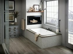
Aquatic's Serenity tub featuring an elegant built-in installation without a height that requires steps.
4. Stone floors
The shinier the floor, the more clean and polished a bathroom looks—and the more slippery it is when wet. NKBA recommends slip-resistant surfaces for the bathroom floor, shower floors and tub bottoms.
“The problem with marble floors is that when you get them wet, they are just like walking on ice,” Warren says. “They look good, but they’re way too slippery.”
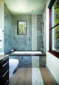
This bath by designer Leslie Lemarre, CKD, a second-place winner in the 2017 NKBA Design Competition, features foot-friendly porcelain tiles and an easy-to-access bathtub. Photo: Bernard Andre
5. Shower size
Squeezing a shower into a powder room—meant to be a half-bath—can cramp a bather. NKBA recommends that interior shower size be at least 36 inches by 36 inches. That’s half a foot wider than the code requirement of 30 inches by 30 inches.
“You have to allow for elbows to come up to bathe,” says Pantalon. “If you have a shower that’s too tiny to move your elbows, you can’t even grab the soap to wash with.”
This article is part one of a two-part series. See part two, featuring common kitchen mistakes, here.
