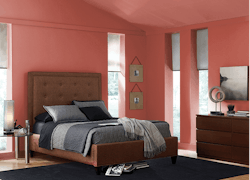
Consider this a primer for all the paint companies that named a Top Paint Color of the Year for 2017. The hues ranged across the spectrum, but soft, cool colors earned the most recognition.
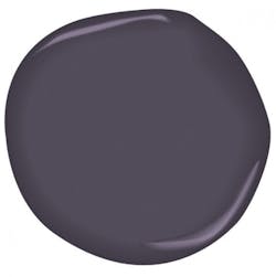
After a year of research, which included trade show visits and input from experts in home furnishing, architecture, and fashion, Benjamin Moore selected Shadow as its color of the year. The royal amethyst is similar to lilac, and the manufacturer says it adds energy and sophistication to a room. The color headlines Benjamin Moore’s Color Trends 2017 palette, which features 23 hues including Grandfather Clock Brown, Pink Bliss, and Dark Burgundy.
“I think that Shadow does everything,” Lita Dirks, interior designer and president of Lita Dirks & Co., in Greenwood Village, Colo., told Professional Builder. “It’s a beautiful neutral, and it’s a beautiful accent at the same time. It can capture such amazing character and feeling in a room.”
Poised Taupe from Sherwin-Williams is a neutral gray with a touch of brown mixed in. The result is a warmer, cozier tone, a departure from monochrome grays. The manufacturer recommends Poised Taupe as a backdrop that pairs well with 40 other colors in its 2017 Colormix forecast, including Stardew, a faded indigo; Marea Baja, a deep teal; or Rave Red, which has the appearance of red-stained bedrock.
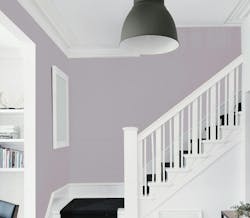
PPG and several of its brands all chose shades of violet for their Top Paint Colors of 2017. PPG, which introduced four new palettes, opted for Violet Verbena. The gray-purple hue is meant to evoke a bohemian, “gypset” (gypsy + jet set) lifestyle, blending the masculine and the feminine, the mystic and the modern, the company says. PPG said it sequestered 20 color experts for three days to determine the top choice.
PPG’s Olympic brand selected Cloudberry, a soft violet that, as the manufacturer put it, is meant to blend in. It’s serene and free of noise, limiting distractions. PPG’s Glidden went with Byzantine Blue, a peaceful, versatile purple. The hue, which borrows characteristics of blue and gray, appears bluish-purple when paired with whites, but looks gray when partnered with neutrals.
Dutch Boy recognized two willow-green shades, In The Brush and Thunder Storm. The gray-greens give a room a pop of color. The manufacturer says that the colors are great for open floor plans, giving a space an inviting, social atmosphere.
Pratt & Lambert also selected a green, albeit a darker one. The company says the viridian Leafy Bower offers intimacy to smaller rooms and brings a sense of luxury to a kitchen.
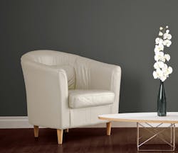
The gray Kettleman, from Kelly-Moore Paints, is a go-to neutral for both interior and exterior spaces that pairs well with wood tones, warm neutrals, whites, and other bolder accent colors. Kelly-Moore determined its Color of the Year by sending out surveys to 15,000 interior design experts.
The companies are in lockstep with their more subdued colors. “It’s a bit of a softening, and paint manufacturers are capturing that,” Dirks says. “Color is taking on the feeling of a cloud—a bit softer, a little more dramatic, a little more moody.”
Dirks says that the lighter shades of gray, blue, green, and violet that dominate the Colors of the Year represent the homeowners’ psyche: After working their way out of the recession, and in the age of constant tech engagement, people want to take a deep breath.
Compared with more vibrant Colors of the Year in the past, “These are far more soothing,” Dirks says. “They capture the essence of people’s desire to find some calm in their lives.”
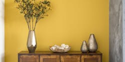
There are still some options for those who want to spice it up. Honey Glow, from Dunn-Edwards, is golden yellow with orange undertones, meant to infuse energy into a room. The company says the vibrant hue can match with everything from earthy, neutral palettes to colors such as brown, red, gray, green, and orange.
Pantone, the provider of professional color standards for the design industries, opted for a change of pace with its color of 2017. Last year, the company chose Serenity and Rose Quartz, a muted blue and a soft pink, respectively, to represent the need for harmony. This year’s pick, Greenery, is a sharp lime yellow-green shade meant to resemble the lushness of nature. Pantone said it evokes rejuvenation and revitalization.
A few paint companies eschewed naming one color, focusing on a range of hues instead. Behr introduced three palettes: Comfortable, Composed, and Confident. Comfortable features lighter colors such as baby blue (Peek a Blue) and subtle gray (Close Knit). Composed has moderate tones, such as the teal Polished Aqua. Confident offers bold colors, such as the deep orange Fired Up, and the stark red Hot and Spicy.
Valspar named 12 Colors of the Year, ranging from the green Crushed Oregano (also known as Fickle Pickle or Parrot Feather), to the water-like Lake Henry (or Roadster Blue), to the pitch-black Twilight Purple (or Black Currant).
