We’ve all collected a few “best-selling” plans over the years — designs that just seem to have lasting appeal. But even the most popular plans eventually need an overhaul. While some of these designs might merely need a facelift to update the exteriors, most could also benefit from an interior makeover.
For example, since kitchens have become the focal point of most homes, many older designs require this area to be completely re-worked, incorporating bar seating and a view toward the family room. In many cases, the formal dining room can be replaced with a single, spacious dining area that’s also open to the family room.
Traffic patterns may need some improvement. By creating logical paths from one area to another, there’s no longer the need to travel directly through the family room, dodging furniture as you go. While eliminating hallways and creating open floor plans was the goal for many years, the result often compromised privacy. Who really wants to sit in the family room and see directly into the master bedroom?
Finally, the media center has gradually replaced the fireplace as the focal point in the family room. In fact, the fireplace might even disappear completely from the family room in some markets.
For past House Review topics, visit www.HousingZone.com/HouseReview.
Improving Traffic Patterns
Designer
Larry W. Garnett, FAIBD
254.897.3518
[email protected]
www.smartlivinghomedesigns.com
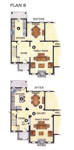
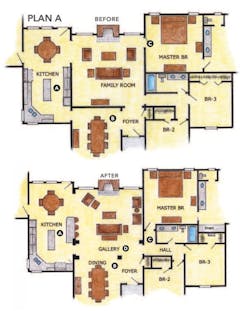
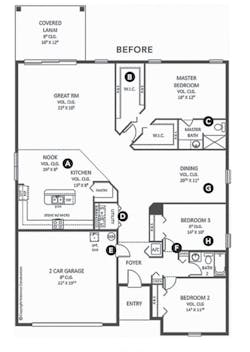
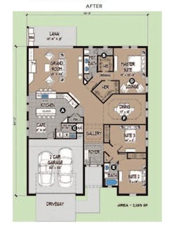
Traffic flow throughout a home becomes one of the most critical and often overlooked details. The following two plans, although bestsellers for many years, certainly benefit from improving the traffic patterns and opening up a few walls. The kitchen in each plan now becomes the focal point of the design, providing views to the family and dining areas, in addition to creating informal eating bars.
BEFORE - Problems with the original plan:
A. Kitchen is closed off from dining and family room.
B. The rear portion of a rather large family room is actually devoted to traffic flowing from the foyer toward the hallway and dining area.
AFTER - Benefits of the new plan:
A. Kitchen now opens to dining area and includes a small island bar and corner windows above the sink. Also, note that the rear door eliminates traffic directly through the middle of the kitchen.
B. A 10-inch-thick half-wall defines the foyer and family room.
C. Dining area now also opens to family room, creating a more informal and useful area.
D. Now the defined gallery directs traffic past the family room and dining area. Note that the square footage and furnishing areas remain identical.
BEFORE - Problems with the original plan:
A. Kitchen is closed off from the family room.
B. Formal dining room is isolated from the family room. As a result, it’s a room that’s seldom used.
C. Entrance to master bedroom from family room saves some hallway, but at the price of compromising privacy. Someone sitting in the family room has an unobstructed view into the master suite.
AFTER - Benefits of the new plan:
A. Kitchen opens to family room and provides casual bar seating.
B. Removing the walls between the dining room and the foyer and family area makes all three areas seem larger and more inviting.
C. The footage required for a short hallway is a small price to pay for a secluded master suite.
D. The new gallery is actually space borrowed from the family room. Note that the furnishing space is the same. But now the traffic flows from the kitchen and foyer to the bedrooms without having to walk diagonally through the family room, dodging furniture.
[PAGEBREAK]
Snout House
Architect
Richard C. Handlen, AIA, LEED AP
EDI International, Inc.
[email protected]
415.362.2880
www.edi-international.com
Plan size
Before: 1,870 sf
After: 1,890 sf (plus a 245-sf studio)
Width: 50 feet
Depth: 60 feet
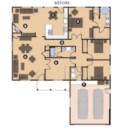
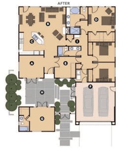
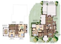
Snout houses are popular with developers because of their ease of construction — a rectangular box for the house with the garage attached out front, like a snout. This configuration frees up the perimeter for windows, topped off by two simple truss shapes. The shortfall of the concept is that the house is set back too far from the street, creating neighborhoods dominated by prominent garage doors. The objective of this study is to keep the economical elements of the footprint, while bringing living space forward and updating the interior to match today’s lifestyles.
BEFORE:
A. The combo foyer/living/dining room was often underutilized, even in its heyday.
B. Family room with corner fireplace and entertainment center; space is difficult to furnish.
C. Secondary eating area and dead-end, U-shaped kitchen
D. Master suite with double doors opening to the side of the bed and the closet in the bathroom
E. Den or bedroom four option
F. Utilities at the rear of the garage
G. Long narrow hall open to master
AFTER:
A. Flex room — formal dining room, parlor, or home office
B. Great room — center of family life
C. Flow-through kitchen with view of wall-mounted flat-screen TV
D. Master suite removed from view with his-and-her closet access from the bedroom and walk-in shower
E. Den or bedroom four option
F. Using a wall-mounted tankless water heater and an attic FAU allows the expansion of the house into the garage space.
G. Studio with optional bathroom. The addition of this element negates the “snout” by bring living space out in front of the garage.
H. The studio and entry gate create a private courtyard with direct access from the house, studio, and garage through optional French or siding doors.
I. Shortened hallway with linen cabinet for visual variety
[PAGEBREAK]
Reload, Restructure, and Renew
Architect
Donald F. Evans, AIA
The Evans Group
[email protected]
407.650.8770
www.theevansgroup.com
A regional builder came to us with 11 of their current plans to update, or as we like to call it, “reload, restructure, and renew.” With 2,300 square feet, three bedrooms, and two baths, this home is the perfect “right-sized” home for the lifestyle of today’s family.
BEFORE - Deficiencies in the old plan:
A. Need to create a defined casual eating space; kitchen doesn’t make sense.
B. Closets need to be bigger and should never be on the outside wall where there is an opportunity for views and light.
C. A one-room master bath provides no privacy. Also, the vanity is too small and there is no window or light into the space.
D. Placing the utility room off the foyer is a big no-no.
E. No entry from the garage to the kitchen, so the groceries are carried into the foyer, past the dining room, and around the corner into the kitchen. I can just see mom’s reaction to this.
F. Enter home and look into the secondary bath and see the toilet, another no-no.
G. Dining room is too large and not well defined.
H. Never provide 10-foot bedroom dimensions.
AFTER - Solutions and improvements in the new plan:
A. Large kitchen with defined casual eating in the café, bar seating at the new island, and a view of the grand room.
B. New master bath configuration with a large dual vanity and shower with lots of light, as well as two large walk-in closets.
C. Utility room is centrally located, exactly as it should be.
D. Defined lounge space in the master suite.
E. Well designed secondary bath with privacy from the foyer.
F. Defined dining salon, separate from the circulation and gallery.
[PAGEBREAK]
Hamilton Park
Rick Garza
RPGA Design Group, Inc.
[email protected]
817.332.9477x206
www.rpgaarchitects.com
Villa Trinity (before plan)
First floor: 1,741 sf
Second floor: 1,383 sf
Porches: 83 sf
Garage: 518 sf
Hamilton Park (after plan)
First floor: 2,342 sf
Second floor: 1,323 sf
Porches: 335 sf
Garage: 703 sf
When clients come to us, they come with a dream of casual living, spacious master suites, and impressive curb appeal. We can offer this with the same best-selling floor plan by changing up a few design elements to make the plans feel as if they are a completely new home.
Flipping the plan horizontally is one of the easiest ways to change up a plan to give it a new feel.
For the curb appeal, we’ve changed up the Mediterranean style for a Tudor style by adding in brick and half timbered walls. A trend that is becoming more popular in today’s market is the desire for private office space located in close proximity to the master suite. Another trend is incorporating a game/TV room; it’s a convenient place for families to spend time together.
BEFORE
AFTER
A. Mediterranean style changed to a Tudor style
B. Private office space in master suite
C. Work area
D. Eat-in kitchen
E. Game or TV room
F. Terrace
[PAGEBREAK]
Coventry
Todd Hallett, AIA, CAPS
TK Design & Associates
[email protected]
248.446.1960
www.tkhomedesign.com
Plan size
Living area: 2,283 sf
Porches: 93 sf
Width: 40 feet, 2 inches
Depth: 36 feet
Garage: 428 sf
Garage width: 20 feet, 4 inches
Garage depth: 21 feet, 7 inches
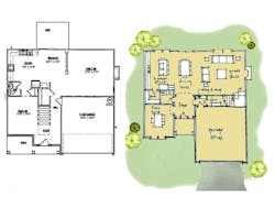
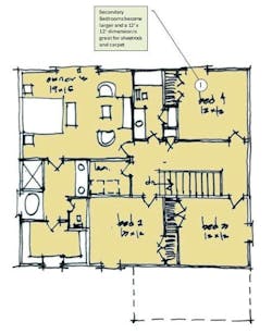
This home is a design that we re-imagined with Dave Erikson from Grayhawk Homes, based in Columbus, Ga. Our approach was to update the existing Coventry plan to make it build Lean and be more current. In general, home designs that were produced pre-recession are not doing as well as current designs in today’s market. This is occurring for two main reasons: downward pressure on pricing and trend shift. In this environment the bestselling designs are Lean and reflect the needs of today’s customer. Let’s take a closer look.
A. This space becomes flexible as the family’s needs change. It can act as an office/den or remain formal dining.
B. Repositioning the powder room creates more privacy and alleviates the feeling of being right off the Kitchen.
C. Large "Costco pantry" vastly increases kitchen storage
D. Reconfigured kitchen allows for island seating and opens up the space to bring in more natural light
E. Great room is open to kitchen dining space. The space acts as one large room, which is perfect for entertaining
F. Space has been allocated for a "stop and drop" at the family entrance. This is a great spot for keys, phone chargers, and anything else you can unload on the way in.
G. Repositioning the stairway allows the stair to be where the action is and takes it out of the foyer, where it felt “in your face” upon entry.
H. The foyer has been right-sized and no longer feels like a hallway.
I. Secondary bedrooms become larger, and a 12x12-foot dimension is great for drywall and carpet

