Home builders often walk the fine line between delivering homes that satisfy consumer demand for something different (or even unique) and homes that also are familiar and timeless.
Today's consumers increasingly follow Instagram influencers, watch how-to home design shows, read magazines, and scour Houzz.com, among other sources, to find new inspiration ... but also to validate what they already like. The push-pull of that modern dynamic creates a kind of zeitgeist—or, in housing lingo, a trend.
Here, we present four current trends with examples pulled from winners of the 2020 Best in American Living Awards (BALA) to inspire and influence your next project.
Trend 1: Blue Hues and Color Palettes
In December 2019, Leatrice Eiseman, executive director of Pantone’s Color Institute, told AdPro, “Blue, from an emotional, psychological standpoint, has always represented a certain amount of calm and dependability. It’s a color that you can rely on.”
And that's how a trend is born. From backsplash tile to bedroom paint and beyond, blue is infiltrating and, to some degree, defining today's color palette in residential design.
Everything ties together in this modern farmhouse, from the kitchen's light-blue backsplash tile and blue-toned cabinetry to the art elements, furniture accessories, and tchotchkes. | Photo: Joshua Caldwell
Project: Sterling Grove-The Smithfield Location: Surprise, Ariz. Architect: KTGY Architecture + Planning Builder: Toll Brothers Interiors: Design Line Interiors Market: 55+ Size: 1,529 square feet
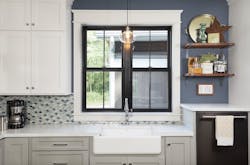
Water views inspired the blue palette in this Craftsman-style home. Backsplash tile along with various blue hues chosen for walls in the kitchen, bathrooms, hallways, and bedrooms create a cohesive, calming ambiance. | Photo: Ashley Avila Photography
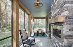
The blue wood ceiling of the home's screened porch is echoed in the blue-gray stone of the two-sided fireplace, which brings the color indoors. | Photo: Ashley Avila Photography
Project: Bayou Low Country Location: Saugatuck, Mich. Architect: 42 North-Architecture + Design Builder: Cnossen Construction Interiors: Whit and Willow Market: Custom Size: 1,870 square feet
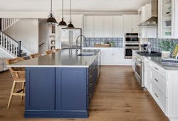
The kitchen’s large, dark blue island base helps center the space as the heart of this farmhouse home. Patterned backsplash tile adds visual interest and movement to the kitchen’s clean lines. | Photo: David Patterson Photography
Project: Solstice Location: Littleton, Colo. Designer: DTJ Design Builder: Shea Homes Interiors: HRI Design Market: Move-up Size: 3,538 square feet
Trend 2: Designs With Clerestory Windows
Originally a feature in Romanesque or Gothic church naves, clerestory windows—a high section of wall containing windows above eye level—tick all of the boxes for what consumers want in contemporary homes: they bring in natural light that, because of their placement, is ambient and can help keep a home cooler in summer and warmer in winter; if operable, the windows also allow for air circulation; and their height provides privacy while preserving eye-level wall space for furnishings, artwork, or books.
Clerestory windows are a particular favorite for designers of mid-century modern houses and are a great choice for smaller homes that may not be able to pull off large glazed areas. But while clerestories are growing in popularity, they’re still used infrequently enough to make them feel like a special and unique design feature.
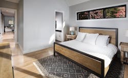
The modern farmhouse–style home is on a narrow (0.23 acres) lot in a newly constructed pocket neighborhood. The clerestory windows in this small bedroom offer privacy and allow residents to place furniture without worrying they’ll block incoming natural light. | Photo: Tim Burleson/The Frontier Group
Project: Town Walk-Alderney Location: Weaverville, N.C. Builder/Designer: Red Tree Builders Market: Move-up Size: 2,306 square feet
Clerestory windows make an appearance in nearly every room of this custom home, optimizing the forested hillsides of the surrounding Blue Ridge Mountains and adding another layer of interest to the home’s modern design. | Photo: Mark Herboth Photography
Project: Solomon Circle Location: Hendersonville, N.C. Builder/Designer: BlueStone Construction Market: Custom Size: 2,260 square feet
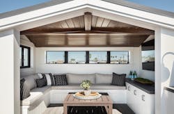
Clerestories aren't just for the main house. For this home’s covered patio, the windows provide unique modern accents as well as visual interest, ambient light, and access to great views. | Photo: Manolo Langis/Lango Works
Project: Bay Front Location: Newport Beach, Calif. Architect: Brandon Architects Builder: Patterson Custom Homes Interiors: Tru Studio Market: Custom Size: 5,042 square feet
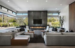
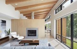
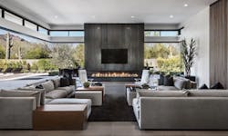
This band of clerestory windows tops generously sized glass doors that surround a massive steel-wrapped fireplace in the home's great room, which serves to connect the indoor and outdoor living areas. | Photo: Mark Boisclair Photography
Project: Urban Modern Location: Paradise Valley, Ariz. Architect: Drewett Works // Architecture Builder: Bedbrock Developers Interiors: Ownby Design Market: Move-up luxury Size: 5,625 square feet
Trend 3: For Home Décor, Black Is the New Black
Just as the little black dress is known throughout the fashion world for its versatility and elegance, so too are black elements in the home design realm. The trend for clean lines starts with black, evoking simplicity through lighting and plumbing fixtures, appliances, cabinetry, windows, and decorative wall elements. Every home style from traditional to transitional and modern gets an immediate dramatic boost from black accents.
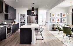
Black cabinets along with a black range hood, pendant lighting, and wood trim create a crisp, clean feel in this mid-century modern residence, while also adding a level of sophistication and richness to this collection of compact, alley-loaded homes. | Photo: Eric Lucero Photography
Project: Painted Prairie Location: Aurora, Colo. Designer: DTJ Design Builder: McStain Neighborhoods Market: Millennial middle-income Size: 2,151 square feet
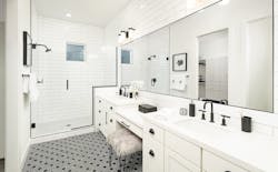
In this bathroom, precise black lines define spaces and highlight architectural shapes, turning something that could be plain into a space with punch. The tile harkens back to—and elevates—classic 1960s black-and-white treatments. | Photo: Joshua Caldwell Photography
Project: The Calistoga at Sterling Grove-Sonoma Collection Location: Surprise, Ariz. Architect: BSB Design Builder: Toll Brothers Interiors: Est-Est Market: Empty Nesters Size: 2,730 square feet
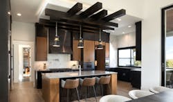
The kitchen's crisp look is accentuated by the black cabinetry, range hood, appliances, and light pendants, while a distinctive ceiling beam treatment helps define the space, adding depth and dimension. | Photo: Rachel Kay/Applebox Imaging
Project: Lavish Lake Living Location: Austin, Texas Builder/Designer: Sterling Custom Homes Interiors: Mary DeWalt Design Group Market: Second move-up/Luxury Size: 3,541 square feet
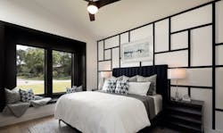
In the bedroom of this modern lakeside home, a black Mondrian-like wall element adds texture and visual interest. | Photo: Rachel Kay/Applebox Imaging
Project: Lavish Lake Living Location: Austin, Texas Builder/Designer: Sterling Custom Homes Interiors: Mary DeWalt Design Group Market: Second move-up/Luxury Size: 3,541 square feet
Trend 4: Creative Thinking in Lighting
The advent of LED lighting created new ways for designers to enhance ambiance, add sculptural elements to spaces, and improve the functionality of a variety of rooms. Taken a step further, when LEDs are an art element in and of themselves, they impact the way a fixture looks.
Creative thinking in LED lighting design sees home designers using chandeliers inside and out, employing lighting in the living room as statement pieces, and using wall sconces for additional layering.
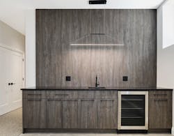
Lighting as trompe l'oeil. This horizontal LED light fixture hanging from translucent wiring over the bar area in this home adds a touch of whimsy by tricking the eye into seeing a range hood above the countertop. | Photo: Atanas Kan/StudioM87
Project: Chicago Modern Location: Chicago Builder/Designer: United Chicago Builders Market: Millennial market-rate Size: 3,000 square feet
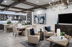
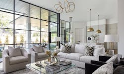
Matte black and gold work well together in this interior. The curving forms of the sculptural fixture that hangs from the living room ceiling offer a fun counterpoint to the solidity and straight lines of the oversize pendants hanging over the kitchen island and the cluster of light bulbs that hang in the dining area. | Photo: Kerry Kirk Photography
Project: Caruthers Location: Houston Builder/Designer: Frankel Building Group Market: Custom Size: 6,343 square feet
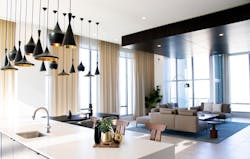
Task lighting need not be boring. In this luxury apartment, a cluster of black pendant lights in various shapes are hung at different lengths above the kitchen island and dining area for a beautiful, sculptural effect, and play off the black-finished drop ceiling in the living room.| Photo: Scott Goodson
Project: Rise & Bolden Location: Tysons, Va Developer: Kettler Builder: Clark Construction Interiors: Perkins Eastman Market: Multifamily; Millennial and Empty Nesters Size: 573 to 1,399 square feet
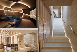
In this contemporary home, the media room (upper left), staircase, and wine tasting room all benefit from the use of energy- and space-efficient LED lighting, which aids in way-finding while also adding ambiance. | Photo: Roger Davies
Project: Ridge House Location: Los Angeles Architect: Landry Design Group Builder: Peter McCoy Construction Interiors: The Wiseman Group Market: Custom Size: 12,300 square feet
Stacey Freed writes about design from her home in Pittsford, N.Y. and is a frequent contributor to Pro Builder Media.
RELATED
- Watch: Design Highlights and Trends from the 2020 Best in American Living Awards
- Best of BALA 2020
- Design Highlights From the Best in American Living Awards
