1/ MATERIALS HELP DEFINE MODERN
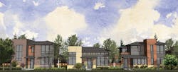
Modern home design is challenging to reproduce in the context of production housing, admits Seth Hart, senior designer/project manager for DTJ Design, in Boulder, Colo. “Materials play a big role in the execution of this style.” Using materials creatively or thinking of fresh ways to use traditional ones helps set modern apart from traditional, he says.
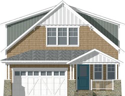
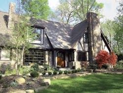
Flat roof forms in conjunction with hip or shed roof forms are the key to the design language of these homes. “Combining flat-roof elements either with hipped or even gabled/shed roofs is more cost-effective than doing an entirely flat roof. A parapet wall in front of a hip roof gives the impression of a flat roof, without the waterproofing concerns.”2/ TELLING COTTAGE FROM CRAFTSMANToo often, Hart says, builders switch from lap siding to shake and change a gable to a hip to create a different “style.” These two designs from DTJ demonstrate the importance of adjusting rooflines, proportions, and details to achieve a unique look for each style. Steep roof pitches, for example, characterize the cottage elevation above. Substituting shallower roof pitches to help save money in this type of house will result in an elevation that’s bland and lacks appeal, he says.
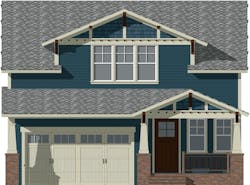
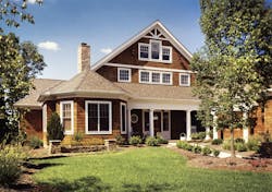
Hart notes that architects are often challenged by design guidelines when trying to execute classic elevation styles. “We have encountered many design guidelines within neighborhoods that try to limit the minimum roof slopes to 6:12,” he says. “Although that works well with some styles, it doesn’t allow for styles like Craftsman that rely on low-slung roof pitches that accentuate the horizontal rather than the vertical.”
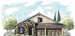
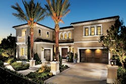
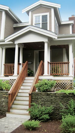
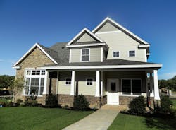
With front-loaded, narrow-lot homes, garage doors can often be an unattractive, dominant element. DTJ softens the Craftsman elevation, directly above, by bringing the entry porch roof across the home and over the garage. Rich detailing at the gable ends also adds visual interest. 3/ ITALIAN INSPIRATION OFFERS A RANGE OF POSSIBILITYWith its casual, no-rules expression, Tuscan style is a contrast to Italianate. What makes it so popular is its rustic and even haphazard aesthetic, says architect Deryl Patterson. The haphazardness evolved organically, Patterson explains. Farmhouses in Tuscany were built out of indigenous materials, such as stone pulled from the fields. As the original family outgrew the house, they added a lean-to shed on one side. The next family, which was even bigger, put on another addition without attempting to blend it into the rest of the house (Illustration: Housing Design Matters).
In contrast to that formality is Tuscan, above. “What started as a simple form now has a bunch of tacked-on forms,” says architect Deryl Patterson, president of Housing Design Matters, in Jacksonville, Fla. Tuscan style utilizes warm, rustic materials such as stone, stucco, and rough-sawn timbers. Lower-pitch roofs and windows in darker colors, with a 4-over-1 mullion profile, are a good complement for those materials. If the budget allows, concrete tile is a great option—either a flat tile or a Spanish S-tile in a terra-cotta color similar to the brick headers. Fiberglass shingles also work well, she says.
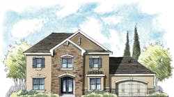
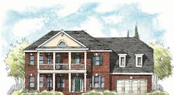
4/ GETTING SCALE AND DETAILS JUST RIGHTCrasi also believes it’s not one feature that makes an elevation feel right, but rather a combination of features. “It starts with the shape of the building,” he says. “A Georgian style home is very boxlike with the typical symmetrical arrangement of windows and doors, while both Shingle Style and Tudor Revival are asymmetrical in shape with varying rooflines and shapes. Once you get the shape correct, you add the pieces that correspond to the style—dormers, windows, materials, and details.” He adds, “I’ve seen homes that I know were Colonial but were converted to Tudor by adding incorrectly sized half-timbering. The results were pretty unfortunate.”
5/ THE CLASSICS: A CRASH COURSE
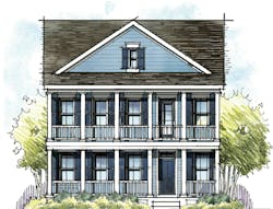
Low Country is a relaxed style that’s popular in the Southeast. “Today, with the push for a return to the traditional, pedestrian-friendly neighborhoods of the past, the porch has made this style popular with community planners and developers as well as buyers,” Patterson says. Indeed, the front porch is what defines a Low Country elevation. It’s often raised a few feet above the street to capture breezes—a throwback to the days before air conditioning when families would sit on the porch to escape the heat. Low Country style tends to be very traditional and often symmetrical. In the past, two-story homes had double stacked porches, a feature that has had a huge resurgence today as buyers crave more outdoor living space.
“There are so many color options that can intertwine this style with a buyer’s personal preferences,” Patterson says. “You can go classic with a yellow body and black trim or go bold with a red body color and taupe trim.”
6/ GETTING IT RIGHT V. MISSING THE MARK
Here’s more advice on getting elevations right, from Seth Hart of DTJ Design:
• Sparingly apply materials such as brick, stone, stucco, metal, and panelized rainscreen to add flair to the façade. “With brick, instead of a running bond, use a stack bond coursing for a more modern look,” Hart suggests, “or do a running bond that runs vertically rather than horizontally.”
• Apply siding in varying depths. For example, a body of 8-inch lap siding with an accent of 4-inch siding. “I’ve also seen varying depths within one plane,” he says.
• Use larger fixed windows strategically. Instead of three 3060 single-hung windows in a room, use one 3060 single-hung next to a 6060 fixed window. “This will modernize the window package but still keep the egress window affordable,” Hart says.
• Find ways to incorporate unique materials, such as a standing-seam metal roof used in accent locations on the front of the home. This adds character while being mindful of cost.
• Corner window systems help create an elegant, contemporary look and don’t need to be done with a true corner window or butt-glazed window assembly. Painting the corner jamb on the exterior to match the window trim will add definition.
• Add banding—either through color or relief—for a visual contrast within the field of brick.
• Alternatives to brick, such as CMU, can also create an interesting element on an elevation. PB
