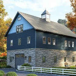
Whether styled in classic colors that never fade from favor or featuring trendy pops of color, the exterior façade sets the tone—and critical first impression—for the home. With tastes changing at a near-constant rate, what’s the best way to choose exterior color combinations that meet today’s needs without feeling dated quickly? We checked in with Kate Smith, color expert and president of Sensational Color, to get the latest tips and tricks for exteriors.
What Exterior Colors Are on Trend?
As often happens with exterior trends, some familiar looks remain popular amid a few emerging options.
“We’re seeing so much interest in very dark paints, which is surprising,” Smith says, including black, deep gray, olive green, and blue gray, as well as colors with dark undertones, such as green-black.
Smith says that classic grays and other timeless neutrals continue to trend, along with bright white or off-white for the popular Modern Farmhouse look.
Material colors are coming into play, as well, she notes, with stained wood accents, such as beams, appearing on homes where they may not have in the past. Metal is popping up in similar ways, from steel beams to glass-and-metal contemporary-style garage doors.
And, of course, mixing materials, textures, and colors continues to be popular, offering homeowners the opportunity to differentiate their façade and add an extra touch of personality.
Best Practices for Combining Exterior Colors
Indeed, multi-color and -texture facades are a key trend right now, but pulling it off well isn’t always easy. Smith recommends starting with the fixed elements—the roof and any brick or stone materials—and ensuring they work together.
“When those harmonize, it’s harder to go wrong with siding and trim,” she says.
From there, select exterior colors that work well alongside them. For example, if the stone façade has a lot of grays or browns, choosing a paint or pre-finished siding color that coordinates will ensure a more cohesive look.
When considering neutrals, keep in mind that not all beiges and grays are the same. They likely have undertones, such as brown or even purple, that alter their look. When in doubt, look at the grout, which can clue you in to a coordinating neutral hue.
“Your house is telling you what color to paint it, you just have to listen,” Smith says.
Another thing to keep in mind is the role of light in the appearance of the home exterior. Color in the paint store will likely look very different—from washed out to more vibrant—in daylight. When narrowing down color selections, advise your customers to take samples to the project site to see how the colors look in the environment in which they will be used.
Avoiding Common Mistakes With Exterior Colors
Smith is quick to note that “there are no bad colors, just some unfortunate combinations.”
Here are a few ways to avoid an exterior façade that stands out for the wrong reasons:
- Don’t go too vibrant: Jewel tones and other vibrant colors are beautiful, but can be overwhelming in large amounts on the home’s exterior. Choose a toned-down or grayed-out version of the hue to avoid an over-the-top, dated look.
- Don’t go too bold: Similarly, a full façade of purple or chartreuse may stand out too much and even affect resale value. The entry door, shutters, and other accents are great spots for those bolder hues and personalized style expressions, adding that pop of color without feeling overwhelming.
- Don’t aim for the perfect match: It might be tempting to precisely match the siding color to the brick, stone, or roof. But it’s nearly impossible to do and can create an off-putting look. Even if perfectly matched, materials weather differently over time and likely won’t look the same for long. If similar colors are desired, go for a lighter or darker shade to create a blended look instead.
RELATED: From Fashion to Facade: How Homes are Getting Bolder and Edgier
When in doubt, consider timeless combinations. These might include white siding with black trim and a red door or gray walls with a black slate roof. Neutral hues are always a safe bet, as well. “A great gray or a great beige will never go out of style,” Smith says. She notes that neutrals are particularly helpful for multi-textured facades, acting as a bridge between materials and helping draw attention to visual focal points like a stone bump-out or dramatic copper gutters. “If color blends well, it becomes the backdrop.”
Also, be sure to leverage Westlake Royal Building Products’ color and design tools.
Roofing:
Siding & Trim:
- Royal® Vinyl Siding Color Combinations guide
- Exterior Portfolio® Color Combinations guide
- Celect® Cellular Composite Siding Color Combinations guide
- Virtual Remodeler, HomePlay, and Dream Designer online visualizers.
Stone:
To learn more strategies for choosing exterior colors, download Smith’s e-book. Smith offers free color consultancy for consumers looking to purchase DaVinci Roofscapes products—learn more here.
Westlake Royal Building Products’ portfolio of siding, trim, stone, and roofing brands offers a diversity of styles and options to meet your buyers’ needs—and color preferences. Learn more here.

