9 Standout Spaces With Small but Mighty Design Details
This article first appeared in the May/June 2024 issue of Pro Builder.
Even the smallest design element or space within a larger context can elevate a project from really good to memorable. Ranging from full rooms and front entry makeovers to garden niches, signature outdoor living elements, and even a simple wall dividing a room into two uses, these design details inspire us to think more creatively and deliver homes that bring everyday joy.
Two Levels Provide a Range of Outdoor Living Options
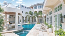
Located within Orlando’s Four Seasons Private Residences at the Walt Disney World Resort, the Pearl offers a variety of outdoor spaces for relaxing and entertaining with multiple connections to the indoors.
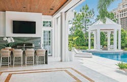
Architect and builder Phil Kean designed the main level lanai to wrap around the home’s swimming pool and encompass a gazebo sitting area with a waterfall fountain into the pool; an outdoor living room with a fireplace, wall fountain, and TV; and an outdoor kitchen and bar with tiles that evoke the water features.
The lanai’s curving design also provides privacy from neighbors, access from multiple rooms, and both covered and open outdoor seating areas. Retractable screens can be lowered to keep insects out or reduce glare on the outdoor TV.
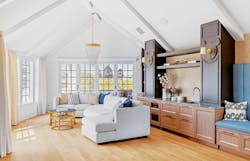
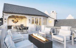
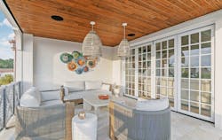
Three levels above, an outdoor lounge is designed to maximize views of the nightly Disney World fireworks and includes both covered and open sitting areas, a dining table, and a firepit. The lounge adjoins an indoor game room (above) that includes a bar and a bathroom, all easily accessible via an elevator and staircase.
Project specs: The Pearl
Award: Gold, Outdoor Room (lanai)
Location: South Orlando, Fla.
Architect, builder, interior designer (entrant): Phil Kean Design Group, Winter Park, Fla.
Landscape architect: Redmon Design Co., Maitland, Fla.
Size: Lanai: 1,237 sf; third-floor terrace: 709 sf
Photos: Uneek Image
RELATED
- 2023 BALA Winners: The Best of the Best
- 4 Inspiring Adaptive Reuse Projects With Real Impact
- A Smart Single-Family Infill Development
'The Cube' Design Detail Helps Bring Structure to an Open-Plan Kitchen
While nearly everyone loves an open floor plan, clusters of small appliances and a cluttered prep space can quickly detract from the concept.
In the award-winning modern Slate House built by Hygge Design + Build, “The Cube” solves that problem with panache. The 112-square-foot structure, standing 10 feet tall with an open-air ceiling, is both functional and stylish.
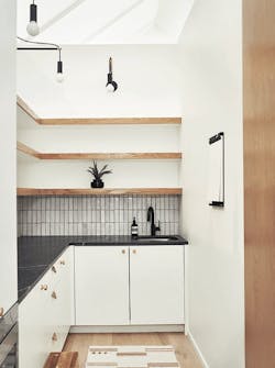
Adjacent to and serving the kitchen, The Cube is paneled with sheets of white oak accented with narrow black metal trim. On one side, the cladding conceals access to a butler’s pantry and a prep and staging space through a flush-set door with self-closing hinges and a magnetic stop.
Inside that space is a sink, a microwave drawer, 9 feet of counter space with undercounter storage, and open shelving above to contain and hide useful, everyday clutter. Swing-arm pendants overhead provide supplemental lighting. The opening at the top allows views of the vaulted ceilings above and brings fresh air into the space.
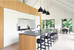
The other end of The Cube features a built-in bar facing the living area, while the front elevation contains the kitchen’s stainless-steel range-oven flanked by an oven and a refrigerator encased in sleek white cabinets and appliance fronts that mirror the home’s overall aesthetic.
Project specs: Slate House
Award: Gold, Detached Home 3,001 sf – 3,500 sf, Single-Family Production-Built for Sale
Location: Ada, Mich.
Builder and interior designer (entrant): Hygge Design + Build, Ada
Architect: Chad Gould Architects, Grand Rapids, Mich.
Size: 112 sf
Photos: Ashley Avila Photography
Modernizing the Entryway for a 100-Year-Old Bloomfield Hills Residence
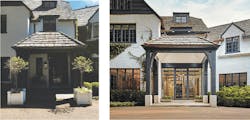
The entrance to this 100-year-old home overlooks a manicured lawn, but the original entry didn’t take advantage of the view.
The homeowners wanted a modern twist for the entrance to their classic home that could bring those views inside and offer a luxury experience from both the interior and exterior for guests and the owners.
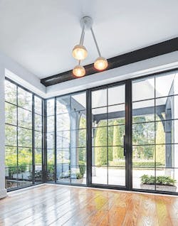
The winning solution, designed by CBI Design Professionals, updates and upgrades an existing portico and transforms a dark entryway into an all-glass entrance that shares natural light between the indoors and outdoors (and also from a new skylight atop the portico) and captures the garden views while maintaining the classic character of the historical home.
Project specs: Bloomfield Hills Residence
Award: Platinum, Specialty Project, Remodeling
Location: Bloomfield Hills, Mich.
Architect (entrant): CBI Design Professionals, Bloomfield Hills
Builder: Thomas Sebold & Associates, Bloomfield Hills
Interior designer: Linda Powers Interiors, Bloomfield Hills
Size: 350 sf
Photos: James Haefner Photography
A Custom Home ADU That Emphasizes Privacy
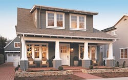
When architect Robert Hidey designed an accessory dwelling unit (ADU) for a cottage-style custom home in San Jose, Calif., he intentionally disconnected the ADU from the main house to provide separation and privacy for its occupants.
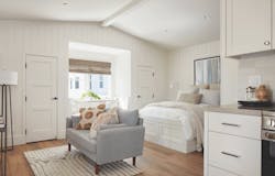
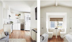
The 462-square-foot ADU, located above the garage at the back of the property, includes a kitchen, dining nook with built-in seating with storage, full bathroom, closets, and a living space that can accommodate sleeping and seating areas. A brick patio between the garage and house provides sharable outdoor space.
ADUs, which are becoming common requests for new homes and renovations in California, can be designed to provide a variety of functions, such as a rental unit for extra income, to house a family member or guests, or as a home office or studio.
What makes this ADU award-worthy is the abundance of natural light, uncompromising construction quality and finishes, and its efficient use of space.
Project specs: Rosewood at Camden Park
Award: Platinum, Accessory Dwelling Unit, Single-Family Custom
Location: San Jose, Calif.
Architect (entrant): Robert Hidey Architects, Irvine, Calif.
Builder: Robson Homes, San Jose
Interior designer: Design Line Interiors, a Dahlin company, San Diego
Landscape architect: Design Focus Landscape, Ben Lomond, Calif.
Size: 462 sf
Photos: Agnieszka Jakubowicz Photography; R. Brad Knipstein Photography
Creating a Garden Room From an Enclosed Breezeway
Emphasis on indoor-outdoor living has become an essential part of residential design over the past decade or more, but Visbeen Architects designed a home in Beverly Hills, Mich., that embraces the outdoors with a little extra effort.
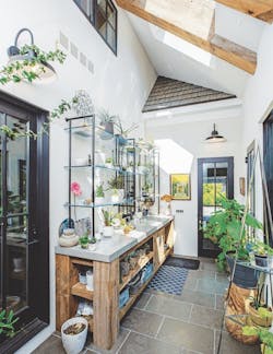
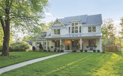
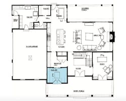
While a screened-in porch along the rear elevation opens onto a large stone terrace for entertaining, an enclosed breezeway from the kitchen to the garage has been outfitted as a garden room that leads to its own terrace plotted with a trio of raised beds for herbs, vegetables, and flowers.
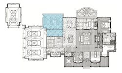
The space, which measures nearly 18 feet long by 7 1/2 feet wide, is outfitted with a stout potting bench and open glass shelving above. It enjoys an abundance of natural light from four skylights and a row of clerestory windows to the home’s interior, as well as glass doors on all sides and expansive windows to the terrace. The configuration of the three-car garage and bumped-out dining room flanking the space creates a courtyard effect for this garden room and its terrace.
Project specs: Newport
Location: Beverly Hills, Mich.
Architect (entrant): Visbeen Architects, Grand Rapids, Mich.
Builder: PRM Custom Homes, Birmingham, Mich.
Size: 391 sf
Photos: MBuck Studio
Fun and Functional Juice Bar
Oregon-based Renaissance Homes designed a fun yet functional juice bar that has become a signature element of their homes and an innovative space for entertaining.
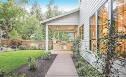
With the turn of a latch, the juice bar’s pop-up window connects it to a covered (and heated) outdoor living area with a grill, dining area, and spaces for seating.
Whether a caterer, bartender, or homeowner host provides the service, the window is a fun element akin to the pick-up window at an ice cream shop. Guests can also self-serve on their way from the home’s interior to the outdoors.
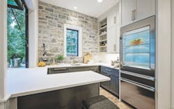
Just off the home’s main kitchen and pantry, the award-winning bar can also function as a prep kitchen and serving area for indoor entertaining, as well as providing extra storage in its cabinets and open shelving, handling overflow with a refrigerator and freezer, and clean-up chores thanks to a dishwasher and sink.
Project specs: Lake Front Juice Bar
Award: Gold, Specialty Room/Project in a Home Priced over $1 million
Location: Lake Oswego, Ore.
Architect, builder, interior designer (entrant): Renaissance Homes, Lake Oswego
Landscape architect: All Oregon Landscaping, Sherwood, Ore.
Size: 111 sf
Photos: Diana Sell Photography
A Clever Dividing Wall to Enhance Townhouse Living
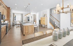
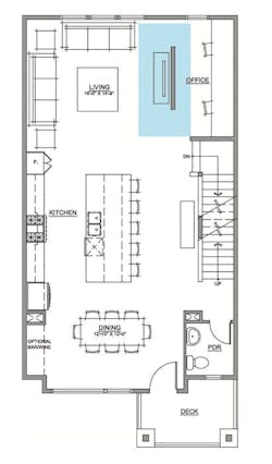
While 21-foot-wide townhouses are desirable for their square footage, the typical main-level floor plan can sometimes feel oversized. So DTJ Design came up with an interesting alternative: a freestanding room divider that offers additional versatility and functionality without closing off the space.
In the firm’s design for a Toll Brothers’ townhouse community, the Overland model features a wall divider between the living room and a flex space; it also serves as a focal point, with distinctive vertical trim detailing and an option to add a fireplace or tiles to the wall.
The space behind the wall, shown in the model home as a wine room, can also be configured as a pocket office with desk space along the wall, or as a cozy reading nook with built-in bookcases.
Project specs: Heights at Downtown Superior Townhomes
Award: Silver, Attached Homes/Townhomes-Built for Sale
Location: Superior, Colo.
Architect and Interior designer (entrant): DTJ Design, Boulder, Colo.
Builder and developer: Toll Brothers, Fort Washington, Pa.
Interior designer and merchandising: Trio Design, Denver
Size: 240 sf
Photos: Davies Imaging Group; Eric Lucero Photography
A Pocket Office With Expansive Potential
Every inch of this Southern plantation-style production home in St. Louis was efficiently designed to maximize functionality and design.
Builder/developer Homes by Rolwes teamed up with architect DL Design to create a flex room at the front of the house that’s accessible directly from the main entry porch, which currently serves as a multiperson pocket office. The office features built-in desks, ample storage, great views and light, and easy access through an extra-wide barn door to the kitchen behind it.
Any way you use it, though—as a craft room, a homework space, or a yoga room—this 100-square-foot gem feels bigger with the pair of French doors leading out to the covered porch and the view beyond.
Project specs: 656 Norfolk
Location: St. Louis
Builder and developer (entrant): Homes by Rolwes, St. Louis
Architect: DL Design, St. Louis
Interior designer and merchandising: Studio G Design, Greeley, Colo.
Land planner: The Sterling Co., St. Louis
Size: 108 sf
Photos: Front Door Media
A Crow's Nest Atop a Remodeled Home Maximizes Views and Indoor-Outdoor Connection
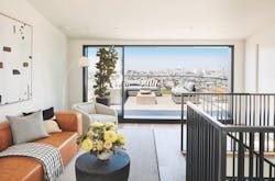
The fourth floor of this renovated San Francisco home offers sweeping views of downtown, the East Bay, and the nearby Twin Peaks recreational area.
Part of a whole-home renovation, the “crow’s nest” can be used to entertain, work, or simply to relax and enjoy the view.
Developer Forma Construction intentionally designed the space to be more than a pass-through to an open-air deck, adding a wet bar, a bathroom, and a living space indoors.
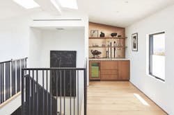
Telescoping patio doors provide a seamless indoor-outdoor connection and large windows on two other elevations are engineered with thin profile frames to further accentuate the connection to enviable views. A pair of skylights deliver additional natural light (see second photo, below).
The nest is clad in dark-stained vertical cedar siding and has a gently sloping metal roof to match. Inside, the custom wet bar (see below) features smoked glass mirrors for the front of the under-counter refrigerator and as a full-wall backsplash.
Project specs: 328 Cumberland
Location: San Francisco
Builder and developer (entrant): Forma Construction, San Francisco
Architect: Hood Thomas Architects, San Francisco
Interior designer: Geoffrey De Sousa, San Francisco
Size: 350 sf
Photos: Brad Knipstein Photography
