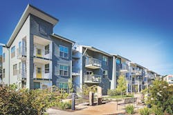
Top Winners From the 2016 Best In American Living Awards
For more information on the Best in American Living Awards, go to the home page and see more BALA coverage here.
Platinum Award for Best Single-Family Detached Home, 3,001-3,500 Square Feet
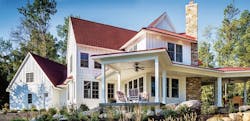
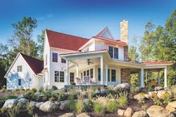
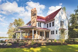
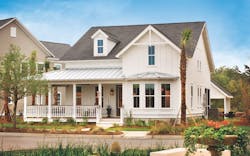
Capturing the best of Tudor, cottage, and farmhouse styles, Waterside is angled to capture lake views to the rear and create a welcoming presence in the front. White board-and-batten siding contrasts with the red roof and stone accents.
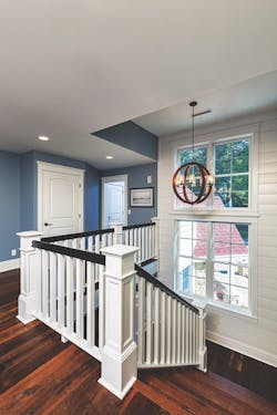
The stairwell is finished with white shiplap to add a dash of character.
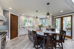
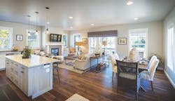
Casual dining is encouraged at the kitchen island as well as outside on the porch. White cabinets and trim are carried inside, contrasting with the soft blue of the island base.
The wraparound porch projects from the main body of the house at different points to take full advantage of views of the lake and woods.
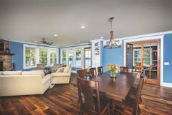
In this open floor plan, the living room and dining room are adjacent, offering great sightlines.
Farmhouse With a Twist
Waterside is a 3,200-square-foot, lakefront vacation home that is strongly reminiscent of farmhouses and cottages, with a dash of Tudor flavor. That’s because it has elements of all three styles: a steep-pitched roof and groupings of windows (Tudor); a gabled roof, large porches, and a wraparound veranda (farmhouse); and stone accents and board-and-batten siding (cottage).
Taking full advantage of the lakeside setting, the architect created an asymmetrical design that captures views of water and woods from a series of projecting porches and patios. The indoor/outdoor spaces include a three-season porch with a fireplace and covered patio, perfect for entertaining.
Inside, the highlights include a roomy first floor with 1,800 square feet of living space, including a mudroom and laundry; a study; and an open-plan living, dining, and kitchen area. The second floor is 1,400 square feet and includes a large master bedroom with a 10-foot ceiling; two secondary bedrooms; and a bunkroom. The lower level has an additional 1,300 square feet and includes a walk-out family room that connects the interior and exterior. An additional bedroom on this level welcomes guests.
The judges felt the massing of the home was “just right.” They loved the red farmhouse roof and the fact that the plan has many twists and turns that “keep it from looking like two barns glued together.” The interior, they said, was very tasteful and classic.
Project Name: Waterside
Location: Wolcottville, Ind.
Designer/Architect: Visbeen Architects, Grand Rapids, Mich.
Builder: Pete’s Construction, Wolcottville, Ind.
Photographer: Jeff Garland
Platinum Award for Best Single-Family Detached Home Over 4,001 Square Feet
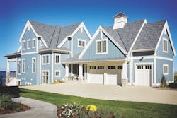
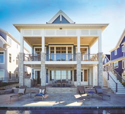
Onaway is designed for narrow lakefront lots, with a floor plan that orients the garage to the street and living spaces to the water. Shingle- and Craftsman-style details give the home a warm cottage feel.
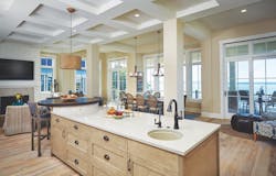
On the main level of Onaway, all living spaces have a lake view and are open to each other, but are defined by low built-ins and furniture arrangements. The kitchen island has a built-in, pub-height table for casual dining.
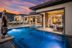
The rear of the home has two levels of covered outdoor living space overlooking the pool and lake. The lower-level patio has a custom grill pit.
Narrow-Lot Solution
Onaway was designed as a cottage for narrow lakefront lots, albeit a roomy cottage at 4,319 square feet. The garage is oriented towards the street; the main living spaces face the lake; and the entryway is on the side of the house. An open floor plan and layered outdoor spaces ensure that the Onaway works as well for family living as it does for entertaining.
The exterior features elements of both Shingle Style and Craftsman architecture, with board-and-batten siding accentuating the steep roof gables and classic shingles cladding the lower half of the structure. Oversize roof brackets and porch columns with stone bases are a nod to the Craftsman aesthetic.
Inside, furniture arrangements and low built-ins define the perimeter of living spaces, while keeping the rooms open to one other with views of the lake. The cottage feel of the exterior is carried inside with a neutral, crisp white, and blue nautical-themed palette. The kitchen features natural wood cabinetry and a long island capped by a pub-height table.
The master suite, second bedroom, laundry room, and office are located upstairs. The best views of the lake can be found on the master bedroom’s private deck. There is also a lower level with a gathering space, kitchenette, bedroom, and “lake” bath that can be accessed from inside as well as the adjacent pool patio.
Above the garage and separate from the main house is a bedroom suite and bunk room for overnight guests. Custom-built stairs with built-in storage drawers lead to the top bunks.
The judges deemed Onaway “architecturally stimulating” and praised the well-executed details and the synergy between the exterior and interior.
Project Name: Onaway
Location: South Haven, Mich.
Designer/Architect: Visbeen Architects, Grand Rapids, Mich.
Builder: Mike Schaap Builders, Holland, Mich.
Interior Designer: Benchmark Wood & Design Studio, Holland, Mich.
Photographer: Ashley Avila Photography
Platinum Award for Best Single-Family Detached Home Up to 2,000 Square Feet
The Townsend, a 1,866-square-foot, cottage-style home, is a skillful example of 360-degree architecture. The wraparound porch, Craftsman accents, and detached garage are characteristic of the neighborhood, where homes have views of water, parks, and woodlands.
Aging in place is facilitated by the open floor plan and first-floor master suite. No space is wasted here; note the reading nook to the right of the fireplace.
Cleverly Composed
Like all of the Ludlow Cove Cottages, the 1,866-square-foot Townsend is designed with 360-degree architecture and thoughtfully placed on the home site to offer the best possible views of water, woods, and parkland. It features detailed design techniques and innovative energy-efficient elements.
The interior is a mixture of high-quality finishes and modern fixtures, coupled with design that transforms small areas into practical living spaces. Universal design accommodates aging in place, with an open floor plan and main-level master suite. The main living spaces are oriented toward the water. Thoughtful touches can be found throughout, such as the reading nook next to the living-room fireplace. Storage is maximized with built-in shelves under the stairs and a “landing zone” for keys, phone chargers, and other necessities of daily life.
On the second floor are two additional bedrooms with a shared bath, and a loft for reading, working, or relaxing.
Custom details include Craftsman accents, Shaker cabinets, stainless steel appliances, and designer paints and finishes. The inviting front porch, charming back patio, and picturesque views inspire outdoor living that is uniquely Northwest.
The judges applauded the composition and massing of the home and the fact that no space is wasted. “Fantastic use of space [with the] little nooks and crannies, [such as] the reading nook,” they noted.
Project Name: Townsend
Location: Port Ludlow, Wash.
Designer/Architect: Union Studio Architecture & Community Design, Providence, R.I.
Builder: Westharbor Homes, Port Ludlow, Wash.
Developer: Port Ludlow Associates, Port Ludlow, Wash.
Interior Designer: Pam Saftler, PCS Design, Redmond, Wash.
Photographers: Jeff Caven, Peter Hanson and Eric Kerttula
Platinum Award for Best Single-Family Community, 100 Units and Over
The custom-designed homes at Hallsley capture the flavor of traditional American architecture and are sited to take advantage of the wooded landscape.
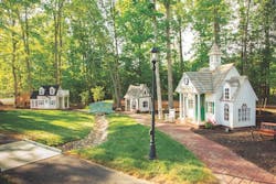
This children's playhouse village is one of the many upscale amenities at Hallsley.
Colonial Roots
Imagine a modernized Colonial Williamsburg with 727 custom-designed homes rooted in American architecture sitting in a natural setting with a brook running through it and your minds eye would probably conjure up something like Hallsley.
The 700-acre development in Chesterfield County, Va. sits on one of the most desirable tracts of land in the area and the developer had the good sense to capitalize on its natural attributes, giving special attention to landscape design and preserving 25 percent of the woodlands throughout.
While wooded natural landscape takes center stage, planners also managed to tuck in resort-style amenities rare in the area. There is a grand clubhouse with terraced patios and a cabana bar and waterpark for adults and kids plus a sand volleyball court and tennis courts. There are whimsical touches to the amenities including a dog park and a child’s dream of a playground complete with a zip line, babbling brook, fishing pond and playhouse village.
Some 44,000 home seekers flocked to the neighborhood between August 1, 2015 and July 31, 2016. As a result, 150 homes were sold in the timer period. Home prices ranged from the $500,000s to more than $1.5 million. The sales yielded $105 million in volume, a 63 percent increase from the year before.
Project Name: Hallsley
Location: Midlothian, Va.
Developer: East West Communities, Midlothian
Land Planner: E.D. Lewis & Assoc., Richmond, Va.
Photographer: Brian Chavez/Gamma Photography
Platinum Award for Best Mixed-Use Community
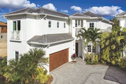
Inspired by Caribbean architecture, the homes at the Residences at Mercato offer a high standard of urban living in a walkable atmosphere.
Homeowners at the Residences at Mercato can enjoy shopping, dining, and entertainment without leaving the neighborhood.
Everything Within Walking Distance
There is hardly a need to back the Audi out of the garage at the Residences at Mercato. All the requirements for sustenance, creature comforts, and entertainment, are just a walk outside the gates of this village of 47 two-story, single-family homes neighboring a posh shopping complex. Residents can eat at a variety of restaurants; take a yoga class; catch a movie; get a massage, facial, and haircut; meet with their broker; or buy a Tommy Bahama shirt for leisure lounging at the pool party that night without leaving the neighborhood.
The homes, most in the 3,000-plus square-foot range, loosely channel Caribbean architecture and include three to five bedrooms and indoor-outdoor spaces for soaking up the sun, dipping toes in a small pool, and taking in the sea breezes from the Gulf of Mexico, which is minutes away from the community. They're selling at a rate of one single-family home a month.
The 53-acre, urban mixed-use community includes 47 residences: 30 single-family homes and 17 villas. The commercial space, with 456,359 square feet of high-end retail and office space, is almost completely occupied.
Project Name: Residences at Mercato
Location: Naples, Fla.
Designer/Architect: MHK Architecture & Planning, Naples
Builder: Lutgert Construction, Naples
Developer: The Lutgert Cos., Naples
Interior Designer: Clive Daniel Home, Boca Raton, Fla.
Photographer: Naples Kenny-Real Estate Photography
Platinum Award for Best Kitchen
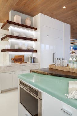
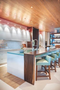
White lacquered cabinets and a turquoise, recycled-glass island countertop create a shimmering effect in the 6 Ocean kitchen, anchored by a wood bar top and a wood-clad ceiling.
Nights in White Lacquer
The 6 Ocean designers created an effective balancing act between shiny sleek and warm organic in this decidedly modern kitchen. White lacquered cabinets and a striking turquoise blue, recycled-glass island countertop are anchored and warmed by a wood-clad ceiling, a wood floor inlay, floating backlit wood shelves, and a simple wood bar top with an organic edge.
Other organic materials also play a part in the design. Custom stone slabs with discreet finger pulls cover drawer fronts, offering a seamless appearance. Down lights cast sculptural pools of light onto the lacquered cabinetry, creating a focal point over the range. A custom wood-and-metal-clad, floor-to-ceiling window creates an art sculpture moment in the kitchen.
Project Name: 6 Ocean
Location: Palm Beach, Fla.
Designer/Architect: Affiniti Architects, Boca Raton, Fla.
Builder: Mark Timothy Luxury Homes, Boca Raton
Interior Designer: Marc-Michaels Interior Design, Winter Park, Fla.
Photographer: Ed Butera/IBI Designs Photography
Platinum Award for Best Adaptive Reuse, Multifamily
A top-to-bottom renovation transformed this former factory into a project called The Mill, comprising 25 luxury apartments. Dormers were added on the east facade.
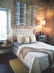
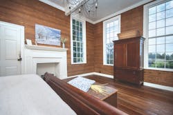
The master bedroom of this apartment at The Mill displays exposed brick complemented by wide-plank hardwood flooring and other contemporary finishes.
Building on Good Bones
The Mill has seen a few things in its 170 years on Washington Street in Alexandria, Va. It has been a cotton factory, a Union Army facility, a spark-plug factory, a bottling plant and an office building. Yet it still has life in its spectacularly built brick walls.
CAS Riegler bought the 26,283-square-foot building in 2013 and took it down to its brick and wood bones. The bricks were repointed and the exterior repainted. A new copper roof and energy-efficient windows were also added, along with some contemporary touches that blend well with the bricks. Glass railings; interior steel stairs and railings; wide-plank hardwood flooring; and high-end cabinets, countertops, and stainless steel appliances look right at home. Residents have access to a club room on the building’s top floor that opens onto a shared terrace with views of Washington, D.C., Old Town Alexandria, and the Potomac River.
Dormers were added and attic space was converted into livable space to make room for two-story loft units on the Mill’s top floor. The meticulously restored building yielded 25 living units ranging from 457 to 1,960 square feet. The Mill also has a private park. Rental rates range from $1,850 to $5,500 per month.
Project Name: The Mill
Location: Alexandria, Va.
Designer/Architect: Cooper Carry, Washington, D.C.
Builder: Snead Construction, Washington, D.C.
Developer: CAS Riegler, Washington, D.C.
Interior Designer: Akseizer Design Group, Alexandria
Photographer: Marlon Crutchfield Photography
Platinum Award for Best Affordable Multifamily Development
Common areas at Celadon include a ground-floor community room and terrace, two resident terraces, a fifth-floor garden, and a terrace on the 15th floor with a green roof and community room featuring expansive views of San Diego toward the bay.
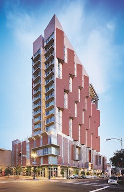
Celadon's slender tower has angled bays on the west side tilted to protect it from the glare of the setting sun.
Innovative Financing and Design
Celadon, a 17-story building at 9th and Broadway in San Diego, is a game changer for developers looking to create affordable housing. It is the first to mix 9 percent tax-credit funding and 5 percent tax-credit funding in a single vertical subdivision in California. Already, other development groups have adopted the innovative strategy across the country. An additional 400 units of new affordable housing have since been constructed using similar financing.
Built on a former parking lot, Celadon created 250 affordable rental apartments that embrace a multigenerational population. Eighty-eight units are targeted as supportive housing, including 25 reserved for youth aging out of foster care and adults under the Mental Health Services Act. Frail seniors can find homes in 63 of the apartments.
The building itself is a piece of sculpture that sits on a four-story plinth base that melds into the historic fabric and scale of the neighborhood. Above, the tower is slender, with angled bays on the west side tilted to protect it from the setting sun’s glare and to direct interior views to San Diego and the ocean beyond.
Project Name: Celadon at 9th & Broadway
Location: San Diego
Designer/Architect: SVA Architects and Studio E, San Diego
Builder: Turner Construction Co., Chicago
Developer: BRIDGE Housing Corp., San Diego
Interior Designer: Chameleon Design, Costa Mesa, Calif.
Photographer: Stephen Whalen
Platinum Award for Best Single-Family Detached Home, 2,000 to 2,500 Square Feet
The Camelia's wraparound porch and traditional facade give it a timeless character.
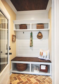
A drop zone in the owner's entry is one of the Camelia's modern design features.
Southern Comfort
Visually, the Camelia is spot-on with its southern vernacular roots. The wraparound front porch and traditional façade cry out for lemonade breaks on hot South Carolina afternoons. In Summers Corner, where the home is located, there’s a good chance a neighbor will mosey by before you finish your drink. Homes in that community all have strong connections to the street.
While the Camelia’s interior matches its traditional exterior, the floor plan is modern, open, and informal. The kitchen island is expected to become the meeting place for the household, yet there is still space for a traditional dinner table for holidays and entertaining guests in the open kitchen.
The home, sited on a pie-shaped lot with the point in the backyard, makes use of the space with both a detached garage and a carport, offering covered space for outdoor living out of the view of neighbors. A second screened porch is also attached to the rear of the home.
Sale prices are between $500,000 and $750,000.
Project Name: Camelia at Summers Corner
Location: Summerville, S.C.
Designer/Architect: Housing Design Matters, Jacksonville, Fla.
Builder/Interior Designer: Sabal Homes, Mt. Pleasant, S.C.
Developer/Land Planner: WestRock Land & Development, Norcross, Ga.
Photographer: Johnson Pictures
Platinum Award for Best Historic Preservation/Restoration
During the renovation of this 1840 Greek Revival home, the existing siding was stripped down to the bare wood and repainted.
The original living room was converted to a master bedroom.
Reviving a Classic
The remodeler of this 1840 classic Greek Revival home had two main objectives: first, to bring back as much of the two-story, historic part of the home to its original state as possible; and second, to create a modern, open floor plan to accommodate a large family. That meant extensive renovation of a 1960s addition. Hindering the project was severe water damage and mold that had occurred in a 10-year period of vacancy.
The kitchen was relocated to the center of the home, with an open floor plan connecting to the family room.
Much of the renovation had to do with removing non-period additions, including drywall that hid the original heart-pine walls. The heart pine was cleaned and left in place. The windows in the original part of the house were painstakingly removed and the glass replaced with period wavy glass found in salvage yards.
Finally, new modern updates were made, bringing all the electrical, HVAC, and plumbing up to code. Another concession to modern life was the addition of closets and a mudroom.
Project Name: Historic Renovation Retreat Road
Location: Westminster, S.C.
Designer/Architect: Summerour & Associates, Atlanta
Remodeler: The Berry Group, Six Mile, S.C.
Photographer: Edie Ellison/Accent Photography
Platinum Award for Best Senior Housing, Single Family
The desert contemporary exterior of the Wakefield plan features stone and a neutral color palette that reflects the rugged desert terrain.
Alternating lot sizes and creative setbacks establish distinctive outdoor spaces, enhancing the custom feel of the community.
Modern Design for the Active Adult
The Wakefield plan at Regency at Summerlin may target upscale 55-plus buyers, but it could easily appeal to any buyer with a social mindset who prefers a climate conducive to indoor-outdoor living. The home’s modern lines are attractive to Millennials as well as their grandparents.
The entrance opens into a small foyer that quickly reveals an open floor plan with a dining room, great room and kitchen. The view extends to a 30-foot-wide covered patio with an optional fireplace. Buyers can customize the sliding doors up to a width of 24 feet.
The public part of the home is separated from the private side, creating a clear demarcation between the two. The 2,323-square-foot home can also be customized to include a second master suite for those with snoring spouses. To enable aging in place, the homes are all one story and ADA compliant.
Project Name: Wakefield plan, Regency at Summerlin
Location: Las Vegas
Designer/Architect: KTGY Architecture+Planning, Irvine, Calif.
Builder: Toll Brothers, Las Vegas
Interior Design: CDC Designs, Costa Mesa, Calif.
Photographer: Christopher Mayer
Platinum Award for Best Rental Development Up to 4 Stories
Capitol Yards offers a mix of unit types to create a wide distribution of family sizes within each courtyard micro-community.
The clubhouse at Capitol Yards has high-performance solar glazing and a cool roof.
Sacramento Connection
Capitol Yards, a 280-unit apartment complex adjacent to downtown Sacramento, is situated between a minor-league ballpark and a single-family residential zone. Consequently, a residential feel to the north and a civic space anchored by the clubhouse to the south connects the ballpark to the residential community.
Unit types were mixed to create a wide distribution of family sizes within each of the courtyard micro-communities. Capitol Yards is within walking distance of the Sacramento Capitol building and the downtown area, which attracts young professionals who desire a walkable environment. The dwelling units wrap around three sides of the tuck-under parking to create a narrow aperture at alley entrances, eliminating massive parking areas or driveways at the street.
Glass and steel construction provides an opportunity for expansive windows, unique forms, large cantilevers, and dynamic massing. Capital Yards is a highly sustainable project, with flow-through ventilation, proper solar orientation, exterior sunshades, and a radiant roof barrier minimizing the need for air conditioning even in Sacramento’s hot summer climate. High-performing solar glazing, high-insulation values, LED lighting, and zoned mechanical systems result in a beautiful building that does not compromise on environmental stewardship. Underground basins throughout the site capture storm water to recharge the local groundwater supply. Zoned irrigation and thoughtful landscape design minimize water use on site.
Project Name: Capitol Yards
Location: West Sacramento, Calif.
Designer/Architect/Land Planner: Mogavero Architects, Sacramento
Builder: Inland Construction, Sacramento
Developer: The Wolff Co., Scottsdale, Ariz.
Photographer: John Swain Photography
2016 BALA Judges
Susan Bady, Senior Editor, Professional Builder and Custom Builder magazines, Arlington Heights, Ill.
Ed Binkley, Design/Business Director, BSB Design, Safety Harbor, Fla.
Stephanie Henley, Co-President, Beasley & Henley Interior Design, Orlando
Yu-Ngok Lo, Principal/Design Director, YNL Architects, Los Angeles
Karen Kassik-Michelsohn, Designer, Michelsohn & Daughter Construction, Anchorage, Alaska
Christina Presley, President/Founder, Epic Homes, Littleton, Colo.
Sean Ruppert, Principal, OPaL, Cabin John, Md.
Bill Sanderson, Vice President of Construction and Land, BR Knez Homes, Painesville, Ohio
For more information on the Best in American Living Awards, go to the home page.
