These winning projects from the National Association of Home Builders' 2022 Best in American Living Awards (BALA) provide some great examples of kitchen designs that marry good looks with functionality, offering cooking and dining spaces that are both hard-working and beautiful, whether meeting the daily needs of the family or serving as a primary entertaining space.
Kitchen Remodel BALA Winner: Stark Reminder
PROJECT SPECS: OTTO STARK KITCHEN REMODEL
Category: Kitchen Remodel, $75,000 – $125,000
Location: Grand Rapids, Mich.
Square footage: 390 sf
Builder/Remodeler (entrant): New Urban Home Builders, Grand Rapids
Architect + Interior Designer: Deidre Interiors, Grand Rapids
Green Verifier: GreenEdge of Michigan, Holland, Mich.
Photographer: Geoff Shirley Photography
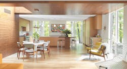
It may be a bit daunting to undertake the renovation of a 1960s-era modern home designed by renowned Chicago architect Otto Stark, but the team at New Urban Home Builders, in Grand Rapids, Mich., had a vision ... and a healthy respect for the home’s initial design intent.
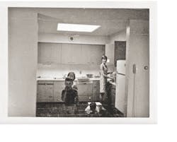
Part of a whole-house remodel, the original kitchen (photo, below) was isolated and not well connected to the rest of the house, says company owner Scott Branc, “so we pulled the kitchen to the front and connected it to the outdoors with more floor-to-ceiling glass,” he says, to deliver natural light and views of the surrounding landscape.
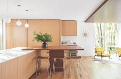
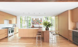
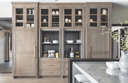
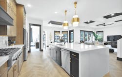
“The cabinetry has a streamlined, modern look, and we kept everything fairly minimal to draw attention to the outside,” says Deidre Remtema, who co-owns Deidre Interiors with her husband, Jeff. “The white oak gives you variation in the wood without red undertones. With the walnut, it all looks light but not washed out.”
The couple also designed a sleek pantry with sliding panels that match those of the adjacent refrigerator. The pantry opens to reveal a 2-foot-deep space with outlets for small appliances and storage for food and other cooking gear. “The panels keep the kitchen streamlined and uncluttered but also ensure it’s extremely functional,” Deidre says.
The judges agreed. “The warm hues, the creative table layout, the well-integrated hood and overall clean lines add a modern polish while still respecting the home’s original mid-century aesthetic,” said one judge. “The finishes in the kitchen are amazing! It’s clear the designers put care into every detail.”
The Remtemas plan to design similar cabinets in future homes, adds Jeff, because so many clients want an open floor plan but dislike messy kitchens. —Michele Lerner
RELATED
- This Lakeside Custom Home Lives Large on Lake Minnetonka
- 7 Kitchen Designs for Today's Lifestyles
- 11 Kitchen and Bath Products That Pair High Performance With Great Design
Custom Home BALA Winner: Down by the Riverside
PROJECT SPECS: RIVERSIDE PRIVATE RESIDENCE
Category: Single-Family Custom Home, 3,001 – 4,000 sf
Location: Cape Coral, Fla.
Square footage (kitchen): 297 sf
Builder (entrant): Aubuchon Homes, Cape Coral
Photographer: Barry Milligan Photography
In a departure from Southwest Florida’s traditional and still prevailing Mediterranean architecture, this ultra-modern, custom home in Cape Coral optimizes the beauty of its natural surroundings while delivering comfort, style, and convenience.
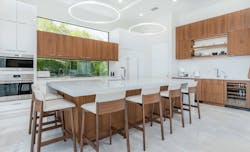
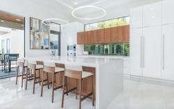
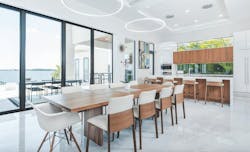
Nowhere is that break from the status quo more apparent than in the design of the kitchen. In addition to complementing the home’s contemporary design and open layout, the 297-square-foot space features cabinets in contrasting but equally sleek lacquered white and warm walnut (photo, below). Both are anchored by subtle shades of white in the quartz countertops and flooring that serve as a canvas for pops of color.
But the real showstopper is the kitchen window backsplash that runs along the wall by the cooktop, and the matching clerestory window above it, with a run of wall cabinets between them. Both provide views to a palm garden that looks like an artwork in itself. LED light fixtures suspended over the island and dining room table also draw the eye, while recessed ceiling lights provide additional ambient light as needed.
In keeping with the spirit of the house, the kitchen and dining area connect to more than 1,000 square feet of outdoor living space via a wall of sliding glass doors, allowing for a seamless flow from indoors to outside. The generous breakfast bar/island and the entertainment wall opposite the kitchen also feature walnut cabinets. There is also a sink and countertop for morning coffee and a specially designed cooler for wine. —Sandra Gurvis
Production Home BALA Winner: Among the Pines
PROJECT SPECS: PINE VALLEY
Category: Single-Family Detached Production Home, 4,500 – 5,000 sf
Location: Lake Oswego, Ore.
Square footage (Kitchen): 276 sf
Builder/Designer/Developer (entrant): Renaissance Homes, Lake Oswego
Landscape Design: All Oregon Landscaping, Sherwood, Ore.
Green Verifier/Rater: Moffet Energy Modeling, Tualatin, Ore.
Photographer: Diana Sell Photography
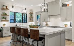
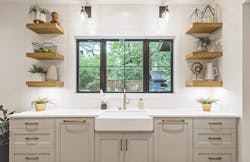
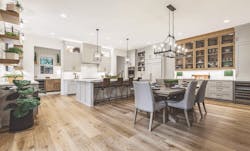
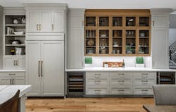
The kitchen for this luxury production home sits at the intersection of function and good looks. Consider the 5-foot-by-10-foot island with storage underneath and a tough quartz countertop; the window by the walk-in pantry that lets in light and is fronted by a high, open shelf that practically begs to be stocked with herbs and other plants; the appliance garage positioned next to the refrigerator, which keeps its piece of the countertop clutter-free; the open shelves along the sink wall (photo, below) that provide both point-of-use storage above the dual dishwashers and a sense of visual openness and interest; and the white tile backsplash behind both the farmhouse sink and cooktop, which brightens the space and is easy to clean.
All that and more creates a kitchen designed for several zones encompassing prep work, cooking, serving, and cleaning. The primary sink wall serves as a hardworking cleanup station with two dishwashers flanking the oversized cast-iron farmhouse sink; another sink is nearby (but not too close!) in the island. The back “butler’s counter” lines the wall beside the walk-in pantry and has an under-counter refrigerator, while the back door leads to an 86-square-foot heated area the design team calls a barbecue porch.
Besides functioning smoothly and looking good, the kitchen was designed to allude to the traditional estate feeling of the neighborhood while incorporating a more contemporary open floor plan—an approach used throughout the home. Natural wood elements, such as wood shelving, cabinets, and a hardwood floor, have the feel of bespoke furniture. —Diane Kittower
RELATED
- Kitchen Designs That Deliver Big on Form and Function
- Home Design Details That Add Distinction
- Design Excellence: A Selection of Projects From the 2021 Best in American Living Awards
Production/Spec Home BALA Winner: Prairie Companion
PROJECT SPECS: ROCHESTER
Category: Kitchen, Production/Spec Home
Location: Rochester, Mich.
Square footage: 350 sf
Interior Designer (entrant): KSI Kitchen & Bath, Livonia, Mich.
Builder: Moceri Homes, Auburn Hills, Mich.
Photographer: Martin Vecchio Photography
When Moceri Custom Homes wanted a kitchen design for a Mountain Prairie-style home in Rochester, Mich., the designers at KSI Kitchen & Bath immediately envisioned a modern look with warm wood tones and plenty of texture for a space that is both one with nature yet also luxurious.
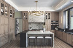
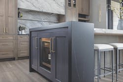
The materials and colors chosen for cabinetry, countertops, and other surfaces reflect those priorities. The cabinets are crafted from quartersawn oak, with light-colored quartz for the island countertop, range hood, and backsplash. The black of the perimeter counters and the bar that hugs one end of the island complements the black windows and contrasts with the light colored quartz (photo, below).
Two distinctive features of the kitchen required extra thought and effort. First, the clever pocket doors on the cabinets that house a coffee bar and a smoothie prep station (photo, below) between the fridge and freezer columns had to be engineered on site to ensure they would operate properly and look seamless when closed.
Second, getting the asymmetrical island right required several design iterations. To call out (but not too loudly) the bar adjacent to the island (photo, below)—which features a full-depth wine refrigerator and two cabinets—the designers fashioned a double waterfall design.
The run of cabinets surrounding the range also draws attention, with liberal use of quartz for the backsplash, shelf, and oversized hood, while the kitchen’s tray ceiling earned praise from the judging panel. “The high ceilings ... add drama and open the space,” said one judge. “The whole kitchen incorporates elements of the home’s exterior materials to complement adjacent outdoor spaces.” —D.K.
Production/Spec Home BALA Winner: Vacation Haven
PROJECT SPECS: HARBOR HOUSE
Category: Kitchen, Production/Spec Home
Location: Longboat Key, Fla.
Square footage: 480 sf
Builder (entrant): Ross Built Construction, Bradenton, Fla.
Designer: Beacon Home Design, Bradenton
Interior Designer: Ross Built Construction; furnishings and décor by Serena & Lily, Sausalito, Calif.
Photographer: Ryan Gamma Photography
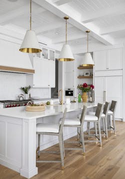
It’s not surprising that coastal comfort with a touch of elegance is the hallmark of the kitchen for Harbor House, in Longboat Key, Fla., a vacation home where the primary focus is the deep-water view at the back of the house, and residents enjoy nearly year-round indoor-outdoor living.
“The kitchen was designed with the idea of creating a central gathering space with a strong connection to many of the spaces where the homeowners and their guests want to spend their time,” says AJ Barnard, chief architectural designer for Beacon Home Design. There’s also an adjacent “dirty kitchen” that contains extra storage and a prep area. “And we always incorporate a multifunctional workstation sink, as well as open shelving, so guests can help themselves,” says Lee Ross, co-owner and design liaison for Ross Built Construction.
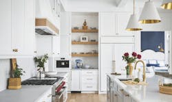
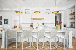
In keeping with the rest of the house, the kitchen features a mix of traditional finishes with a nautical spin, such as a marble backsplash in a fish-scale pattern, subtle natural-wood accents, and a white painted beam ceiling with tongue-and-groove wood for texture, Ross says. “The white-on-white color palette works well in Florida because it reflects the light and doesn’t fade,” she points out. —M.L.
Production/Spec Home BALA Winner: Black and Tan
PROJECT SPECS: ELLAVILLE
Category: Kitchen, Production/Spec Home
Location: Ponte Vedra Beach, Fla.
Square footage: 223 sf
Builder (entrant): Providence Homes, Jacksonville, Fla.
Developer: PARC Group, Jacksonville
Green Verifier/Rater: Jacksonville Building Science, Jacksonville
Photographer: Kim Lindsey Photography
The Ellaville café/kitchen exemplifies the casual comforts of its coastal location. The space flows effortlessly into a dining room, family room, and a generous covered patio—the perfect space for indoor and alfresco entertaining, complete with its own summer kitchen facing a lakefront backyard.
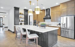
The main kitchen provides an idyllic workspace, with views to the outdoors. Its arresting yet elegant black, white, and tan color scheme is both practical and beautiful, drawing the eye to divergent yet harmonious herringbone patterns in the white marble backsplash and wood floor. The white waterfall island further extends this study in contrasts between the white surfaces and black and tan cabinets.
The main run of cabinets remains on trend, with rich wood that has hints of modern gray. The warm wood pairs elegantly with the white counter surfaces and black cabinets under the island and above the kitchen desk, the latter offering the dual convenience of both storage and floating shelves for collectibles. Sophisticated pulls in a gold finish add a final, zippy touch.
The kitchen’s open, welcoming feel extends to its everyday aspects: a large, walk-in pantry; a 36-inch gas range with a black chimney hood (another effective, dramatic contrast with the lighter wood cabinets); and generous counter space that allows for easy food preparation and serving—all of which creates a sense of continuity, elegance, and style. —S.G.
