Mixed use continues to be integral to both urban and suburban settings as communities look to these projects to inject vitality into parcels with underutilized space or to add density near public transportation. Though they often come with significant regulatory oversight and can be difficult to get permitted, these projects offer developers a key advantage: two streams of income—commercial and residential.
There’s no single formula for success on mixed-use projects. To identify the best combination of retail, office, and dining for the location takes a thorough analysis of the immediate neighborhood and surrounding community. Cities, in many cases, want to encourage the inclusion of small retailers or restaurants, perhaps to revive a struggling retail strip. But such wishes may not be realistic, especially in light of the overall decline of brick-and-mortar retail.
“One of the struggles many cities have with mixed use is that they want retail, but retail doesn’t work everywhere,” says Chris Haegglund, president and CEO of BAR Architects, in San Francisco and Los Angeles. It may seem that a new eatery, for example, with the addition of perhaps hundreds of new residents in the development, would be a slam dunk. But that’s not necessarily the case. “It takes thousands of roofs in a community to support a single small restaurant,” Haegglund says. Dining or conventional retail isn’t appropriate everywhere. The best commercial strategy could be something less flashy such as storefront office space. “It’s not in anyone’s best interests to have empty retail space,” Haegglund points out.
Sometimes an amenity such as a fitness center for residents can be placed in a ground-floor retail space that projects street vitality, even if it doesn’t bring in people from beyond the development. To attract residential tenants, areas for socialization, including rooftop lounges, courtyards, demonstration kitchens with communal seating, and game rooms, are in vogue.
We took a look at four recent mixed-use projects with their own approaches to infill development. Each has distinctive designs and strategies for its commercial and residential space. All are tailored to address some community goals and speak to current trends.
The Meyden, Bellevue, Wash.
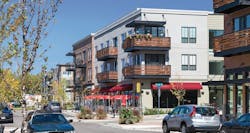
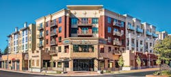
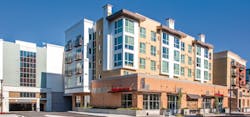
Positioned both geographically and marketing-wise as the “Gateway to Old Bellevue,” The Meyden is a short walk from a historical district with specialty shops and restaurants and is one block from a city park. The five-story structure in a suburban Seattle community has 255 residential rental units and several commercial tenants.
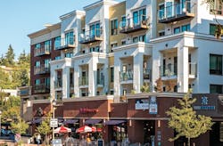
The front façade is oriented at a 45-degree angle on the corner of two busy streets. The rest of the façade is broken up by red brick and tan-and-brown masonry for visual interest, as was required by the city’s design review process.
Commercial tenants—a chain drugstore and a jewelry store, pastry shop, and barber shop—add needed services to the neighborhood. The drugstore includes a drive-through situated next to a less busy street, making use of a back alley on the property.
The structure is anchored by a concrete podium at ground level, accommodating commercial units and extending three levels below grade for parking. Above that is a four-story wood-frame structure comprising the residential section, which is set back from the ground-floor façade. The concrete podium provides soundproofing and acts as a fire wall to the wood-frame section above.
One challenge facing Benson & Bohl Architects, based in San Diego, was designing the commercial units with a significant unknown: “We didn’t have a clue about who was going into those spaces,” says Randall Bohl, a principal at the firm. While the developer wanted a restaurant in a corner unit, the type of eatery it would be was up in the air. It was clear, though, that the space needed appropriate plumbing, and exhaust extending through the roof for stoves, but other interior details were to be determined after a restaurant tenant was selected. “So we made the space as flexible as possible,” Bohl says.
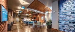
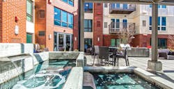
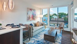
For enhanced security, there is no direct connection between the commercial and residential sections of the project. The residences have a separate elevator that tenants access via key card. The studio, one-, and two-bedroom residential units feature floor-to-ceiling windows, quartz countertops, wood floors, and stainless steel appliances. One- and two- bedroom units include a private balcony or terrace. Residents also have several indoor and outdoor shared lounges and courtyards. “The Meyden probably has more balconies and outdoor spaces than is typical in the Seattle area,” says Richard Benson, a principal at Benson & Bohl. Shared amenities include a patio with a fountain, fire pits, and outdoor cooking areas; a high-tech theater, fitness center, and game room with a billiards table; and vintage video-game machines.
The Meyden addresses young, single adults’ desire for vibrant urban living near nightlife, restaurants, and cafés. Though on-site parking is available, residents have much of what they need within walking distance and can live car-free if desired. (The Meyden, photos: Michael Walmsley)
Gunbarrel Center, Boulder, Colo.
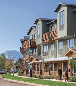
A key goal of this suburban infill project in Boulder designed by BAR Architects, in San Francisco and Los Angeles, was to create a small retail main street with first-floor commercial space that links to an adjacent shopping center. Five buildings provide a total of about 15,000 square feet of retail space with residential units above. Nine other buildings are exclusively devoted to residential units and private amenities.
The street layout and parking are designed to encourage shoppers to walk to and from the neighboring retail development. A new road is oriented to end opposite a back entrance to the shopping center.
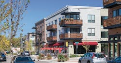
The buildings in the three-block retail strip within the Gunbarrel Center feature distinctive architecture. Each tenant provided design input on their storefront. All of the façades employ brick and fiber-cement siding, but different coloring and forms make them appear to have been built separately—like a typical small-town commercial strip that arose over decades. The sidewalks are wide enough for any restaurant tenant to create an outside dining area. The mix of retail tenants, including a pizza shop, espresso café, and Indian/Nepalese restaurant, attracts visitors.
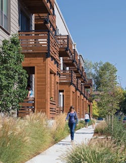
The nine solely residential buildings have a uniform look—sloped gable roofs, front porches or steel and cedar wood balconies, and earth-tone horizontal cement board—that jibe with the mountain community vernacular. About 10,000 square feet in the residential section houses first-floor amenity space including a fitness center, coffee bar, lounge with demonstration kitchen, sports simulator and pool hall, and conference room and business center for residents. The lounge, kitchen, coffee bar, pool hall, and lobbies feature hardwood or wood laminate flooring with open views of the other spaces, and windows that almost reach from floor to ceiling.
Outside, residents can make use of a grilling station within a picnic area. Two bioswales with stone walls, native grasses, and other vegetation hold stormwater, add a decorative landscaping element, and provide a visual buffer to the adjacent shopping center. To cap off the site plan, the developer installed a new public park at the terminus of the retail zone that includes a small playground.
Residential units consist mainly of one- and two-bedroom apartments with a few studios mixed in. Most units have either surface parking or tuck-under garages. Residents can also park in a public garage close to the commercial zone. High-end finishes include quartz countertops and stainless steel appliances.
The project stands as an exemplar for a mixed-use project outside of the urban core. “It provides a good prototype for a medium-size urban infill site,” Haegglund says. “The scale, at three stories, is important.” (Gunbarrel Center, photos: Doug Dun / BAR Architects)
Parkside on Adams, Roslindale, Mass.
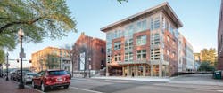
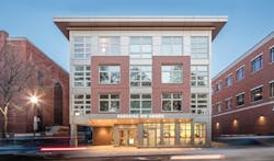
The Parkside on Adams urban infill project in the Boston village of Roslindale frames a historical brick former electrical substation on two sides. The two intertwine in both form and in conception. Community group Roslindale Village Main Street spearheaded a plan to restore and reuse the substation and build multifamily housing next to it. The first RFP attracted no takers, but after another parcel of land became available to expand the housing portion, which helped to subsidize the substation renovation, the project penciled out.
Peregrine Group, a real estate development company based in Rumford, R.I., devised the four-story, 43,000-square-foot apartment building to complement the substation. Roslindale Village Main Street occupies the first-floor commercial office space. The substation renovation, completed a year after Parkside, accommodated a Trillium Brewing Company tap room for several months. Today, the space is available for a full-service restaurant or café.
Together, the two projects bring vitality and badly needed housing to an urban infill setting across the street from a lush city park. The L-shaped housing project shares a small plaza with the substation. Parkside’s exterior of fiber-cement board with red brick accents plays off the red brick substation and a neighboring brick structure. “We didn’t feel going with all brick was the right approach,” says Laura Homich, senior associate at Prellwitz Chilinski Associates, in Cambridge, Mass., which designed the project. “It would have saturated the site.”
Amenities include a fourth-floor fitness room that opens to a roof deck outfitted with an electric grill and seating, container plants, and lighting. Views from this outdoor lounge include the entry area of the substation and the neighboring park. “The units below needed a little more engineering to support the deck,” Homich says.
Pitched roof gables on one side of the Parkside building break up the roofline for visual interest and echo a nearby church steeple as well as the form of triple-deckers in the neighborhood. “It was a challenge to figure out how to slide the units into those spaces with the pitched roofs,” Homich says. “Those units aren’t the most efficient use of space, but they are attractive and they rented right away.”
First-floor units have separate entrances, unconnected to any hallways or units above. Interior design aimed for the midrange of the market. Finishes include granite countertops, stainless steel appliances, and vinyl plank flooring resembling hardwood. Corner units have wraparound windows. Six of the 43 housing units are designated as affordable, available by lottery. (Parkside on Adams, photos: Flagship Photo)
Ten at Clarendon, Arlington, Va.
Just outside Washington, D.C., Ten at Clarendon takes an innovative approach to mixed use in an urban infill setting. The neighborhood, already a hot spot for dining and shopping, wasn’t crying out for a lot of new retail. Thus, the five-story structure’s commercial space leaves those uses out and instead includes live/work units for artisan-type businesses as well as conventional office space for small businesses such as insurance and real estate firms.
The eight live/work units are 5,800 square feet in total. Tenants for these spaces include a florist and a framer that secured pricey Clarendon street frontage well below the cost of typical retail space.
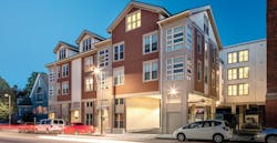
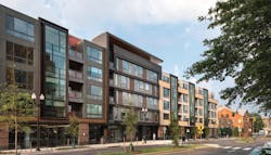
The Arlington, Va., development site was cobbled together from multiple properties over several years. It lies in a zone between high-rises and a residential area of single-family homes and townhomes. The building’s height and mass provide a transition between the two zones. The developer and city planners were concerned that the 145,000-square-foot structure could appear monotonous in the streetscape, so the design visually breaks up the building. “We provided a variety of forms that march down the street,” says Bill Bonstra, managing partner at Bonstra | Haresign Architects, in Washington, D.C. Each form has its own color and material accents, providing a distinctive look.
An interesting innovation is the inclusion of some four-bedroom, three-bath, cohousing-type units. The suites, fetching $5,000 per month, include shared kitchens and living rooms. “They could be for empty nesters who want to have their kids over often,” Bonstra says. “Or they could be for extended families or even for people who are not related.”
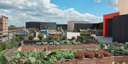
Notably, the project has earned LEED Platinum status for an array of leading-edge sustainability features. Double-stud demising walls with thick insulating material reduce both air leaks and sound transmission. A green roof, Energy Star appliances, organic rooftop garden, in-lobby public transit information screen, and Nest Learning Thermostats boost energy efficiency. Located near a D.C. Metro transit station, the development also includes ample bicycle parking and a bike workshop for all residents. Car-free living is a viable option.
Many shared spaces, live/work units, and office spaces are within a concrete podium with high ceilings. The wood-framed structure above the podium is designed to look like a high-end concrete and steel commercial building featuring continuously glazed curtain wall bays—an unusual detail. As a result, some units have floor-to-ceiling glazing. The complex takes inspiration from the sharing economy; tenants can check out vacuum cleaners and clothes irons from a lending library so they don’t have to buy and store those items themselves.
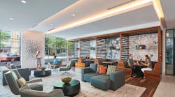
The development features amenities in high demand by young professionals including a rooftop courtyard with a fireplace, grilling areas, TVs, foosball, artificial turf, and the organic garden. The ground level has an outdoor patio, communal dining and lounge areas, study and meeting space, and a fitness center. (Ten at Clarendon, photos: Hoachlander Davis Photography)
Peter Fabris writes about design and construction.
