MORE IN CATEGORY
ADVERTISEMENT
Residential Products Online content is now on probuilder.com! Same great products coverage, now all in one place!

Color is an integral piece of our surroundings and literally provides a natural cue for design. In nature itself, the vast amount of color found in trees, grasses, wildflowers and rock formations are the perfect foundation for a community’s palette. The same can be found in more urban environments too.
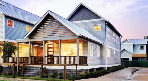
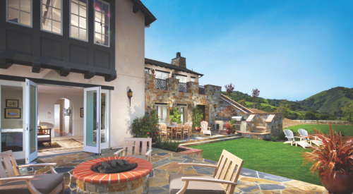
When using your surroundings—natural or built—as the starting point for a community’s color palette, it is possible to create a timeless scheme that will remain fresh and vibrant whether it is applied to new construction or reintroduced into a community. This concept is illustrated by Shea Homes’ BackCountry community in Highlands Ranch, Colorado.
When the master-planned community was developed in 2006, the color palette was created based on extensive field research that included photographing the surrounding landscape, wildflowers and grasses over many months to capture their changes throughout the seasons. After completing observation, photos were documented and the color palettes were pulled from the naturally occurring hues in the landscape, thus creating a motif that compliments and blends with the surroundings. This plan also took into account a mixture of saturations – light, medium, dark – to create a visual flow through the neighborhood, much like the transition of the wild grass in the area throughout the seasons.


Photos taken by Amy Troutman when researching the area to develop a color palette for BackCountry.
Surrounded by an 8,200-acre wilderness area, nature was an obvious focal point for the community’s color concept. If your community is in a more urban setting, the same method still applies; study the surroundings – neighboring buildings, street lighting and right-of-ways, nearby parks – for inspiration.
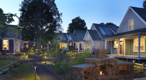
Today, they are still building at BackCountry and still using the original color palette. The colors look fresh and new when continued through the community, even eight years later, because they were developed in tandem with the surrounding environment and with the intention of being timeless.