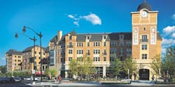
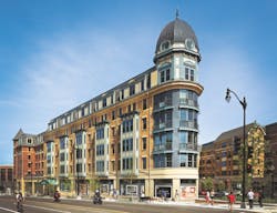
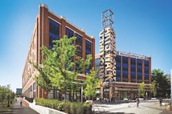
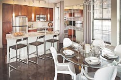
The term “mixed-use development” covers a lot of ground. It can mean a single multifamily building with residential over retail or an extensive, multiphase project with as many as a dozen land uses; rental and for-sale housing; and a variety of outdoor spaces for public gatherings and events. But regardless of size, mixed use works best when it creates a vibrancy that was absent in the neighborhood, says Frank Ricks, principal of Looney Ricks Kiss (LRK) Architects, in Memphis, Tenn. In other words, it should generate crowds, and not just at a specific time of day.
Mixed use can be vertical—such as a 10- or 15-story building that stacks housing, shops, and offices—or horizontal, where various uses are spread over multiple buildings. “Not every community or city can support, or needs, 10-to-15-story vertical mixed use, but it might need 50,000 to 250,000 square feet of mixed use in close proximity,” Ricks says.
Rental apartments aren’t the only type of housing found in mixed-use developments. “In vertical mixed use, you’re more likely to see rental apartments because they’re easier to finance, but in horizontal mixed use, for-sale housing is quite common,” says Les Binkley, vice president of Boyle Investment Co., in Memphis, Tenn.
KTGY Group’s experience with mixed use has helped the architecture firm break into smaller markets such as Raleigh and Charlotte, N.C., and Columbia, S.C. “We’re seeing that urban mixed use, even in the secondary markets, is coming of age,” says Rohit Anand, principal in the firm’s Tysons, Va., office. And it’s happening in the suburbs, too. KTGY is creating mixed-use, walkable neighborhoods, replacing the vast surface parking at strip centers and shopping malls with residential.
For those new to mixed use, Binkley advises, “It’s much more complex because you must always maintain the larger vision while knitting together all of the smaller pieces. The timing of each piece and the integral connections necessary to maintain continuity take tremendous effort and prove difficult in a variety of ways.” Parking, for instance, is always an issue with mixed use, says Mike Henehan, vice president of Bozzuto Development, in Greenbelt, Md. “It’s costly and difficult to get right—definitely one of the bigger items that moves the needle on underwriting these deals and making them financeable,” he says.
Look outward, not inward, Binkley advises. “The networking of practically all building projects is complex, but the key to a well-executed, mixed-use project, whether vertical or horizontal, is how well the project relates to its surroundings and enhances the overall neighborhood and, most important, the public realm.”
Town center enlivens a Washington neighborhood
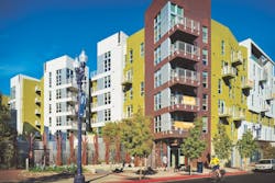
Winner of a Platinum Award in the 2015 Best in American Living Awards, Monroe Street Market is a redevelopment of the Catholic University South Campus, located on six city blocks in Washington, D.C.’s Brookland neighborhood.
“This is a fantastic example of placemaking where there was [nothing] earlier,” says KTGY’s Rohit Anand. “It’s a walkable district with retail and residential, and it’s really cleaned up a blighted [area].” It doesn’t hurt that Monroe Street Market is adjacent to a Metro station and an 8-mile bike trail.
KTGY was the executive architect, while Maurice Walters Architect, of Washington, D.C., and Torti Gallas and Partners, Silver Spring, Md., handled the conceptual design and master planning. The developers are Bozzuto Development, Greenbelt, Md.,and Abdo Development, Washington, D.C. There are four buildings (two Brookland Works buildings, Portland Flats, and Cornerstone) with a total of 562 residential units; 50,000 square feet of retail space; and 15,000 square feet of artist studio space; as well as a 3,000-square-foot, freestanding community arts building. The developers made a significant investment in the infrastructure of the project, creating public plazas and sidewalk cafes that enhance walkability.
The two Brookland Works buildings are connected by a public promenade and have an industrial-chic look inspired by SoHo artist lofts. They include 27 artist studios with glass roll-up doors that allow the artists to directly interact with the public, plus 152 residential units. The apartments tend to be smaller (740 square feet on average) than in the other buildings and include more studio and one-bedroom units, Bozzuto’s Henehan says.
Portland Flats has a ground-floor sandwich shop and 100 residential units, each averaging 1,100 square feet. Working professionals are the primary renters—“folks that want bigger units,” Henehan says.
Cornerstone has 310 residential units over an Internet café with warehouse-inspired finishes and eclectic touches. The architecture, Anand says, is suggestive of Second Empire, a style that was dictated by the city’s prescriptive zoning process.
At press time, the retail space was approximately 75 percent leased; about 90 percent of the phase-one residential units were rented. All of the Brookland Works artist studios are occupied. Marking the project’s transition from rental to for-sale housing, Bozzuto has 45 townhomes under construction. Two condominium projects, totaling 160 units, are also in the works.
The renter profile includes employees of nearby hospitals; students and faculty at Catholic University, Trinity University, and Howard Divinity School; and commuters traveling from the central business district to Silver Spring. “We have 99 floor plans, which is incredible,” Henehan says. “With 562 units, we wanted to make sure we had something that spoke to everyone.”
In San Diego, capturing artistic ambience
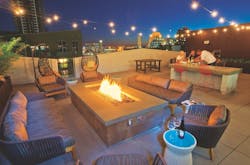
The site of Form 15 in San Diego’s East Village had been vacant for a number of years. The neighborhood had transitioned from a heavy warehouse/industrial location to a more residential neighborhood, with many warehouses converted into work spaces for artists and designers. What makes Form 15 ideal for mixed use is its proximity to restaurants, nightlife, parks, cultural offerings, a trolley line, bicycle routes, and local freeways.
Vancouver, Wash.-based Holland Partner Group is developing Form 15. Brent Schertzer, development director, says that 80 percent of the building’s 242 units are leased. Renters include students attending nearby colleges and universities; working professionals; families who want to downsize and live downtown; and aging boomers. But the majority are relocating from out of state to work in the medical, tech, biotech, or military sectors.
The design, says architect David Gonzalez of Carrier Johnson + Culture, in San Diego, is “hip, cool, and fresh. We wanted to embrace the artist community and create a building that was somewhat bohemian…a bit abstract.”
Corrugated, weathered paneling and a consistent patterning of windows give Form 15 an industrial flavor. Local businessman and artist Bob Sinclair, who recently passed away, left behind a warehouse full of industrial machine parts that were used to sculpt different components. The architecture features undulating forms and dramatic angles inspired by tectonic plates under the site.
“This is one of the few downtown projects that offers three-bedroom lofts,” Gonzalez notes. “All of the units feel more like for-sale product, with double-height spaces and lots of light.”
At last, a college town center for Notre Dame
With 12,000 students, the University of Notre Dame in South Bend, Ind., is hardly small. Yet before Eddy Street Commons was built, there was no college town center where students, faculty, and staff could walk to shops, restaurants, and other amenities.
“There was a blighted neighborhood at the university’s front door,” recalls Greg Hakanen, director of Northeast Neighborhood Redevelopment, a university entity that is working to revitalize South Bend’s Northeast Neighborhood. “Eddy Street Commons is part of a broader initiative to address the blight and recapture a residential neighborhood that historically had been a great place.”
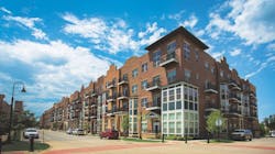
Indianapolis-based Kite Realty Group is the master developer of Eddy Street Commons. Looney Ricks Kiss Architects did the master planning. The development comprises 90,000 square feet of retail space; 82,000 square feet of office space; and more than 470 residential units, including rental apartments and a variety of for-sale housing. There are also two hotels (one was completed at press time) and a 1,276-car parking garage.
The housing options include 266 apartments at The Foundry, a group of four-story buildings with street-level retail. Hakanen says the apartments are 97 percent leased. The for-sale housing, which was designed by Kil Architecture|Planning and is being built by Highline U.S., both of South Bend, Ind., includes Champions Way City Homes (62 single-family row homes); Triumph Court (16 townhomes); Legends Row (66 condominiums); and Victory View Flats (57 condominiums). Champions Way, Triumph Court, and Legends Row are sold out, and Hakanen also expects Victory View to be quickly absorbed.
“There was a conscious effort on the part of the university to create a lot of diversity in the housing [to attract] students, faculty, alumni, and full-time area residents, including young professionals,” says LRK principal Victor Buchholz.
The first apartments started leasing in 2009, and the for-sale housing opened for sales in 2010.
“Phase 2 will be mixed use like Phase 1, with retail, restaurants, and probably for-sale and rental residences,” he says. “We’re getting a handle on what the market will support.” Because Notre Dame alumni absorbed most of the for-sale housing in Phase 1, the university is hoping that Phase 2 attracts more local residents.
With a mix of uses, a historic building is reborn
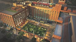
As LRK’s Frank Ricks notes, the repurposing of historical buildings for mixed use gives the project authentic character and doesn’t enlarge the city’s footprint any more than necessary. Such is the case with Ponce City Market, an adaptive reuse and historical renovation of a former Sears, Roebuck & Co. building in Atlanta.
Ponce City Market includes rental apartments, restaurants, and retail and office space. In all, 2.1 million square feet were restored and 259 rental apartments were created.
The residences, known as the Flats at Ponce City Market, were designed by Stevens & Wilkinson, in Atlanta. The Flats are studio, one-bedroom, two-bedroom, and three-bedroom apartments, including 17 two-level lofts. As of June 2015, more than 70 percent were occupied, according to Jamestown Properties.
Young professionals, both married and single, and empty nesters are the targeted demographics for the Flats, which offers a highly desirable location in close proximity to several of Atlanta’s transportation options, says project architect Laura Morton. “A number of the city’s parks and popular neighborhoods are within a 2-mile radius,” Morton adds.
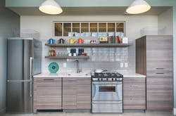
Stevens & Wilkinson preserved the original bones of the building with its square concrete columns, and refurbished the existing steel-frame windows with new glass and paint. The raw brick on the exterior walls was left exposed, and the concrete floors were sealed, predominantly as-is, capturing the patina of years of use.
“The predetermined column spacing gave us a 20-by-20-foot grid to work with, and one window per gridline,” Morton says. “We had to provide adequate unit and room sizes, circulation, and support spaces, all within the footprint carved out of the building for residential.”
