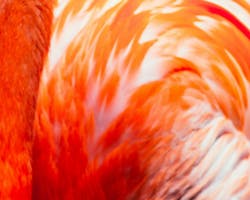
The Pantone Color of the Year for 2019 is Living Coral, evoking feelings of reassurance, Americana, and a retro vibe. Experts are saying that this may supplant the supremacy of Millennial Pink.
Laurie Pressman, vice president of the Pantone Color Institute, tells Fast Company, “Just as coral reefs are a source of sustenance and shelter, we see this color giving us assurance and buoyancy in an environment that’s been continuously shifting for 10 years,” adding, “With technology, and all the [political] unrest around the world, our global culture has continued to accelerate this shift.”
As Pressman points out, Living Coral has a lot of functional attributes that have made it increasingly popular over the past few years. With an orange rather than pink base, its warmth complements most skin tones. In interior design, it’s surprisingly versatile, and can actually be pulled in and out of many color schemes almost like a neutral. On smartphone screens, it’s a super-saturated, vibrant option that can pop on social media–but because it’s found in nature, it bridges the gap between the real and hyperreal. Even when it appears in digital content, it has ties to the natural world.
