MORE IN CATEGORY
ADVERTISEMENT
Residential Products Online content is now on probuilder.com! Same great products coverage, now all in one place!

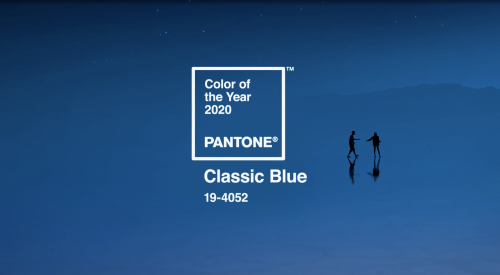
Drum roll, please. The Pantone Color of the Year is… Classic Blue. It is not the eye-popping Living Coral of last year, but the company wasn’t looking for shock value. Instead, the color of the year is meant to bring stability and calm to the surrounding chaos. To drive this point home, Pantone created a multi-sensory, calming experience, releasing a berry tea, a classic blue fabric, and a blue-inspired song called “Vivid Nostalgia.” With these additions, you can see, touch, hear, and taste Classic Blue.
The coming year's hottest shade isn't actually hot at all. Nope, it's the calm, cool Classic Blue—Pantone's much anticipated 2020 Color of the Year.
Leatrice Eisman, executive director of the Pantone Color Institute, says this solid, still waters-run-deep hue was selected because of—wait for it—the global need for stability.
"We're living in a time that requires trust and faith, and it's this kind of constancy and confidence that is expressed by Pantone's 19-4052 Classic Blue, a solid and dependable blue we can rely on," she explains. So maybe chalk up all the White House drama and climate change woes for our need to embrace this honest, relatable tone.