What Will be the Trending Paint Colors in 2021?
Each Fall, paint companies analyze emerging trends they believe will rule the upcoming year. Sherwin-Williams, Behr, Benjamin Moore, and more tackle this forecast in their own ways, which results in varying takes on the beloved Color of the Year and color palettes of the year.
Though the chosen palettes and colors vary by company, this year there is a clear focus: comfort. Undoubtedly a result of the shelter-in-place orders and more time being spent indoors, the palettes and colors of 2021 feature warm neutrals and deep natural hues.
In addition, the companies typically offer up suggestions for where to use the colors and what atmosphere or area of the home they would work best.
We reviewed each palette of the year (so far)—Benjamin Moore color of the year is set to be announced October 14— to see where paint companies predict interior design trends are headed. Are they vastly different? All the same? Read more to find out.
[ Read More: 11 OF THE BEST ECO-FRIENDLY INTERIOR PAINTS ON THE MARKET ]
Urbane Bronze
Sherwin-Williams
Sherwin-Williams announced its 2021 Color of the Year this week: Urbane Bronze.
“Urbane Bronze is a comforting color, drawing from nature for a feeling of relaxation and serenity,” says Sue Wadden, director of color marketing. “There’s also reassurance in its sentimentality, with nostalgic ties to the design of the ‘70s and ‘90s, but with gray undertones that give it a distinctly modern twist.”
Since 2011, Sherwin-Williams’ global color and design team has researched heavily to identify the color. Last year, Naval, a deep navy blue, which was much like the Pantone color of the year, stole the spot. In order to discover the upcoming year’s color, the team studies the biggest trends that influence how someone may interact with a color, the company says.
[ Read More: WITH COVID-19, CONSUMERS ARE JUMP-STARTING HOME IMPROVEMENT PAINTING PROJECTS, J.D. POWER FINDS ]
Oakmoss and Bonafide Beige
Remaining indoors emerged as the key factor that influenced the color choice. The company believes Urbane Bronze evokes feelings of safety and relaxation while tying people to nature.
“The home is now the ultimate retreat from the world, and color is an easy and effective way to create a personal haven,” says Wadden. “Urbane Bronze encourages you to create a sanctuary space for mindful reflection and renewal.”
Those feelings of finding a sanctuary at home continue through Sherwin-Williams’ Sanctuary palette, which the company forecasts as the other “it” colors. After forming the palette, the design and color team zeroes in on one individual color.
[ Read More: OUTER LIMITS: 27 EXTERIOR PRODUCTS TO IMPROVE YOUR CURB APPEAL ]
Messenger Bag
In addition to the Sanctuary palette, the company released Continuum, a palette inspired by mid-century modern trends intended to evoke positivity with its soft purple, blues, and yellows. Maximalism is embodied in the Tapestry palette, which features bright pinks, greens, blues, and yellows. Encounter brings it all down to Earth with muted colors that still present a saturated tone.
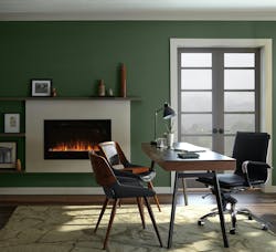
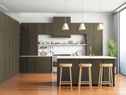
Colors in the Sanctuary palette include several neutrals, greens, reds, some greens, and gray. Out of the 10 colors, only four fall out of the neutral palette. Oakmoss is a deep, forest green. Antique Brown features a rusty, orange-heavy tone. Canyon Clay is representative of terracotta clay and its reddish, brown color. Messenger Bag is a mix between olive, brown, and gray.
The other six colors are variations of whites and grays, with three grays, one beige, a pure white, and the dark bronze from Urbane Bronze.
[ Read More: WHAT THESE 10 'COLOR OF THE YEAR' PICKS SAY ABOUT DESIGN IN 2019 ]
Preference Red
Farrow & Ball
Farrow & Ball categorizes its color trends into four distinct groups with three paint colors in each: rich and warm, clean and timeless blues, natural greens, and Earth colors.
The UK-based paint and wallpaper manufacturer has a more unique angle coming from a different country, yet its color choices reflect the same moods that US companies chose for their colors.
All Farrow & Ball paints are water-based and low-VOC. The company offers an array of finishes for interior and exterior paints from matte to high shine finishes.
Farrow & Ball predicts more designers and homeowners will venture away from darker blues and charcoals, which were previously identified as trending colors of the year in 2020. Instead, the company says its palette is friendlier, warmer, and rooted in nature.
[ Read More: NEW START-UP SIMPLIFIES PAINT SHOPPING ]
Pitch Blue
Curated by Joa Studholme, the company’s color curator for the past 20 years, the color trends are a direct result of the changing needs from a home.
“These thoughtful choices convey a sense of ease and familiarity and are a result of wanting to find calm within the chaos of our turbulent world,” the company says.
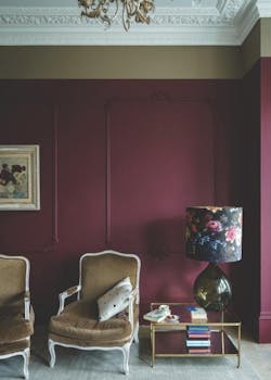
For the Rich and Warm palette, Farrow & Ball attempted to provide hues that enrich homes and can be used in areas that occupants want to use for relaxation. Deep Reddish Brown, Tanner’s Brown, and Preference Red can create a luxurious atmosphere by day and calm by night, the company says.
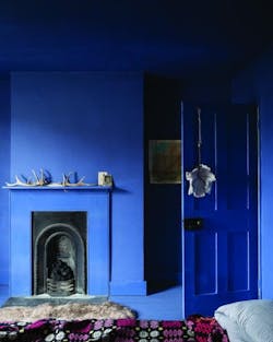
Clean and Timeless Blues feature Pitch, Stiffkey, and Ultra Marine Blue paints. Farrow & Ball wanted to evoke feelings from childhood with these tones, they say, which soothes occupants.
[ Read More: NEW SHERWIN-WILLIAMS SURVEY SAYS WHITE, GRAY WALLS ARE OUT IN 2020 ]
Dead Salmon
Green Smoke, Treron, and Sap Green complete the Natural Greens palette, which reinforce connections to nature, the company says. Hallways, the company points out, is ideal for greens like this as they evoke calmness but can also make attached rooms feel larger. Larger living spaces are in high demand as more Americans stay indoors, so attempting to play with spatial feelings via paint is a useful and cheaper alternative.
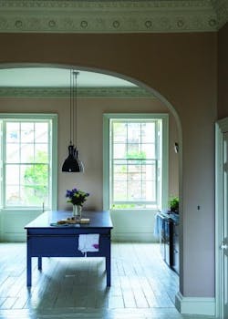
Earth Colours have two beige base colors with a pop of rich yellow. Jitney and Dead Salmon feature a mushroom tone in two different depths, while India Yellow is stronger and more rich.
“The palette of colors we want to use in the home has expanded, and we are looking to introduce warmer tones to add personality and elegance while still remaining comfortable,” the company says.
[ Read More: NEW DURA SUPREME CABINETS CURATED COLOR COLLECTION OFFERS AN ON-TREND PAINT FINISHES ]
Sierra
Behr
Behr’s Color Trends 2021 Palette appears as a culmination of both Sherwin-Williams’ and Farrow & Ball’s, though Behr released its colors first at the end of August. The company calls its palette Elevated Comfort, saying that it’s exactly what the world needs now.
“This has been a year of unpredictability and 2020 has significantly changed our relationship with our home, says Erika Woelfel, vice president of color at Behr. “When our color team began exploring a palette for the coming year, we knew it needed to be grounded in what we’ve been craving: comfort and personalization. A new, ‘elevated’ articulation of ‘comfort’ goes beyond traditional beige, gray and green hues, and embraces colour in a way that can redefine and enhance any type of space inside or outside the home.”
The chosen Behr colors of the year are, no surprise, another response to the pandemic. Its 2021 color themes include Casual Comfort, Optimistic View, Subtle Focus, Calm Zone, Quiet Haven, and Outdoor Escape.
[ Read More: IS IT TIME TO CONSIDER SPA TOWEL WARMERS FOR YOUR BATHROOMS? ]
Saffron Strands
Within the themes, colors were grouped up based on their ability to complement each other, says Behr. Overall, the goal of each paint color is to evoke positivity within the home.
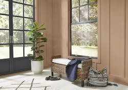
Casual Comfort aims to update the stark white farmhouse aesthetic with warmer beiges. It’s filled with light, warm tones that Behr sees working well in entryways, kitchens, and open living spaces.
Optimistic View combines bright shades reminiscent of the 70s and steers most similarly to Farrow & Ball’s palette. Consider using this palette in a room filled with energy, such as playrooms or kitchens, says the company. Eclectic styles would thrive in rooms featuring this palette. The color’s boldness leans itself toward being used as more accents rather than filling an entire room.
[ Read More: CAMBRIA TEAMS UP WITH GENSLER FOR NEW QUARTZ SURFACING COLLECTION ]
Seaside Villa
Subtle Focus gives hints to growing art deco trends, says the company, as its soft pastels try to mimic a modern version of the classic movement. These lighter pigments bring up feelings of sophistication and invitation, and are suggested to be used on cabinets and furniture pieces, in addition to walls, of course.
Calm Zone and Quiet Haven pull from natural colors like the ocean and forests. Calm Zone’s palette is filled with various shades of blues and greens that are meant to offer an escape. Quiet Haven’s shades are much more rich, dark, and expressive.
Outdoor Escape focuses on curb appeal, offering up colors that would pop on a home’s exterior in either accents for doors and shutters, or the home’s exterior itself. The colors are colorful and bright.
