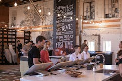
Today’s master planned communities and multifamily dwellings are being reinvented. What’s trending are places that focus on lifestyle and amenities that encourage sharing: community vegetable gardens, parks, playgrounds, trails, rooftop lounges, coffee shops, restaurants, and other gathering spots. Standouts among myriad offerings are the winners of NAHB’s 2017 National Sales and Marketing Awards, with programs and campaigns that offer fresh approaches, new inspiration, clean design, and modern takes on traditional ideas.
The 2017 Community of the Year, Wallis Ranch, in Dublin, Calif., across the bay from San Francisco, used high-impact marketing with crisp, consistent collateral and a well-orchestrated Grand Opening celebration. This MPC focuses on tying the community to its surroundings, with a branding campaign that created buzz and brisk sales despite having few models open. The Mill at Broadway, in Sacramento, Calif., on the site of an old lumber mill, offered a new way to experience home models in its pared-down sales center that tips its hat to the site’s industrial heritage. And in Toronto and Aurora, Colo., both SQ2 and Southshore, respectively, are writing the playbook for how to leverage extant amenities, such as diverse urban neighborhoods and beautiful natural resources. The following selection from this year’s winners presents an array of ideas from which every marketer, regardless of the campaign type or geography or budget, can draw inspiration.
Master Planned Community of the Year: Diverse Product, Consistent Collateral
There’s not much open land within commuting distance of Silicon Valley, so news of Wallis Ranch, a new master planned community of 800 homes on 184 acres in Dublin, Calif., was highly anticipated. Trumark Communities, which acquired the MPC in 2014 in a partnership with investment management groups Isles Ranch Partners and Castlelake, has set a high bar in creating a community that organically unfolds with rolling hills and pastures, sidewalks, a residents-only clubhouse, a pool, playgrounds, and a fitness center. And they were able to sell 30 homes in one month, with just four of the seven builders open with 16 models. “Now that’s marketing,” noted one judge.
KB Home, Pulte Homes, Warmington Residential (two neighborhoods), Trumark Homes, Taylor Morrison, D.R. Horton, and Emerald Homes will create eight neighborhoods featuring a range of product, from 1,450-square-foot townhouses to 4,000-square-foot estate homes. “The plan appeals to a large range of people, from first-time buyers to move-up,” says Peter Kiesecker, COO of Trumark Communities, in San Ramon, Calif.
Natural Connections
Marketing Wallis Ranch, nestled in the hills 2 miles from a Bay Area Rapid Transit station and 4 miles from the Interstate 580–680 corridor leading to Silicon Valley and San Francisco, focuses on tying the community to nature and a rustic past anchored in ranching, Kiesecker says. “There’s a wall with hand-placed stones along the entry; granite boulders lead the way to Kindred House [the clubhouse]; and you can only access the community by going over bridges, to avoid disturbing the wildlife,” Kiesecker says.
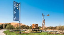
From 1912 to 1943 there had been a one-room schoolhouse, called Anton School, on the property, which Trumark moved and rebuilt at the community’s entrance. “It’s a gathering place and a trailhead, and whether you’re traveling, hiking, biking, or walking into the community, you come to Anton Pavilion,” Kiesecker says. Dublin was once the place where two stagecoach routes (now Interstate 580 and 680) intersected, and Mexican and Irish communities have their roots there. It’s now the second fastest growing city in California, and Wallis Ranch’s entry gates and benches, designed by local artist Eric Powell, are a nod to its agrarian past and equestrian present. Kindred House has a modern farmhouse feel to it, in the spirit of Northern California’s wine country. A tall windmill sits at one entrance, serving as a monument. Starkly graphic against the sky, it has become an icon for the entire community. These elements tell the community’s story, Kiesecker says. “And we promoted these images, as well as the gated aspects, which is a little unusual for Northern California.”
But on Grand Opening Day, Sept. 24, there were just 16 models open. Despite this, “We had 750 people go through on that day,” Kiesecker says. Organized by Trumark, the event included six San Francisco–style trolleys taking visitors from neighborhood to neighborhood. The “Passport Program” encouraged people to hop off the trolley at each neighborhood to have their passport booklets stamped. At day’s end, attendees were entered into a prize drawing. “People really responded to that. Kids were excited,” Kiesecker says. There were high-end food trucks and music. “A key aspect of the opening was having the clubhouse pool events area open for people to touch and see. Although they couldn’t swim [in it], they saw the pool was ready, the fitness center was up, and there was an events lounge and terraces. We had picnic blankets available.”
There was dazzling collateral, with letterpress brochures featuring the windmill logo (its circular blades a staple on all marketing materials); sturdy, quality shopping bags; and pens and coasters. Every piece of promotional material was consistent in putting forth the agrarian message.Kiesecker says he believes the marketing materials are doing their job but that the product and location are what’s driving sales. “We have a huge diversity of product that appeals to a lot of buyer groups,” he points out. “And you’re nestled in these wonderful hills.”
Taking cues from high-end retail boutiques, The Studio by Ashton Woods, in Atlanta, comes across, as one judge noted, “as a swanky department store.” To reach move-up homebuyers who place a premium on design and personalization, says Atlanta design studio manager Kellie Bell, the company shifted its focus from a design center to a design studio. In the old model, “it was like walking into a big-box store, where you could see everything all at once,” Bell says. “But try getting a buyer to concentrate. It was crazy.”
Best Design Center: Boutique Approach
Ashton Woods hired Canadian firm Cecconi Simone to help the builder create a space where “a consultant could control the appointment; where buyers could see the samples in a controlled manner and not get distracted,” Bell says.
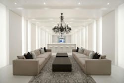
Buyers start in the glass-walled “Hall of Inspiration,” which consists of various kitchen and bath vignettes that allow consultants to see what buyers gravitate toward. “It helps us ask design questions,” Bell says. The hall terminates at a huge 14-foot-wide video wall showing a continuous loop of upscale design ideas, “[which helps buyers] see a global connection in home and fashion design,” Bell says. “And some of the photography is from our homes.”
After that, buyers are led to product-specific selection areas. Creating these individual spaces has helped to decrease cycle time for buyers to make a selection, Bell points out. “We’re able to get them through faster and in a more focused manner,” she says. For example, “in the flooring area, buyers select tile or hardwoods and focus on that one thing. They can’t see the cabinets [until they’re taken to the next area].” They can then take samples into a viewing room to look at their choices all together.
Studio visitors have usually already purchased a home, but, says Bell, “we have a 90 percent turn rate for people who see the studio and then sign a contract to purchase.”
Best Signage: Spirit in the Sign
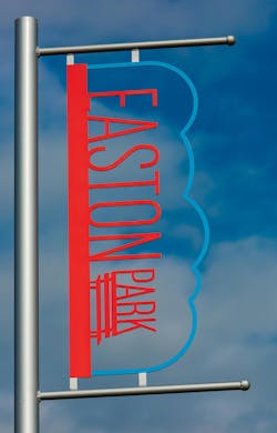
A master planned community in a city whose slogan is “Keep Austin weird,” has a high bar to meet when it comes to out-of-the box marketing ideas. Developer Brookfield Residential hired Lewis & Partners, in Houston, to help create unique signs to reach both Millennials and active adults interested in the recently opened Easton Park development in Austin, Texas.Divided into two sections, the 2,200-acre community about 12 miles from downtown is centered around a park, unlike many other communities, which center on a swimming pool, says Tammy Schneider, Brookfield’s marketing director. In coming up with design ideas, the park bench became iconic for the community, according to Schneider: “A bench says ‘There’s always room for one more.’ It stands for community and stability.”
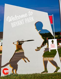
The company’s marketing strives to use as few words as possible, to employ striking graphics, and to appeal to the senses a little differently. “Austin is a city full of amazing artistic talent,” Schneider says. “We wanted an artistic element and not just a sign. But you only have three to five seconds to get people intrigued.”Indeed, this campaign quickly grabs viewer attention, not only with its bright red bench logo but with each sign’s unique cut-out elements, which offer a striking and easy-to-read narrative of life at Easton Park. The durable routed aluminum signs by Executive Signs, in San Antonio, feature recognizable, playful images: In one, a man plays Frisbee with his dog, in another, a child whizzes by on a scooter. Directional signs follow the same game plan. Made from metal, with colorful powder-coated elements, they’re sure to hold up well in the harsh Texas sun and wind. The signage program announces this master planned community as something new and different and, as the judges noted, it “speaks to Austin’s kicky, irreverent spirit.”
Best Sales/Welcome Center: A Hands-On Experience
The sales center for Bardis Homes’ 40-acre master planned community, The Mill at Broadway, in Sacramento, Calif., has a rough-and-ready feel that appeals to Millennials and empty nesters looking for small homes that live large in an urban community. Sacramento’s Vision Launchers, the creative team, generated interest with a video and by collecting a list of names of 1,000 prospects within a week of the sales center’s launch. “We invited people from the list in waves to the sales center,” CEO Russell Breton says. “We wanted to control the experience.”
Walk-through models had yet to be built when prospects arrived at the preview. Instead, they found 1:12 scale models of single-family detached and semidetached homes and loft-type spaces in Craftsman and bungalow styles. (Homes range from about 600 to 1,500 square feet.) Made of cardboard, the easy-to-manipulate models were a big hit. “We had people play with the pretend homes and then leave to get their friends and come back and explain how it worked,” Breton says. “It helped people visualize and understand the houses.”
Bardis sold 21 houses before models were available for walk-through, Breton says. “The American Dream is different now,” he points out. “It’s less about material things and more about living moments.” Along with the MPC’s 1,000 homes will be a community garden, parks, a café, and a farmers market.
Best Social Media Campaign: Social Phenomenon
How do you raise awareness of a new community that’s off the radar in a highly competitive market? With campaigns on Facebook, Twitter, Instagram, and via blogs. Creative use of Facebook led Empire Communities, one of Canada’s largest builders, to sell out of Phase One (218 homes) of its Avalon MPC in less than two weeks, says marketing VP Sue MacKay.
Empire Avalon plans 3,000 homes over the next eight to 10 years and wanted to reach families looking for new homes. But, MacKay says, “this community is outside the greater Toronto area and probably not well known to our target market, yet it has great accessibility to highways and will have a community school and lots of parks and sports courts.”
It’s those amenities that star in the Facebook application that’s the brainchild of Pureblink, the creative team Empire hired for this campaign. The app, which viewers can experience by going to https://empireavalon.me, asks users a series of questions and then launches a video showing what it could be like to live in Avalon. The virtual home is populated with the viewer’s Facebook photos: Pictures of your own friends and family line the fireplace mantle. To drive people to the app, Empire created a special website and banner ads, using Twitter to get people thinking about what life would be like in their dream home and prompting them to come find out more.
Best Graphic Continuity: Celebrating Nature
Southshore, in Aurora, Colo., had been a community of the year before the downturn, but progress stalled. Enter new ownership, with a co-op budget managed by creative ad agency Milesbrand, a repositioning, and a relaunch. The MPC claimed a nearby reservoir as an amenity and delivered that news through a powerful campaign across a variety of media.Through what brand strategist and Milesbrand president David Miles calls a “brand storm,” “Life at the Lake” became Southshore’s brand promise. The 820-acre Aurora Reservoir is a 5-minute walk from the community with swimming, fishing, and kayaking.
Miles and his team explored 20 ideas expressing what life at the lake would look like. They feature a large community lake house in every marketing piece and colorful typeface with overlapping letters, which, he says, “was one of the elements that jumped off the page. We combined that with original photography to get the look and feel we wanted.”
All tactics launched simultaneously: a print campaign in Denver lifestyle, shelter, and real estate magazines, radio on Pandora, banner ads, email marketing, organic and paid search, digital display, social media, signage, and collateral. “It’s a consistent theme we took from one medium to another,” Miles says.
The campaign is performing well, according to Miles: “The website went up in June and we’re getting well over 8,000 people—and climbing—each month to the site.”
Best Brochure/Lifestyle Magazine: Urban as Amenity
The corner of Spadina Avenue and Queen Street West, in Toronto, is a buzzing intersection. A slick magazine about this district helps lure investors and buyers to Tridel’s SQ2, serving as service journalism in the form of an enticing neighborhood guide.
Designed by The Brand Factory, in Toronto, the magazine captures being in the center of a vibrant urban enclave. It speaks to foreign investors who, says account director Tony DeFrenza, make up the project’s core audience, and to the Millennials and Gen Xers who want to be in the thick of things and buy a downtown apartment.
SQ2, in its second phase and nearly sold out, will have about 1,500 condos and townhouses from 600 square feet to more than 2,000 square feet priced from the high $300,000s to more than $1.4 million. “We’re selling lifestyle; the expectations of what the community could be,” DeFrenza says.
For the publication, The Brand Factory hired local bloggers to write about life in the neighborhood. The few ads are for Tridel only. A local photographer shot the neighborhood and followed a model around for a “day in the life”–type story. Some 25,000 copies were printed, placed on magazine racks at coffee shops and restaurants, distributed via direct mail, cross-promoted at other Tridel sites, and given to investors. “They went like hotcakes,” DeFrenza says. Bloggers also posted the blogs on their own sites and The Brand Factory shared them via social media and on its website.
Stacey Freed, a writer in Rochester, N.Y., covers design and building.
