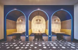
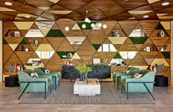
With interior design, color delivers the biggest bang for the buck, according to Mary Cook, founder and president of Mary Cook Associates (MCA), a Chicago-based interior design firm specializing in commercial and residential projects. Paint is a lot less expensive than construction, Cook points out. “With a little cost, you can create a big impact.”
This is one of several takeaways from MCA’s recent white paper “Show Your True Colors: Elevating the Impact of Design Through Color.” Here are a few more conclusions drawn from the MCA report:
Different colors evoke different moods and responses. Consider what’s right for the space.
Color affects our feelings, memory, attention, and motivation to work, the MCA report finds. Red tends to energize us, while blue and green tend to calm. Color can also make a space feel larger or more intimate. “Color influences us both physiologically and psychologically, tying all of our senses together,” according to the report.
When selecting colors, think about the purpose of the space. Is it for socializing, studying, or sleeping? Different colors can help support (or hinder) the room’s purpose. MCA selects colors based on a deep understanding of who will use the space and what function it will serve.
Case in point: Cook had a homebuilder client who couldn’t sell their newly built homes, despite high demand for housing in the area. So the builder called MCA, which quickly spotted a problem: an unfortunate color choice in the model home. The builder had painted the model’s interior a butter yellow, which didn’t flatter potential buyers when they saw themselves in a wall mirror. “Once we changed the paint color to a lovely flesh tone, sales immediately picked up,” Cook says.
Color trends come and go. Neutrals endure (and also change).
Especially when selling homes, it’s safer to keep the large background areas a neutral color. But in the past few years, Cook says, people have been adding accents of color, especially in blues and greens.
And even neutral colors evolve over time. One neutral trend that may have peaked? “The era of gray,” Cook says. “Cool grays have been popular for almost a decade now, but we’ve seen people depart a bit from that. They’re tired of gray.”
Related:
- ‘Step Into The Light’ with These 4 Interior Lighting Considerations
- 4 Interior Design Considerations for Promoting Well-Being
- The ‘5 Ps’ Shaping Function and Livability in Today’s Home Design
Gray is making way for warmer neutrals, Cook notes. “We’re moving away from grays and toward a warm greige with a brown or golden tone and with accents that are navies and deep greens,” Cook says. (For more on the reign of gray, check out Fast Company’s 2022 article “How gray became the king of color.”)
About a decade ago, one trend was to take a favorite color and, Cook says, “add mud.” This gave colors an earthy quality. “Today, everything is crisper, fresher, brighter, and lighter,” she says.
Those headline-grabbing “colors of the year”? Not so much, when it comes to interior design.
“Every year when [colors of the year are] announced,” says the MCA study, “the press starts calling interior design firms for reaction. And every year, they’re disappointed to learn that we’re not in the paint business.”
Cook adds, “The colors of the year are almost comical when we designers look at them because we’d never use those colors” for interior design. Pantone’s color of the year, for instance, is an ink color meant for printing and publishing. “And that’s very different than a color you’d paint a bedroom,” Cook says. In 2022, Pantone’s color of the year was Very Peri, a bluish purple; this year, it’s Viva Magenta, an electric red. Benjamin Moore’s color of 2023? Raspberry Blush, a shade of orange-red.


