MORE IN CATEGORY
ADVERTISEMENT
Residential Products Online content is now on probuilder.com! Same great products coverage, now all in one place!
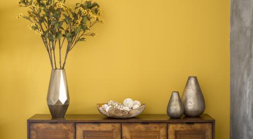
Silvered mink. Mineralized yellow. Iguana? Although these are among 2007's hot colors, choosing the right color for a model living room or an entire development entails more than just flipping through paint swatches.
"Color has enormous effect," says Leatrice Eiseman, a color consultant in Bainbridge Island, Wash., and director of the Pantone Color Institute, which releases an annual color forecast. The Color Marketing Group and Sherwin-Williams also track color trends.
"Color distinguishes your house, making it more memorable. Home buyers are looking at a lot of things. You want people to think about your property and then come back," she says.
Annie Speck of Annie Speck Interior Designs in Laguna Beach, Calif., agrees: "Color sets a mood, a mood influences emotions and emotions drive decisions."
"When a potential home buyer enters a house," explains Speck, "the first impression is typically set by the color on the walls, as it influences everything else in the room." She considers what features enhance a property style, open up a space and create a warm intimate feeling. "Trim and millwork add a lot to the character of a room. In terms of color, rooms with wainscoting and substantial casings need to be treated differently than rooms without," she cautions.
So where do you start? "Color depends on what area of the country you're in — the trends are not all over," says Eiseman. Southern California, she notes, can get away with more intense colors while the Pacific Northwest is better served with muted blues and greens.
"I'm seeing a lot of browns — anywhere from taupe to dark brown, which I love — golds, rusts, greens and deep reds," says Mollie McKennie Christie of Haven Interiors in Morrison, Colo. "It's almost a harvest palette."
Palette is the key word. Pantone develops palettes with eight to 10 colors each, so you can mix and match without worrying about clashing. For example, this year's Aux Naturale palette is an array of so-called organic colors: creamy whites and sandy beiges joined by lilac, lily pad green and denim blue. Grass Roots pays homage to indigenous crafts with hues of terra cotta, adobe rose, mineral blue and iguana, comparable to a mossy green.
 The Grass Roots pallette is based off of colors found naturally in the environment. For more informatioon on Pantone's color report, visit the Pantone site at www.pantone.com. |
"In custom homes, we're seeing the use of many different colors rather than the old theory of using one color to somehow make the space appear bigger or to create 'flow,'" says Christie. But flow is boring, she says.
And color can boost the image of lower-budget homes. "Using different colors is a great concept even in lower-end homes because it creates a more custom feel," Christie says.
Speck notes that many of her clients, regardless of socio-economical status, look to Pottery Barn for design inspiration. She recommends builders do the same, plus check out Williams-Sonoma Home and Restoration Hardware. "These retailers have a huge impact on influencing the current design style," Speck says. "The colors on their walls do not go unnoticed."
If you're still stuck, Eiseman recommends hiring a professional who has studied the trends in your area as well as your target audience. Who knows? Maybe iguana is just the shade for you.