While there’s considerable confusion regarding the variety of home styles, contemporary and modern are likely the most misunderstood. Low-slope roofs and expansive glass come to mind for many of us, while others may use “contemporary” or “modern” to label any design that deviates from the use of traditional and familiar rooflines, window patterns, and materials. Though many of these new designs utilize nonconventional forms and materials, some borrow details and material palettes from more traditional styles.
The following projects from our team feature an array of designs. One concept shown here offers both a traditional form with details that give the project a fresh, modern appeal, as well as an alternate exterior with a more contemporary look. Regardless of the labels we attach to any structure’s style, it’s the thoughtful use of scale, proportion, and materials that results in a timeless design.
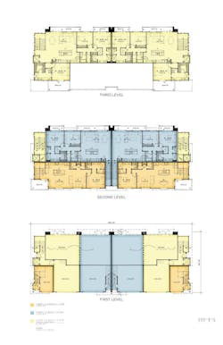
Suburban Row Townhomes, Urban Infill Live/Work
ARCHITECT: Kevin L. Crook, [email protected], 949.660.1587
PLAN SIZES:
TOWNHOMES:
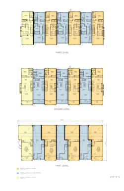
Width: 120 feet, 6 inches; Depth: 50 feet, 4 inches;
Living area (three units): 1,538 sf, 1,810 sf, 1,826 sf
URBAN INFILL:
Width: 126 feet, 6 inches; Depth: 48 feet;
Living area (three units): 1,084 sf, 1,375 sf, 2,149 sf
Row Townhomes
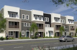
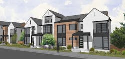
Vertical definition to break down the scale, along with the use of traditional materials, such as board and batten and lap siding, with clean trellis and railing designs and shed-roof elements still speaks to the contemporary vernacular while feeling residential for suburban locations.
Urban Infill
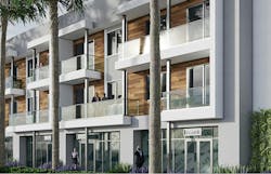
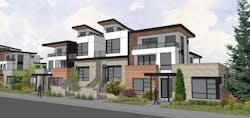
Stacking flats above a retail or commercial base allows for horizontal defining elements that emphasize contemporary components of glass railings, steel columns, and inset stained cladding, promoting a modern look and feel that’s well suited to major boulevards in urban infill locations.
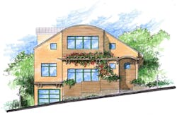
Oberlin Residence
ARCHITECT: EDI International, Richard Handlen, AIA, LEED AP, [email protected], 415.362.2880
PLAN SIZE: Width: 40 feet; Depth: 48 feet; Living area: 3,210 sf
A down-to-the-studs remodel of a 1920s Mission revival home, the downhill side of the split-level plan houses a tandem garage with two bedrooms above. On the uphill side were a number of small rooms including the kitchen, dining room, laundry, and two bedrooms, plus an oversize double-height living room. A stairway leads up to the enclosed roof deck at the home’s rear, near the added master suite above the original living room.
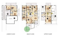
Almeria, Plan I
ARCHITECT: Robert Hidey Architects, [email protected], 949.655.155
PLAN SIZE: Width: 50 feet; Depth: 70 feet; Living area: 3,727 sf
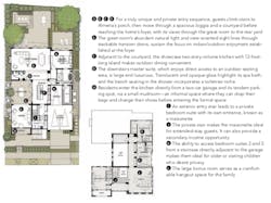
Planned for affluent, mature, empty-nester families, Almeria is situated in an established master planned community, notable for its eco-friendly features, preserved open space, and resort-caliber leisure amenities. The four bedroom, 4 ½ bath Plan 1, with its striking contemporary massing and distinctive plan forms, was designed to attract a sophisticated audience that appreciates modern design. Its articulated volumes, intriguing stair forms, and elevated windows all invite discovery and progression through the residence, and the space planning provides residents with diverse and adaptable activity spaces and outstanding indoor/outdoor connectivity.
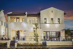
The Rowhomes at Boulevard One
DESIGNER: DTJ Designs, Seth Hart, [email protected], 303.443.7533
PLAN SIZE: Width: 44 feet; Depth: 48 feet; Living area: 2,735 sf
Townhomes are becoming more prominent in both urban and suburban communities. From Millennials to Baby Boomers, low-maintenance living appeals to a wide range of buyer types.
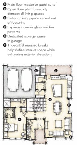
This townhome with ground-level living was designed with a main-floor master catering to a move-down buyer in search of single-level living or to a move-up buyer looking for a guest suite.
It makes a great end unit to break down the scale of the adjoining three-story units.
The two elevations shown here illustrate how different contemporary style preferences can be achieved. Depending on location, either elevation style could be selected to enhance the context of its surroundings. The first is more traditional in form but the asymmetrical window groupings create a fresh and modern appeal.
The second style (top rendering, above) has a more urban feel, with flat roofs, roof decks, material blocking, and again, corner and asymmetrical window patterns for contemporary appeal.
- For more on House Review
- Access a PDF of this article in Pro Builder's November digital edition
