7 Sales and Marketing Trends to Watch (and Learn From)
The annual National Sales and Marketing Awards (“The Nationals”) has long been the housing industry’s bellwether of the latest and greatest campaigns to build homebuyer awareness, drive sales traffic, and close deals, and the latest crop of winners is no exception.
While representing a fraction of those recognized at The Nationals Awards Gala during the 2024 International Builders’ Show, the campaigns selected here represent key trends to watch in their approach and execution.
RELATED
- 2023 Nationals Winners: Home Building Sales and Marketing Magicians
- Sync Sales and Marketing for a Better Brand Experience
- 3 Truths for Home Sales Success Now and Into the Foreseeable Future
Trend 1: Continuity
GOLD: P11
CATEGORY: Best Graphic Continuity-Associate
ENTRANT/WINNER: P11creative, Newport Beach, Calif.
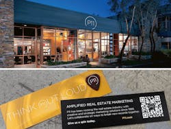
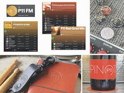
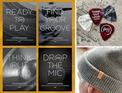
Just like the best concert you ever went to, or a movie that sticks in your head, P11’s dedication to orchestrating a finely tuned, perfectly produced, and expertly delivered graphic continuity for a self-promotional campaign creates a hard-to-kick memory for would-be (and likely wannabe) clients.
From powerful digital experiences to print, merchandise, on-site engagement, and even the studio environment, the campaign’s graphic design delivers a dedicated yet still nuanced continuity that ensures the look and feel of its brand is consistently amplified.
Trend 2: Convenience and Control
GOLD: TRI POINTE DESIGN STUDIO
CATEGORY: Best Design Center
ENTRANT/WINNER: Tri Pointe Homes, Greenwood Village, Colo.
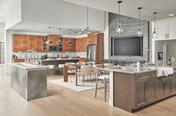
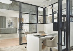
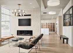
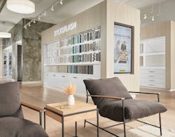
For a design studio serving a new community in Denver, Tri Pointe’s Colorado division made the most of space, technology, and retail techniques to provide home shoppers with a combination of convenience and control during their new-home buying journey.
To underscore the company’s key brand pillars of premium products and customer satisfaction, the studio engages buyers with unique product merchandising and curated selections coupled with technology and visualization tools that help them better understand processes, costs, and
financing—and come to love the finished product.
Trend 3: Tease the Competition
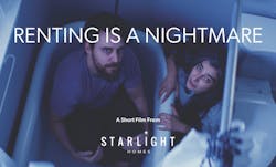
GOLD: RENTING IS A NIGHTMARE
CATEGORY: Best Overall Advertising Campaign
ENTRANT/WINNER:Starlight Homes, Atlanta
AGENCY: Proper Medium, Atlanta
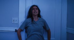
During the 2022 Halloween season, Starlight Homes sought to target current renters and expose the “nightmares” of life in a rented home, apartment, or condo.
To do so, the builder produced a short film in the horror movie genre to deliver that message in a clever, engaging, and, ultimately, successful way.
Adding to the fun, Starlight launched a teaser trailer for the video on Facebook and Instagram on Friday the 13th and ran the film through October 31st, where it extended its reach on LinkedIn, YouTube, and TikTok.
The full video got nearly 300,000 views and more than 1,000 social media engagements.
SILVER: 1-800-BY-RENT
CATEGORY: Best Overall Advertising Campaign
ENTRANT/WINNER: M/I Homes, Columbus, Ohio
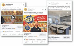
Traditionally, the argument to convert renters into buyers focuses on home equity and appreciation, monthly payments, and pride of ownership. But M/I Homes’ “1-800-BY-RENT” campaign targeting Gen-X and Millennial renters took a different tack by mimicking a late-night infomercial for renting, complete with a smarmy host, stereotypical tropes, and generationally relevant jokes.
Posting a series of video clips to YouTube, Instagram, and other social media channels popular with those cohorts, the campaign drove engaged and curious viewers to a microsite to see new-construction homes priced to rival renting. One popular clip garnered 170,000 views alone, and collectively the campaign was watched, rewatched, commented on, and shared more than 1.4 million times, helping M/I Homes far exceed its quarterly target for townhome sales.
Trend 4: Target the Message
GOLD: 3ROOTS
CATEGORY: Best Overall Advertising Campaign
ENTRANT/WINNER: Paolucci Salling & Martin Communication Arts, Hermosa Beach, Calif.
CLIENT/DEVELOPER: Mesa Canyon Community Partners, Miami
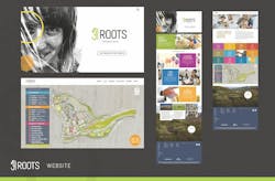
For 3Roots, a community of bungalows, townhomes, and flats in San Diego, reaching first-time homebuyers from the local tech industry and young families in the surrounding market required a hyperfocused, integrated advertising campaign.
Using social, search, Google Display Network targeting, Connected TV, advertising, email, programmatic displays, and digital billboards, channels were optimized with specific restrictions to ensure ads were only served to the highest-quality leads to drive web conversions.
It worked. The campaign netted nearly 500,000 new web users and 2.5 million page views, producing over 40,000 new leads for the community’s 10 neighborhoods. To date, the community’s first two phases are approaching capacity.
Trend 5: Give It a Twist
GOLD: THE HIGHLANDS VISITOR CENTER
CATEGORY: Best Community Welcome Center
ENTRANT/WINNER: Caldwell Communities, Porter, Texas
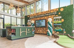
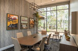
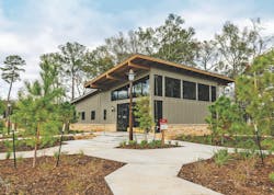
The Highlands Visitor Center eschews tradition with a modern twist inspired by the spirit of our national parks and an immersive connection to nature. That sensibility is echoed in every aspect of the center’s design, from an accent wall of tree rounds repurposed from those removed during site clearing (plenty still remain) to expansive windows along three walls that admit natural light and provide panoramic views that underscore a connection to nature.
Visitors are greeted with a sense of wonder as they explore the interactive exhibits and discover both The Highlands’ unique offerings and the community’s ethos.
Trend 6: Go Bold
GOLD: DUO CONDOS AT THE GATEWAY
CATEGORY: Best Email Marketing/Web Banners/Rich Media Advertising
ENTRANT/WINNER: McOuat | Partnership, Markham, Ontario, Canada
CLIENTS: Brixen Developments, Woodbridge, Ontario, and National Homes, Concord, Ontario
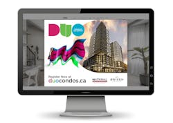
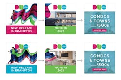
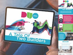
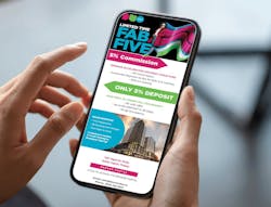
Targeting young, hip, first-time buyers seeking an urban, condo lifestyle, the creative team went bold. Using bright pink, blue, green, and orange colors against clean white layouts and streamlined sans serif fonts sets a fun, unique, modern tone and a fresh look and feel for this digital ad campaign. Stock photography of hip, young urbanites representing the target market was photo-edited to have trailing streaks of color for more visual motion and greater engagement and impact.
The two-month campaign to build awareness for Duo, a new condo project, earned more than 320,000 impressions with high engagement rates—an impressive return on a mere $9,400 investment.
Trend 7: Build It Better
SILVER: PAINTED PRAIRIE MOBILE APP
CATEGORY: Best Use of Technology
ENTRANT/WINNER: Painted Prairie, Aurora, Colo.
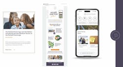
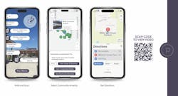
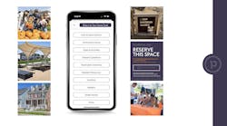
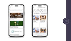
Mobile apps aren’t new to the scene, but Painted Prairie upped the ante with an app that enhances communication, increases engagement, and cultivates community.
The app offers features that residents need and want to access quickly and easily. Using the app, residents can submit digital maintenance requests, complete resident-only event registrations, and make amenity reservations (the latter with interactive augmented-reality showcasing distance, location, and pop-up information). There’s also a “Steals & Deals” page of discounts on local entertainment and activities and custom push notifications of upcoming events, important information, and new features.
Bolstered by an aggressive awareness campaign that included in-person, email, and social media components, the app saw a 93% adoption rate among residents, got 10,886 page views, and resulted in more than 70 maintenance requests being submitted.
