Builders and designers know how important kitchens are to their clients. They are where most of us really live, and so must be carefully designed to function on many fronts, from storage to food preparation to providing a gathering place. Meanwhile, separate “back kitchens” and wine storage areas are high on the lists of homebuyers serious about entertaining. Large walk-in pantries are often spacious enough to provide a place for small appliance storage and use. And while traditional cabinetry with raised-panel doors and crown molding are still popular, sleek, minimalistic materials and finishes are showing up in both contemporary and traditionally styled homes.
Take a look at these kitchens created by our design team, including some stunning outdoor areas, and feel free to reach out with any questions or comments.
THE MAGNOLIA
DESIGNER: DTJ Design, Seth Hart, [email protected], 303.443.7533
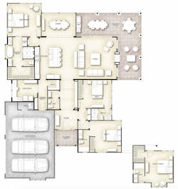
PLAN SIZE: Width: 65 feet; Depth: 75 feet; Living area: 2,540 sf
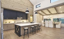
Designed for Legacy DCS, The Magnolia at Westside Landing is an age-targeted, single-level-living community overlooking Lake Travis in Austin, Texas. Vaulted ceilings throughout the living room and kitchen add drama to the spaces, while enhanced wall treatments and transom windows maintain a comfortable sense of scale.
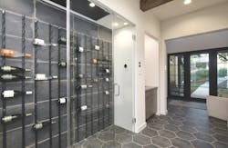
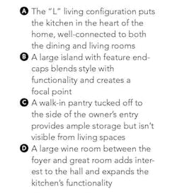
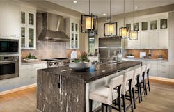
In the Magnolia’s kitchen, accented upper cabinets provide unique design appeal that works well with the modern but rustic style. The kitchen also has direct access from the owner’s entry and is connected to the walk-in pantry and the laundry/tech room, with options that include additional freezer storage for enhanced versatility.
THE EASTWOOD
DESIGNERS: GMD Design Group, Scott Gardner, [email protected], 919.320.3022
Donnie McGrath, [email protected], 770.375.7351
PLAN SIZE: Width: 68 feet; Depth: 80 feet; Living area: 3,567 sf
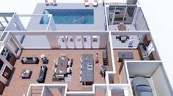
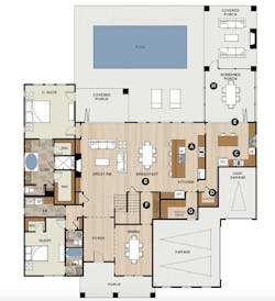
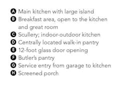
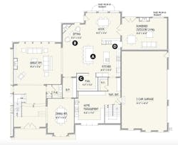
This kitchen takes indoor-outdoor living to the next level. It’s actually two kitchens: The main one features a huge island that connects to the breakfast and great room areas, and the second functions as a scullery with a direct link to an outdoor dining area and the pool beyond via a 12-foot-wide door. The second kitchen doubles as a preparation area for the main kitchen and also as an entertaining area that extends into the outdoors while keeping the main home separate. The large pantry is located between both kitchens for ease of access.
OLGIATA AT ROLLING HILLS C.C.
ARCHITECT: Robert Hidey Architects, [email protected], 949.655.1550
PLAN SIZE: Kitchen: Width: 21 feet, 6 inches; Depth: 17 feet, 10 inches
AREA: 383 sf
BACK KITCHEN (INCLUDING PANTRY): Width: 21 feet, 1 inch, Depth: 6 feet; Area: 132 sf
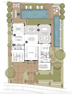
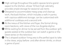
For Toll Brothers’ Rolling Hills Country Club, the Olgiata model is designed in a European ranch style to suit an affluent family that entertains frequently. It celebrates the indoor-outdoor experience from the grand foyer, with views of the city in the distance and opportunities to enjoy the outdoors.
The kitchen, between the great room and the dining room, is the home’s focal point and hub, with unimpeded access to the outdoor living areas through expansive sliding glass doors.
JENNIFER
ARCHITECT: TK Design & Associates, Todd Hallett, AIA, CAPS, 248.446.1960
PLAN SIZE: Width: 180 feet, 4 inches, Depth: 71 feet, 4 inches, Living area: 6,171 sf
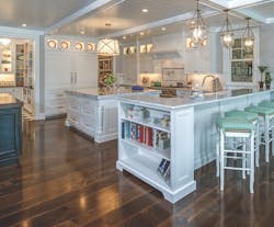
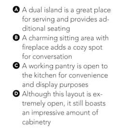
As house design has become increasingly casual, the kitchen has become more and more open to other spaces. It serves as the core of the home, a place to gather, eat, entertain, and connect, while large pantries provide true working spaces.
LAGUNA NIGUEL REMODEL
ARCHITECT: Kevin L. Crook, [email protected], 949.660.1587
PLAN SIZE (KITCHEN): Width: 15 feet; Depth: 24 feet; Total area (including pantry): 360 sf
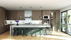
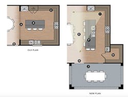
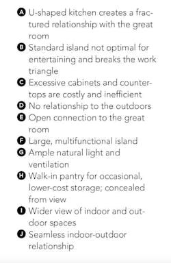
The kitchen is a space where form and function are measured by their ability to support both entertaining and cooking. Compared to the original kitchen, the overall layout of this redesigned space is less compartmentalized and more of an extension of the great room. While the old kitchen had an island, it cut off the everyday need to easily access both sides of the kitchen, and the extensive upper and lower cabinets and countertops of the U-shaped kitchen were costly and inefficient. The new kitchen offers a large entertainment island open to the great room and a minimalist aesthetic through clean cabinetry lines and a refrigerator integrated into the paneling system, blending entertainment with utility. It also engages the outdoors and brings in natural light and ventilation. The new pantry offers more storage capacity in a cleverly concealed space.
Access a PDF of this article in Professional Builder's October 2019 digital edition
