They’re popping up all around the country: collections of homes with small footprints overlooking a central landscaped courtyard.
Pocket neighborhoods, a term coined by architect Ross Chapin, are inspired by the bungalow courts built in Southern California in the early 1900s. Although originally constructed as solutions for multifamily housing, bungalow courts offered the privacy of single-family homes in a higher-density and neighborly setting. Current interpretations feature an assortment of building types and locations.
The following pocket neighborhood concepts range from overlooked and challenging building sites to suburban rental neighborhoods. Each project includes landscaped common areas that encourage people-friendly environments. But the most important and refreshing design element of the pocket neighborhood is its emphasis on the context of all the homes. Instead of uniquely designed homes that compete with one another, the architecture of the overall neighborhood takes precedence.
THE COTTAGES AT CARDINAL WOODS, PLAN 1
DESIGNER
Larry Garnett Designs
[email protected]
www.larrygarnettdesigns.com
254.205.2597
PLAN SIZE
Plan 1
Living Area: 700 sf
Width: 18 feet
Depth: 42 feet
Plan 3
Living Area: 1,250 sf
Width: 24 feet
Depth: 45 feet
Site density: 8.5 d/u per acre
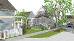
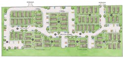
Designed as an alternative to typical rentals, these 700- to 1,500-square-foot cottages are arranged with a pedestrian-friendly layout to emphasize walkability. Residents’ automobiles are located in a variety of detached parking areas that have both covered and open spaces. While the cars are a short walk from each home, everyone travels through the landscaped courts and walkways, allowing interaction with neighbors sitting on their front porches. Private side yards with gates and fences provide secluded outdoor spaces and areas for pets.
A. Most homes face a common courtyard ranging in width from 25 to 32 feet
B. Remaining homes are located along walkways and narrow roads lined with inset guest parking spaces
C. A combination of covered and open parking keeps the automobiles secluded from the homes and allows the residents to travel along the walkways and through the courtyards
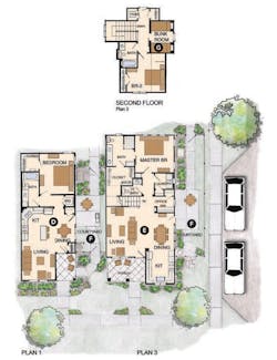
D. The smallest plan (700 square feet) has one bedroom and an open kitchen, dining, and living area
E. Located at the corner of the common central courtyard, this two-story design has a master bedroom on the first level and a second bedroom upstairs
F. Each home has a private side courtyard
G. A second-floor bunk room is ideal for visiting grandkids or a home office
MAPLE PARK
ARCHITECT
Richard Handlen, AIA, LEED AP
EDI International
[email protected]
edi-international.com
415.362.2880
PLAN SIZE
Width: 25 feet
Depth: 30 feet
Living area: 2,250 sf
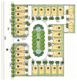
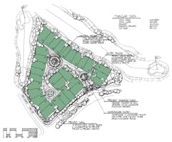
This pocket of undeveloped land had been contaminated over the years by various small-scale businesses. When it was rezoned residential, the most economical approach to development was to keep the contaminants on site. To that end, they were encased and buried under a landscaped park in the center of the site. Twenty-nine homes circle the park. Second-story living spaces keep an eye on the park while the homes on the public street have front doors that address the larger community.
A. Public street with street parking
B. Entry drive and window into the pocket neighborhood from the existing community
C. Single-family homes with front doors on the public street and rear-load garages
D. Single-family homes with garage and front doors facing the private drive that rings the park
E. Central park set above area where contaminants from previous occupants are encased
MODEL A
ARCHITECT
Donald F. Evans, AIA
The Evans Group
[email protected]
theevansgroup.com
407.650.8770
PLAN SIZE
Width: 68 feet
Depth: 112 feet
Living area: 1,868 sf
(over-garage options add 498 sf)
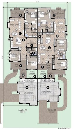
This exclusive, limited-edition enclave is an active-adult community created on a forgotten pocket of land between the 15th and 16th holes. Though they’re attached single-family, they look and live like detached homes: Both sets of garage doors are hidden from the street, and the entrances are completely separate. These single-family homes happen to share a wall, which saves on land costs. What’s more, with today’s construction innovations, there are no downsides to the shared wall. A separate guest house above the garage can be used by family or friends—or by the owner as an office until he or she is ready to go full-time on the golf course. The options are endless.
A. Traditional palette of materials and colors on the exterior elevation of the home with brick, lap siding, and shutters
B. Private garage and entry eliminate side-by-side feel or appearance typical of duplexes
C. Two floor plans speak to different lifestyles. Model A has a grand room, kitchen, and den. Other plans offer a separate leisure and grand room
D. Master suite, which opens onto a covered veranda, includes a walk-in closet, freestanding tub, shower, and two vanities
E. Laundry
F. Outdoor spaces include a front porch, private courtyard, and covered veranda
G. Large secondary bedrooms with shared bath
CLASSICS AT STATION 361
ARCHITECT
Dahlin Group Architecture Planning
[email protected]
www.dahlingroup.com
925.251.7200
PLAN SIZE
Width: 33 feet, 6 inches
Depth: 26 feet
Living area: 1,074 sf
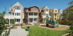
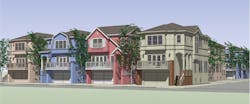
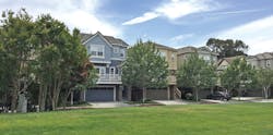
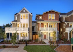
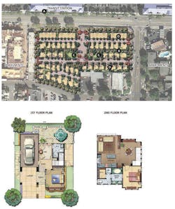
Located in downtown Mountain View, Calif., across the street from Caltrain, this infill pocket neighborhood, developed by Classic Communities, offers affordable, small-lot homes and townhomes that recall the eclectic character of California’s 1920s and ‘30s architectural style. The community, which measures 3.7 acres, is made up of three-story, alley-loaded homes with a connecting central paseo that crosses through the site.
At the center of the community is a neighborhood park providing a comfortable gathering place and recreational area for residents. A GreenPoint Rated and Energy Star Certified community, it features homes that promote affordability via design and technology. Plan A, shown here, is a 1,074-square-foot home on a 1,000-square-foot micro lot with two bedrooms and a single-car garage, attracting young, tech-savvy singles and couples who value the commuter-friendly access to San Francisco and high-tech jobs in Silicon Valley. The community also offers options for move-up families with young children—another plan features three bedrooms and three-and-a-half baths plus a small rear yard.
A. Adjacent to Caltrain station
B. Connecting central paseo
C. Neighborhood park provides a gathering and recreational space for residents
D. Combination of plans ranging from two-bedroom/single-car garage to three-bedroom/double garage located along rear lanes
CINDY, ALICIA, CHELSEA
ARCHITECT
Todd Hallett, AIA, CAPS
TK Design & Associates
[email protected]
tkhomedesign.com
248.446.1960
PLAN SIZE
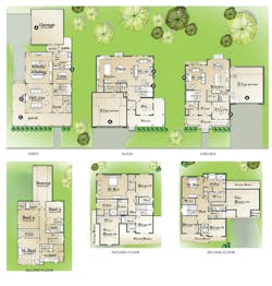
Cindy: Width: 41 feet; Depth: 81 feet; Living area: 3,243 sf
Alicia: Width: 43 feet; Depth: 49 feet; Living area: 2,778 sf
Chelsea: Width: 55 feet; Depth: 48 feet; Living area: 2,445 sf
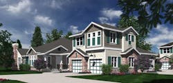
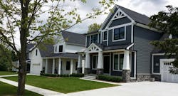
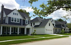
A pocket neighborhood’s core value is establishing a sense of community and shared experience. The Churella family decided that they wanted to take it one step further by taking a neglected lot in Ann Arbor and splitting it into three, one for each family member. Careful consideration was taken to create a sense of scale and proximity when designing these three homes. The Churellas became so passionate about developing this pocket neighborhood that they actually built the homes themselves, acting as their own general contractor. This charming pocket neighborhood has become a gem within the busy city and has brought much life to a neglected piece of property.
A. Minimized garage presence creates more comfortable scaling at street front
B. Window coordination with adjacent house creates private courtyard feel
C. Wraparound porches invite walkability along the street and also soften the separation between houses
D. Minimizing the use of masonry maintains context with the surrounding homes
